It is our habit to expect a solution that is more complex when the problem presented seems harder but that doesn’t have to be the case always. These are such cases while performing Data Transformation in R.
Converting Rownames to a new Column
This may not look like a tough nut to crack as a standalone problem since the base-R function rownames() does the job easily. It is, in fact, a problem when this has to be done while coupling with a few Tidyverse functions or to be coupled with Pipe operator %>% which is getting more popular in designing data transformation pipelines. That’s when the function rownames_to_column() from the package tibble makes it happen with much flair.
mtcars %>%
  tibble::rownames_to_column('Car') %>%
  slice(1:3)
# A tibble: 3 x 12
  Car             mpg   cyl  disp    hp  drat    wt  qsec    vs    am  gear  carb

1 Mazda RX4      21.0  6.00   160 110    3.90  2.62  16.5  0     1.00  4.00  4.00
2 Mazda RX4 Wag  21.0  6.00   160 110    3.90  2.88  17.0  0     1.00  4.00  4.00
3 Datsun 710     22.8  4.00   108  93.0  3.85  2.32  18.6  1.00  1.00  4.00  1.00
The function rownames_to_column() takes the new column name as its argument and hence puts the row names as the first column of the output data frame (or tibble).
Splitting a column to many columns / Text-to-Columns
Splitting a column to many columns is a cliched Data Transformation case that’s hardly unseen while performing Data Transformation. While it’s straightforward to do this in Microsoft Excel, it’s slightly tricky using Data analytics languages. That is true until this function separate() from tidyr came.
mtcars %>% tibble::rownames_to_column('Car') %>%
  tidyr::separate('Car',c('Brand','Model'), remove = F) %>%
  slice(1:5)
# A tibble: 5 x 14
  Car               Brand  Model        mpg   cyl  disp    hp  drat    wt  qsec    vs    am  gear  carb

1 Mazda RX4         Mazda  RX4         21.0  6.00   160 110    3.90  2.62  16.5  0     1.00  4.00  4.00
2 Mazda RX4 Wag     Mazda  RX4         21.0  6.00   160 110    3.90  2.88  17.0  0     1.00  4.00  4.00
3 Datsun 710        Datsun 710         22.8  4.00   108  93.0  3.85  2.32  18.6  1.00  1.00  4.00  1.00
4 Hornet 4 Drive    Hornet 4           21.4  6.00   258 110    3.08  3.22  19.4  1.00  0     3.00  1.00
5 Hornet Sportabout Hornet Sportabout  18.7  8.00   360 175    3.15  3.44  17.0  0     0     3.00  2.00
Few important arguments of the function separate() are
- col – column name that has to be split
- into – the new column name(s)
- sep – separator / delimiter based on which the split should happen
- remove – TRUE/FALSE to remove/keep the original column
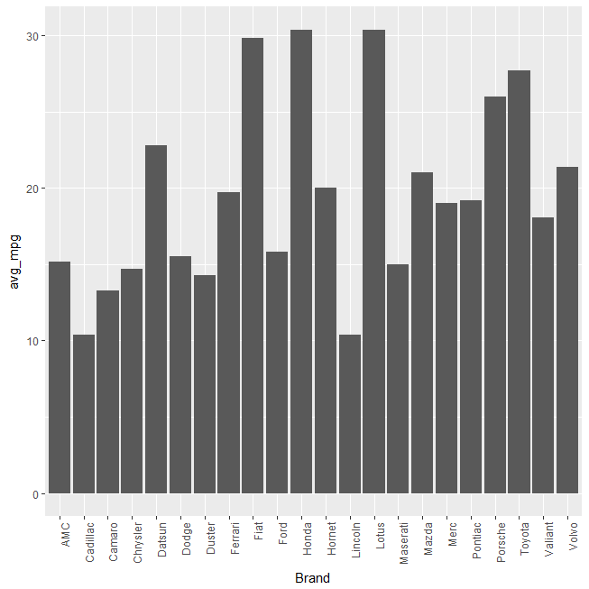
Arranging Bars in ggplot bar plot
By default, ggplot arranges bars in a bar plot alphabetically but most of the times, it would make more sense to arrange it based on the y-axis it represents (rather than alphabetically).
Building upon the above two cases, this code tries to plot the average mpg of car brands in a bar plot.
library(dplyr)
library(ggplot2)
mtcars %>% tibble::rownames_to_column('Car') %>%
  tidyr::separate('Car',c('Brand','Model'), remove = F) %>%
  group_by(Brand) %>%
  summarize(avg_mpg = mean(mpg)) %>%
  ggplot() + geom_bar(aes(Brand,avg_mpg), stat = 'identity')
Gives this plot:
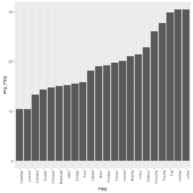
This simple base-R function reorder() wrapped within aesthetic of the geom_bar() function reorders/rearranges the bars based on the y-axis value.
library(dplyr)
library(ggplot2)
mtcars %>% tibble::rownames_to_column('Car') %>%
  tidyr::separate('Car',c('Brand','Model'), remove = F) %>%
  group_by(Brand) %>%
  summarize(avg_mpg = mean(mpg)) %>%
  ggplot() + geom_bar(aes(reorder(Brand,avg_mpg),avg_mpg), stat = 'identity') +
  theme(axis.text.x = element_text(angle = 90, hjust = 1)) +
  xlab('mpg')
Gives this plot:
This post is just an attempt to help those who might struggle with similar issues and also to educate ourselves that the solution doesn’t have to be as complex as the problem itself.