Today we’ll be moving from linear regression to logistic regression. This lesson also introduces a lot of new dplyr verbs for data cleaning and summarizing that we haven’t used before. Once again, I’ll be taking for granted some of the set-up steps from Lesson 1, so if you haven’t done that yet be sure to go back and do it. The other lessons can be found in there: Lesson 2; Lesson 4; Lesson 5; Lesson 6, Part 1; Lesson 6, Part 2.
By the end of this lesson you will:
- Have learned the math of logistic regression.
- Be able to make figures to present data for a logistic regression.
- Be able to run a logistic regression and interpret the results.
- Have an R Markdown document to summarise* the lesson.
There is a video in end of this post which provides the background on the math of logistic regression and introduces the data set we’ll be using today. There is also some extra explanation of some of the new code we’ll be writing. For all of the coding please see the text below. A PDF of the slides can be downloaded here. Before beginning please download these text files, it is the data we will use for the lesson. Only two of the files will be directly used in this lesson, the others are left for you to play with if you so desire. We’ll be using data from the 2010 San Francisco Giants collected from Retrosheet. All of the data and completed code for the lesson can be found here.
Lab Problem
As mentioned, the lab portion of the lesson uses data from the 2010 San Francisco Giants. We’ll be testing two questions using logistic regression, one with data from the entire season (all 162 games) and one looking only at games that Buster Posey played in.
- Full Season: Did the Giants win more games before or after the All-Star break?
- Buster Posey: Are the Giant’s more likely to win in games where Buster Posey was walked at least once?
Setting up Your Work Space
As we did for Lesson 1 complete the following steps to create your work space. If you want more details on how to do this refer back to Lesson 1:
- Make your directory (e.g. “rcourse_lesson3”) with folders inside (e.g. “data”, “figures”, “scripts”, “write_up”).
- Put the data files for this lesson in your “data” folder.
- Make an R Project based in your main directory folder (e.g. “rcourse_lesson3”).
- Commit to Git.
- Create the repository on Bitbucket and push your initial commit to Bitbucket.
Okay you’re all ready to get started!
Cleaning Script
Make a new script from the menu. We start the same way we usually do, by having a header line talking about loading any necessary packages and then listing the packages we’ll be using, for the moment just dplyr. As a reminder, since this is our cleaning script we won’t be loading ggplot2 just yet. Copy the code below and run it.
## LOAD PACKAGES ####
library(dplyr)
Also, as before, we’ll read in our data from our data folder. This call is the same as the previous lessons, but calling in a different file. Also, we’ll be reading in two files today, not just one. Copy the code below and run it. Feel free to look at the data or call head() or dim() if you want to make sure everything looks okay. There should be 162 rows for “data” (for the 162 games in a season) and 108 rows for “data_posey”, since Posey only played in 108 games in 2010.
## READ IN DATA ####
# Read in full season data
data = read.table("data/rcourse_lesson3_data.txt", header=T, sep="\t")

# Read in player (Buster Posey) specific data
data_posey = read.table("data/rcourse_lesson3_data_posey.txt", header=T, sep="\t")
Now we need to clean the data. We’ll start with the full season data. The data as it is currently organized is missing a lot of important information for us to analyze the Giants’ wins and losses. If you look at the data, you’ll notice that all columns are in reference to the “home” or “visitor” team. Instead we want columns to refer to the Giants and their opponents. To do this we’ll start by making a column for whether the Giants were the home or visiting team. This will require a mutate() call and a conditional ifelse() statement where if “home_team” is equal to the Giants (“SFN”), in our new column we write “home”, otherwise we write “visitor”. To better understand the meaning behind each part of the code watch the video. Copy and run the code below.
## CLEAN DATA ####
# Add columns to full season data to make data set specific to the Giants
data_clean = data %>%
             mutate(home_visitor = ifelse(home_team == "SFN", "home", "visitor"))
Since our first question for the analysis focuses around the All-Star break we’ll need to make a column that says whether a given game was before or after the All-Star break. In 2010 the All-Star game was on July 13, 2010. If you look at our “date” column you can see that the date of a game is written “YYYYMMDD”, so July 13, 2010 would be “20100713”. We can use another ifelse() statement in a mutate() call to create our new column. Copy and run the updated code below.
data_clean = data %>%
             mutate(home_visitor = ifelse(home_team == "SFN", "home", "visitor")) %>%
             mutate(allstar_break = ifelse(date < 20100713, "before", "after"))
There’s one last column we’ll need to make for this data frame. As it stands there is currently no column for wins and losses, which we need as our dependent variable for our logistic regression. To do this we’ll use a series of nested ifelse() statements where we check if: 1) the Giants were the home team or not, and then 2) the home team or the visitor team scored more runs. If the first statement executes as true (the Giants are home and the home team scored more runs than the visitor team) we put a “1” in the column to show the Giants won the game, then we move to our second statement. If the Giants were the visitor team and the home team scored fewer runs than the visitor team we put a “1” in the column. In any other situation we put a “0”, to signify the Giants lost. Copy and run the code below to make our file “data_clean”.
data_clean = data %>%
             mutate(home_visitor = ifelse(home_team == "SFN", "home", "visitor")) %>%
             mutate(allstar_break = ifelse(date < 20100713, "before", "after")) %>%
             mutate(win = ifelse(home_team == "SFN" & home_score > visitor_score, 1,
                          ifelse(visitor_team == "SFN" & home_score < visitor_score, 1, 0)))
There’s two questions that may have come to mind with this code. One, what if there was a tie? Similar to how there’s no crying in baseball, there are also no ties in baseball…well, almost no ties. Very rarely is there a tie, but for this particular data set I know for sure there are no ties. Two, every other time we’ve made a new categorical column we used words, not numbers. While in general it is better to have transparent variable labels, it’s common practice that for logistic regression your dependent variable is made up of “1”s and “0”s, where “1” is “true” or “correct” whereas “0” is “false” or “incorrect”. This can especially be important since R chooses a baseline value alphabetically, but with “1”s and “0”s you can ensure that the correct level is the baseline.
This is all we’ll be adding to “data_clean” in this lesson, but if you look at the script online you’ll see I added several more columns in case you want to play around with other types of analyses. There are also other ways to construct our ifelse() statements above and get the same result. As an exercise, think of some other ways you could do this and see if it works. As a hint for one method, we only used the == operator but the != operator could be used as well.
We’ll also need to do some data cleaning on “data_posey”. For example, we’ll need the “win” column to run our regression. Instead of making the column from scratch though, we can combine the “data_posey” data frame with the “data_clean” data frame using the two table verb inner_join(). R will look for all of the matching rows between the two data frames and then copy over the rest of the columns. For a more detailed explanation of what inner_join() does watch the video. Copy and run the code below.
# Combine full season data with player (Buster Posey) specific data and clean
data_posey_clean = data_posey %>%
                   inner_join(data_clean)
To be sure the inner_join() call worked, look at both “data_posey” and “data_posey_clean”. You should see that “data_posey_clean” includes all of the columns from “data_posey”, but also all of the columns from “data_clean”, including our new “win” column. Finally, call a dim() on both data frames as shown below. You should see that they are the same size in regards to rows (108) but not columns (15 for “data_posey”, 32 for “data_posey_clean”). The only difference between the two is the addition of the columns from “data_clean” in “data_posey_clean”.
dim(data_posey)
dim(data_posey_clean)
There is still one column we need to add for our analysis, a column for whether Posey was walked or not during the game. Currently there does exist a column “walks” that says how many times Posey was walked in a game, but we simply want to know if he was walked at least once or not. To do this we’ll use another ifelse() statement in a mutate() call to make a new column “walked”. Copy and run the code below.
data_posey_clean = data_posey %>%
                   inner_join(data_clean) %>%
                   mutate(walked = ifelse(walks > 0, "yes", "no"))
Both of our data frames are cleaned and ready to go to make figures! Before we move to our figures script be sure to save your script in the “scripts” folder and use a name ending in “_cleaning”, for example mine is called “rcourse_lesson3_cleaning”. Once the file is saved commit the change to Git. My commit message will be “Made cleaning script.”. Finally, push the commit up to Bitbucket.
Figures Script
As in Lesson 2, before doing any statistical analysis we’re going to plot our data. Open a new script in RStudio. You can close the cleaning script or leave it open, we’re done with it for this lesson. This new script is going to be our script for making all of our figures. As in Lesson 2, we’ll start by using a source() call to read in our cleaning script and then load our packages, in this case ggplot2. For a reminder of what source() does go back to Lesson 2. Assuming you ran all of the code in the cleaning script there’s no need to run the source() line of code, but do load ggplot2. Copy the code below and run as necessary.
## READ IN DATA ####
source("scripts/rcourse_lesson3_cleaning.R")

## LOAD PACKAGES ####
library(ggplot2)
Now we’ll clean our data specifically for our figures. There’s only one change I’m going to make for “data_figs” from “data_clean”. Since R codes variables alphabetically, on our plot for the All-Star break “after” will be printed before “before” since “a” comes before “b”, but that’s pretty awkward in a time sense. So, using the mutate() and factor() calls I’m going to change the order of the levels so that it’s “before” and then “after”. Copy and run the code below.
## ORGANIZE DATA ####
# Full season data
data_figs = data_clean %>%
            mutate(allstar_break = factor(allstar_break, levels = c("before", "after")))
In the past we’ve always been plotting continuous variables, but for this lesson our dependent variable is categorical (win, loss), so if we were to plot the raw data there would just be a bunch of “1”s on top of each other and a bunch of “0s” on top of each other. Instead what we really want to know is the percentage of wins before and after the All-Star break, and then we can plot a barplot of these values. To do this we’ll use two new dplyr verbs, group_by() and summarise(). See the video for details of what these verbs are doing. Briefly though, what we’re doing with this code is saying we want to find the mean of “win” for both “before” and “after” the All-Star break. I’ve also multiplied the mean by 100 so that it looks more like a percentage. This is another reason why it’s beneficial to code “win” with “1”s and “0”s; since it is a numeric variable we can take it’s mean. Finally, we end our call with ungroup() so that if we do future analyses the grouping isn’t still in place. This doesn’t matter for us right now, but it’s good practice to get in the habit of including ungroup() whenever you’re done with grouped data in case you add further manipulations later on. When you feel that you understand what the code is doing, copy and run the code below.
# Summarise full season data by All-Star break
data_figs_sum = data_figs %>%
                group_by(allstar_break) %>%
                summarise(wins_perc = mean(win) * 100) %>%
                ungroup()
To see what the code did, take a look at “data_figs_sum”. It should only have two columns, “allstar_break” and “wins_perc”, and two rows, one for “before” and one for “after”.
We also need to do some work with our Posey data. Start by creating a new data frame “posey_figs” based on “posey_clean”. We’re not going to modify it at all since for our variable “walked” “no” comes before “yes” alphabetically, and that’s what we want in our plot anyway. Copy and run the code below.
# Player specific data
data_posey_figs = data_posey_clean
Just as we had to summarise our full season data we’re also going to summarise our Posey data, but instead of grouping by “allstar_break” we’ll group by “walked” since that’s our variable of interest. Everything else in the code is the same. Copy and run the code below.
# Summarise player specific data by if walked or not
data_posey_figs_sum = data_posey_figs %>%
                      group_by(walked) %>%
                      summarise(wins_perc = mean(win) * 100) %>%
                      ungroup()
If you look at “data_posey_figs_sum” you should see two columns and two rows.
Now that our data frames for the figures are ready we can make our first barplots. We’ll start with the plot for the full season data. The first few and last few lines of the code below should be familiar to you. We have our header comments and then we write the code for “allstar.plot” with the attributes for the x- and y-axes. The end of the code block prints the figure and if you uncomment the pdf() and dev.off() lines will save it to a PDF. The new line is geom_bar(stat = "identity"). To learn more about this code watch the video. The main thing to know is that stat = "identity" tells ggplot2 to use the specific numbers in our data frame, not to try and extrapolate what numbers to plot. I’ve also added ylim(0, 100) to make sure the y-axis ranges from 0 to 100, since we are plotting a percentage. Copy and run the code to make the figure.
## MAKE FIGURES ####
# All-star break
allstar.plot = ggplot(data_figs_sum, aes(x = allstar_break, y = wins_perc)) +
               geom_bar(stat = "identity") +
               ylim(0, 100)

# pdf("figures/allstar.pdf")
allstar.plot
# dev.off()
As you can see in the figure below, there does not appear to be much of a difference in the percentage of games won before or after the All-Star break. Based on this figure we can guess that our logistic regression will not find a significant effect of All-Star break.

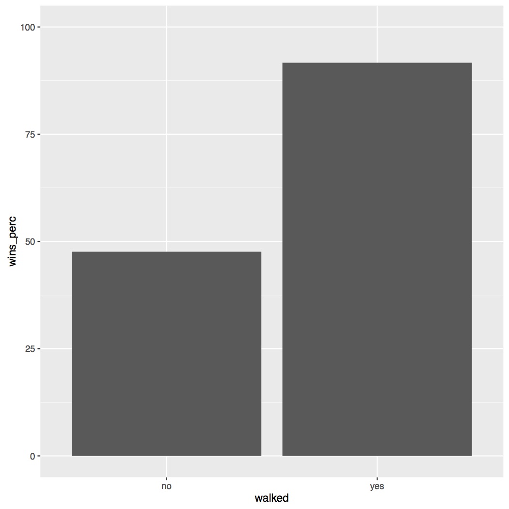
We also need to make our plot for Posey being walked or not. The code for this plot is pretty much the same as for our full season plot, except we set x to “walked” instead of “allstar_break”. Copy and run the code below.
# Posey walked or not
posey_walked.plot = ggplot(data_posey_figs_sum, aes(x = walked, y = wins_perc)) +
                    geom_bar(stat = "identity") +
                    ylim(0, 100)

# pdf("figures/posey_walked.pdf")
posey_walked.plot
# dev.off()
The figure below shows that there is a large difference depending on if Posey was walked or not. It looks like if Posey was walked the Giants are much more likely to win. Soon we’ll get to see if this is statistically confirmed with our logistic regression.
In the script on Github you’ll see I’ve added several other parameters to my figures, such as adding a title and customizing how my axes are labeled. Play around with those to get a better idea of how to use them in your own figures.
Save your script in the “scripts” folder and use a name ending in “_figures”, for example mine is called “rcourse_lesson3_figures”. Once the file is saved commit the change to Git. My commit message will be “Made figures script.”. Finally, push the commit up to Bitbucket.
Statistics Script
Open a new script and on the first few lines write the following, same as for our figures script. Note, just as in Lesson 2 we’ll add a header for packages but we won’t be loading any for this script.
## READ IN DATA ####
source("scripts/rcourse_lesson3_cleaning.R")

## LOAD PACKAGES ####
# [none currently needed]
We’ll also make a header for organizing our data. There’s nothing we’ll be modifying about our two data frames, but for the sake of good practices we’ll still write them both to new data frames ending in “_stats”. Copy and run the code below.
## ORGANIZE DATA ####
# Full season data
data_stats = data_clean

# Player specific data
data_posey_stats = data_posey_clean
To build our logistic regressions we’ll start with our full season data, by testing our question of if the All-Star break had an effect on the Giants’ wins. To do this we’ll use the function glm(). You may notice that this is very similar to our lm() call from Lesson 2. The two key differences are that we use glm() for generalize linear model instead of lm() for linear model. The second is the addition of family = "binomial". This tells R that we want to run a logistic regression. There are several different family types for different distributions of data. Copy the code below and run it when you are ready.
## BUILD MODEL - FULL SEASON DATA ####
allstar.glm = glm(win ~ allstar_break, family = "binomial", data = data_stats)
Also just as before we’ll save the summary of our model and then examine it to see if our independent variable (“allstar_break”) was significant. Copy and run the code below.
allstar.glm_sum = summary(allstar.glm)
allstar.glm_sum
The summary of the model is provided below. Looking first at the estimate for the intercept we see that it is positive (0.4394). This means that after the All-Star break (our default value, remember, we didn’t relevel our data here, and “after” is alphabetically before “before”) the Giants were above 50% for percentage of wins (since 0 is chance, positive number above chance, negative numbers below chance). Looking at the p-value for the intercept (0.065) we can see there was trending effect of the intercept. So we can’t say that they Giants were significantly above chance after the All-Star break, but it was close. More importantly though let’s look at the estimate for our variable of interest, “allstar_break”. Our estimate is negative (-0.3028), which means the Giants had a lower percentage of wins before the All-Star break compared to after (since “before” is our non-default level). But is this difference significant? Our p-value (0.344) would suggest no. So, just as our figure suggested. The Giants did win a larger percentage of wins after the All-Star break, but this difference is not significant.
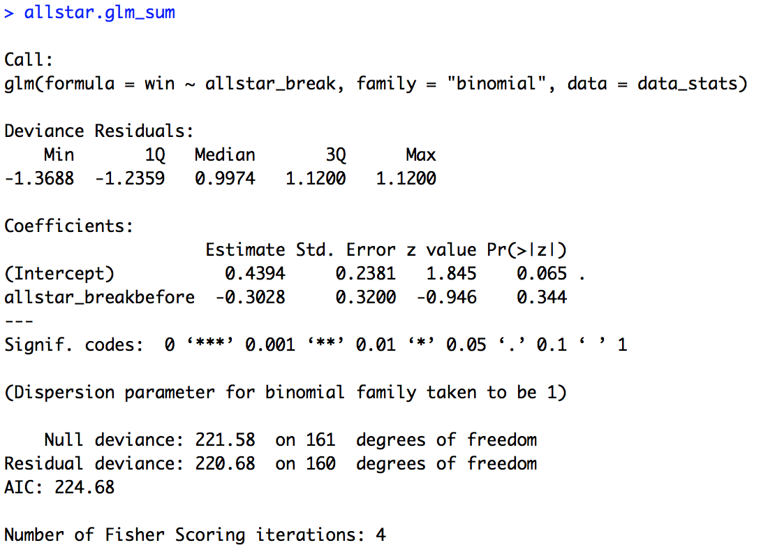
If you found it difficult to think of “after” as the default level, try changing “before” to the default level as we did in the figures script. You should see that the estimate for “allstar_break” is the same but in the opposite direction. Also, think about what the estimate for the intercept is telling you now.
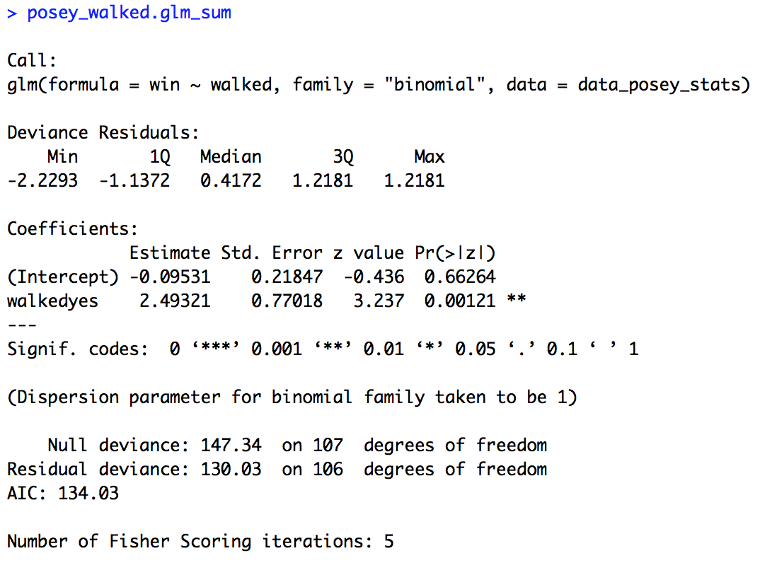
Now let’s do the same thing for our analysis of the Posey data. First build the model like above, but with “walked” as the dependent variable, save the summary of the model, and then print it out. The code is provided below.
## BUILD MODEL - PLAYER SPECIFIC DATA ####
posey_walked.glm = glm(win ~ walked, family = "binomial", data = data_posey_stats)

posey_walked.glm_sum = summary(posey_walked.glm)
posey_walked.glm_sum
The summary of the model is provided below. Here our estimate for the intercept is negative (-0.09531), so if Posey was not walked (“no” is the default level) the Giants were below 50% for winning. Although our p-value (0.66264) tells us that they were not significantly below chance. Our “walked” variable appears to have a very large effect though. The estimate is a large (for logit space) positive number (2.49321), suggesting that if Posey was walked the Giants were more likely to win. Indeed our p-value (0.00121) confirms this effect to be significant. Once again, our figure supports our statistical analysis.
You’ve now successfully run two logistic regressions (and earlier two linear regressions!) in R. Save your script in the “scripts” folder and use a name ending in “_statistics”, for example mine is called “rcourse_lesson3_statistics”. Once the file is saved commit the change to Git. My commit message will be “Made statistics script.”. Finally, push the commit up to Bitbucket.
Write-up
Finally, let’s make our write-up to summarise what we did today. First save your current working environment to a file such as “rcourse_lesson3_environment” to your “write_up” folder. If you forgot how to do this go back to Lesson 1. Open a new R Markdown document and follow the steps to get a new script. As before delete everything below the chuck of script enclosed in the two sets of ---. Then on the first line use the following code to load our environment.
```{r, echo=FALSE}
load("rcourse_lesson3_environment.RData")
```
Let’s make our sections for the write-up. I’m going to have three: 1) Introduction, 2) Results, and 3) Conclusion, and within Results I have two sections: 1) Full Season Data, and 2) Buster Posey Data. See below for structure.
# Introduction


# Results

## Full Season Data

## Buster Posey Data


# Conclusion
In each of my sections I can write a little bit for any future readers. For example below is my Introduction.
# Introduction

I analyzed the Giants' 2010 World Series winning season to see what could significantly predict games they won. I looked at both full season data (all 162 games) and games specific to when Buster Posey was playing.
Turning to the Results section, I can include both my figure and my model results. For example, below is the code for my first subsection of Results, Full Season Data.
# Results

## Full Season Data

For the full season data I tested for an effect of whether the Giants had more wins after the All-Star break or before the All-Star break. Initial visual examination of the data suggests that numerically they won a higher percentage of games after the All-Star break, but the effect looks very small.

```{r, echo=FALSE, fig.align='center'}
allstar.plot
```

To test this effect I ran a logistic regression with win or loss as the dependent variable and before or after the All-Star break as the independent variable. There was no significant effect of the All-Star break.

```{r}
allstar.glm_sum
```
Go ahead and fill out the rest of the document to include the results for Buster Posey and write a short conclusion, you can also look at the full version of my write-up with the link provided at the top of the lesson. When you are ready, save the script to your “write_up” folder (for example, my file is called “rcourse_lesson3_writeup”) and compile the HTML or PDF file. Once your write-up is made, commit the change to Git. My commit message will be “Made write-up.”. Finally, push the commit up to Bitbucket. If you are done with the lesson you can go to your Projects menu and click “Close Project”.
Congrats! You can now do both linear and logistic regression in R!
Conclusion and Next Steps
Today you learned how to do a new statistic in R (logistic regression), you learned how to make a new figure (a barplot), and you learned a lot of new dplyr verbs (inner_join(), group_by(), summarise(), and ungroup()). You also learned how to use ifelse() with a mutate() call to create a new column based on a conditional statement. As I mentioned at the beginning of the lesson, there are two other files on Github for two other Giants players from the 2010 season, Tim Lincecum and Cody Ross. If you found this lesson interesting, try some analyses looking at their effect on the Giants’ ability to win, like we did with Buster Posey’s data. Next time we’ll see what happens when we have more than one independent variable.
* You may notice that I spell “summarise” with an “s” and not with a “z” as any good red-blooded United States citizen would. Frequent use of dplyr has overridden my native defaults, this lesson will make it clear why. This is the only negative side effect I have found from using dplyr on a daily basis.