Scatter plots reveal relationships between two variables X, Y when both are numeric variables. Traditional scatter plots suffer from datapoints overlapping as the number of (Xi, Yi) pairs increases. Datapoints overlapping makes the relationship between the two variables difficult to discern.
If the number of (Xi, Yi) pairs is big “the smoothed scatter plot is the desired visual display for revealing a rough-free relationship lying within big data” [1]. The following procedure can be used for constructing a smooth scatter plot [1]:
- Plot the (x,y) data points on X-Y graph
- Divide the X-axis into distinct nonoverlapping neighborhoods (slices). Usually, the number of slices N = 10 or greater
- Take the mean or median X within each slice (smoothed_X)
- Take the mean or median Y within each slice (smoothed_Y)
- Plot (smoothed_X, smoothed_Y) pairs
- Connect the smooth points
Now we can apply general association test (GAT) [1] to the X, Y variables. GAT procedure consists of the following steps:
- Plot the N smoothed lines in a scatterplot and draw a median line
- Connect the N smooth points with N-1 lines (segments)
- Consider the test statistic TS
where
medial line: a horizontal line that divides the N points into equal sized groups
m: the number of line segments that cross the medial line
H0: there is no association between the two variables. H1: there is an association between the two variables.
TS: test statistics, TS = N – 1 – m. Reject H0 if TS is equal to or greater than cutoff score in Table 3.5 [1]
There is no simple answer to how to choose correct N value for creating smoothed scatter plots. Let’s experiment with several different datasets available here.
import numpy as np
import pandas as pd
import matplotlib.pyplot as plt
%matplotlib inline

# Create new dataframe consisting of two columns name_X, name_y
def extract_from_dataset(dataset, name_X, name_Y):
    return dataset[[name_X, name_Y]].copy()

#Create a dictionary containing intervals (v) and theirs number (k)
def intervals_d(df, n_slices, name_X):
    out, bins = pd.qcut(df[name_X], n_slices, retbins = True)
    intervals = [pd.Interval(left = bins[i], right = bins[i+1], closed = 'right')
                 for i in range(len(bins) - 1)]
    intervals_dict = dict(zip(range(1, len(bins)), intervals))
    return intervals_dict

# Check whether x belongs to an interval from intervals dictionary
def set_interval(x, intervals_dict):
    for k,v in intervals_dict.items():
        if x in v:
            return k

# Smooth X and Y using mean values
def smooth(df, name_X, name_Y, intervals_dict):
    df['X_Interval'] = df[name_X].apply(lambda x: set_interval(x, intervals_dict))
    smoothed_df = df.groupby(by = 'X_Interval').apply(np.mean)[[name_X, name_Y]]
    smoothed_df = smoothed_df.reset_index()
    smoothed_df['X_Interval'] = smoothed_df['X_Interval'].astype(dtype = 'int32')
    df = df[[name_X, name_Y]]
    return smoothed_df

# Plot raw and smoothed scatterplots
def scatterplots(df, name_X, name_Y, n_slices):
    fig = plt.figure(figsize=(18, 18))

    # Raw scatterplot
    ax = fig.add_subplot(221)
    plt.grid()
    plt.scatter(df[name_X], df[name_Y])
    plt.xlabel(name_X)
    plt.ylabel(name_Y)
    plt.axis('tight')

    # Smoothed scatterplot
    ax = fig.add_subplot(222)
    intervals_dict = intervals_d(df, n_slices, name_X)
    smoothed_df = smooth(df, name_X, name_Y, intervals_dict)
    Xmin = smoothed_df[name_X].min()
    Xmax = smoothed_df[name_X].max()
    ymin = smoothed_df[name_Y].min()
    ymax = smoothed_df[name_Y].max()
    ymedial = smoothed_df[name_Y].median()
    plt.grid()
    plt.plot(smoothed_df[name_X], smoothed_df[name_Y], marker='o')
    plt.xlabel('Smoothed ' + name_X)
    plt.ylabel('Smoothed ' + name_Y)
    plt.axis('tight')

    #Plot point numbers
    for i in smoothed_df.index.tolist():
        ax.annotate(str(smoothed_df['X_Interval'].iloc[i]),
                               xy = (smoothed_df[name_X].iloc[i], smoothed_df[name_Y].iloc[i]))

    #Draw medial line
    plt.hlines(ymedial, Xmin, Xmax, color='r')

    plt.show()
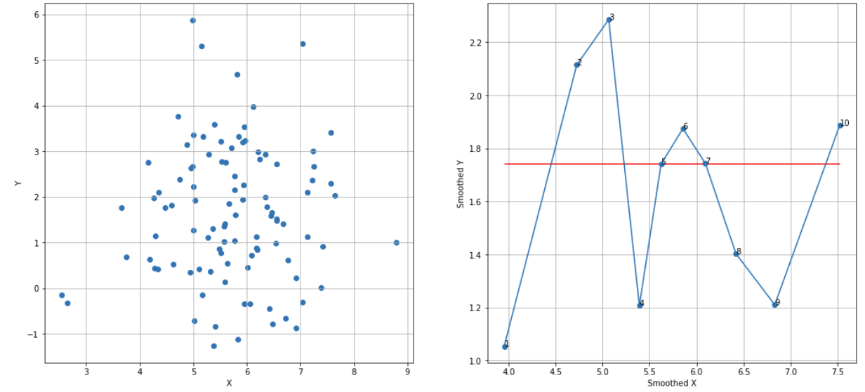
Random X, Y sequences, N = 10, cutoff score = 7 (95%), TS = 10 – 5 – 1 = 4 < 7, failed to reject H0:
df_raw = pd.read_csv('random_dataset.csv')
df = extract_from_dataset(df_raw, 'X', 'Y')
scatterplots(df, 'X', 'Y', n_slices = 10)
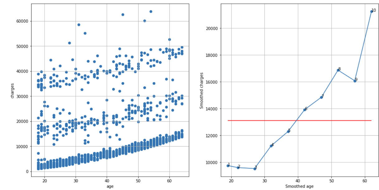
Insurance dataset, N = 10, cutoff score = 7 (95%), TS = 10 – 1 – 1 = 8 > 7, reject H0:
df_raw = pd.read_csv('insurance.csv')
df = extract_from_dataset(df_raw, 'age', 'charges')
scatterplots(df, 'age', 'charges', n_slices = 10)
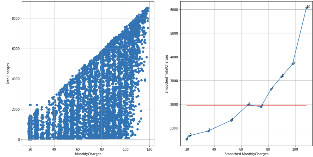
Telco customer churn dataset, N = 10, cutoff score = 7 (95%), TS = 10 – 1 – 3 = 6 < 7, failed to reject H0:
df_raw = pd.read_csv('Telco-Customer-Churn.csv')
df = extract_from_dataset(df_raw, 'MonthlyCharges', 'TotalCharges')
scatterplots(df, 'MonthlyCharges', 'TotalCharges', n_slices = 10)
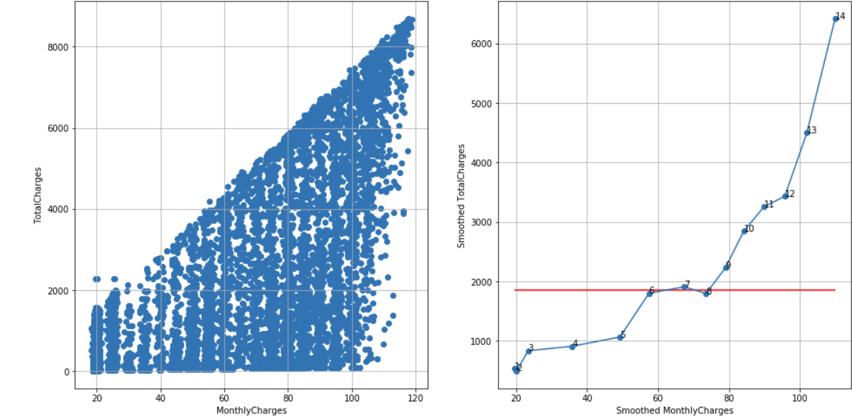
Telco customer churn dataset, N = 14, cutoff score = 10 (95%), TS = 14 – 1 – 3 = 10, reject H0:
df_raw = pd.read_csv('Telco-Customer-Churn.csv')
df = extract_from_dataset(df_raw, 'MonthlyCharges', 'TotalCharges')
scatterplots(df, 'MonthlyCharges', 'TotalCharges', n_slices = 14)
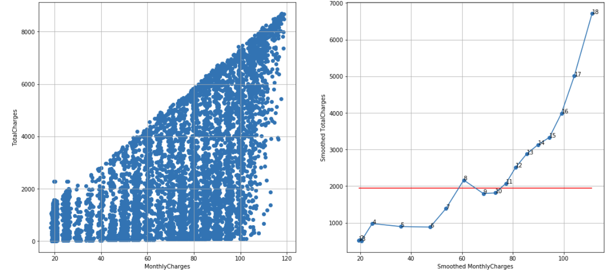
Telco customer churn dataset, N = 18, cutoff score = 12 (95%), TS = 18 – 1 – 3 = 14 > 12, reject H0:
df_raw = pd.read_csv('Telco-Customer-Churn.csv')
df = extract_from_dataset(df_raw, 'MonthlyCharges', 'TotalCharges')
scatterplots(df, 'MonthlyCharges', 'TotalCharges', n_slices = 18)
Conclusion
In some cases, choosing the correct value of N is a trade-off between small and large N values. Small N value may mask too much noise while large N value may show unreliable noise – see, for example, smoothed scatterplot for n_slices = 18 where smoothed points 1, 2, 3 are very close to each other.