This is our first lesson where we actually learn and use a new statistic in R. For today’s lesson we’ll be focusing on linear regression. I’ll be taking for granted some of the set-up steps from Lesson 1, so if you haven’t done that yet be sure to go back and do it. The other lessons can be found in there: Lesson 0; Lesson 2; Lesson 3; Lesson 4; Lesson 5; Lesson 6, Part 1; Lesson 6, Part 2.
By the end of this lesson you will:
- Have learned the math of linear regression.
- Be able to make figures to present data for a linear regression.
- Be able to run a linear regression and interpret the results.
- Have an R Markdown document to summarize the lesson.
There is a video in end of this post which provides the background on the math of linear regression and introduces the data set we’ll be using today. For all of the coding please see the text below. A PDF of the slides can be downloaded here. Before beginning please download this text file, it is the data we will use for the lesson. We’ll be using data from the United States of America Social Security Administration on baby names acquired from the R package babynames. All of the data and completed code for the lesson can be found on my github account.
Lab Problem
As mentioned, the lab portion of the lesson uses data from the USA Social Security Administration on baby names. We’ll be testing two questions using linear regression, one with a continuous predictor and one with a categorical predictor. Continuous Predictor: Does your name get more or less popular between the years of 1901 and 2000? Categorical Predictor: Is your name more or less popular with females or males?
Setting up Your Work Space
As we did for Lesson 1 complete the following steps to create your work space. If you want more details on how to do this refer back to Lesson 1:
- Make your directory (e.g. “rcourse_lesson2”) with folders inside (e.g. “data”, “figures”, “scripts”, “write_up”).
- Put the data file for this lesson in your “data” folder.
- Make an R Project based in your main directory folder (e.g. “rcourse_lesson2”).
- Commit to Git.
- Create the repository on Bitbucket and push your initial commit to Bitbucket.
Okay you’re all ready to get started!
Cleaning Script
One thing I find to be very useful is to have separate scripts for each part of my coding in R. I’ve distilled this down to three scripts: 1) cleaning, 2) figures, and 3) statistics. For most projects these are the only scripts I need. We’ll use that system today and we’ll start with the basis of it all, the cleaning script.
Make a new script from the menu. We start the same way we did last time, by having a header line talking about loading any necessary packages. This time though we’ll only be loading dplyr, not ggplot2 (that will come in later during our figures script). Copy the code below and run it.
## LOAD PACKAGES ####
library(dplyr)Copy
Also like last time we’ll read in our data from our data folder. This call is the same as Lesson 1, just calling in a different file. Copy the code below and run it.
## READ IN DATA ####
data = read.table("data/rcourse_lesson2_data.txt", header=T, sep="\t")Copy
If you want to double check that everything read in correctly take a dim() or a head() of the data frame. You should have 1,792,091 rows and 5 columns. This is all of the baby names with at least five appearances in a year for girls and boys from 1880 to 2013. Today we’ll be focusing on one specific name, yours. For the lesson I’ll be using my name but feel free to use your own. To focus on just one name we’ll need to do a filter() call. This is where my data cleaning begins. In the code below I filter the data frame to only include my name “Page”. Copy the code below and run it with your own name.
## CLEAN DATA ####
data_clean = data %>%
             filter(name == "Page")Copy
To double check that worked call a head() on “data_clean”.
head(data_clean)Copy
If it worked you should see only your name in the “name” column. If you see other names it means something is wrong, and you should double check the code. If you see nothing except for the column names it means your name does not exist in the data set. Pick a different name to use for the lesson and run the code again. When you find a name that works move to the next step.
Another way to check if you only have one name in “data_clean” is to call an xtabs() call like the one below. In theory all the data points should be in one cell, in my case the cell for “Page”.
xtabs(~name, data_clean)Copy
You may notice though that R stops printing out all of the empty cells after a while, for me even before getting to “Page”. This is because even when you filter out a level of a variable the data frame still remembers it used to be there, and notes that there are currently 0 instances of it. To get rid of this we’re going to add a second line to our “data_clean” chuck using a new dplyr verb, mutate(). Copy and run the updated code below.
data_clean = data %>%
             filter(name == "Page") %>%
             mutate(name = factor(name))Copy
The mutate() verb is used to make a new column or change an existing one. In our case we’re changing the existing column “name” to have it recreate the levels to only include the ones after our filter() call, that’s what the factor() function does for us here. Now if you call the xtabs() call from above you should only see one cell, your name, with the number of data points in “data_clean”.
We have two more updates we’re going to make to “data_clean” before we finish with our cleaning script (for now at least). Instead of looking at all years we’re only going to look at the years between 1901 and 2000. To do this we’ll add two more filter() calls. Copy and run the updated code below.
data_clean = data %>%
             filter(name == "Page") %>%
             mutate(name = factor(name)) %>%
             filter(year > 1900) %>%
             filter(year <= 2000)Copy
The first new filter() call says we only want years greater than 1900 and the second that we only want years less than or equal to 2000, thus giving us our range of 1901 to 2000. We can confirm this by looking at the minimum and maximum years in “data_clean” with the code below.
min(data_clean$year)
max(data_clean$year)Copy
It’s okay if the years aren’t exactly 1901 and 2000 (mine are 1909 and 2000), that just means your name didn’t have at least five occurrences in those particular years. Just confirm that you still have some data points and that the minimum and maximum years are within our range.
We’re done with our initial cleaning of the data. Save your script in the “scripts” folder and use a name ending in “_cleaning”, for example mine is called “rcourse_lesson2_cleaning”. Once the file is saved commit the change to Git. My commit message will be “Made cleaning script.”. Finally, push the commit up to Bitbucket.
Figures Script
Open a new script in RStudio. You can close the cleaning script or leave it open, we’ll come back to it but you don’t need it right now. This new script is going to be our script for making all of our figures. We’ll start with some new code we haven’t used before. Copy the code before, but don’t necessarily run it.
## READ IN DATA ####
source("scripts/rcourse_lesson2_cleaning.R")Copy
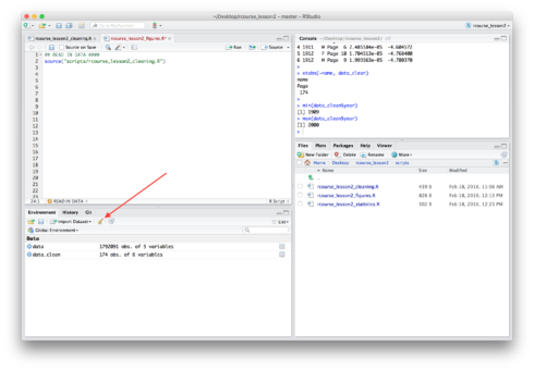
This source() call tells R to run another script. Specifically to run our cleaning script which is saved in the “scripts” folder. Make sure that the name of your script is correct if it’s not the same as mine. In theory we’ve already run this script since we ran each part of the script separately in the previous section, but to be sure the line of code works look for the symbol of a broom on the “Environment” tab and click it. It should be around the same area as the floppy disk you image you clicked to save the environment in the last lesson. See the screen shot below in case you can’t find it.
After clicking the broom image your “Environment” should now be empty, whereas before it listed both “data” and “data_clean” as shown in the screen shot above. Now run the line of code beginning with source() above. You should see all of your variables reappear as R runs your cleaning script. Having two separate scripts that are connected can be useful to avoid having a single very long script. Also, if someone is interested in your figures script but not your cleaning script you can send them both, but tell them they only need to look at the figures script.
Now we can load in any packages we didn’t pre-load in our cleaning script. Right now it’s only ggplot2. Copy and run the code below.
## LOAD PACKAGES ####
library(ggplot2)Copy
Even though our data is cleaned we may still want to change it to a bit for our figures. There’s nothing yet, but it’s still good to make a separate data frame for the figures just in case. Copy and run the code below.
## ORGANIZE DATA ####
data_figs = data_cleanCopy
Now we can start with our figures, but our first figure won’t be looking at either of our questions. Instead we first have to check that our dependent variable (proportion of the population) has a normal distribution, as that is an assumption of linear regression. To do that we’ll start by making a histogram of our data. Copy and run the code below.
## MAKE FIGURES ####
# Histogram of dependent variable (proportion of 'Page's)
name.plot = ggplot(data_figs, aes(x = prop)) +
            geom_histogram()

# pdf("figures/name.pdf")
name.plot
# dev.off()Copy
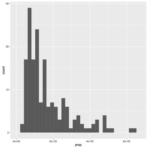
You should now see a histogram in one of your panes. Mine is presented below. To save the figure to a PDF simple delete the # comments before pdf("figures/name.pdf") and dev.off() and rerun those three lines of code. One thing you may notice about this code is how it differs from the boxplots we made in the previous lesson. Whereas in the previous lesson we set both x and y in aes(), for this figure we only set x, since a histogram is only plotting one variable, not two. In this case our x is set to “prop”, which is the proportion of the US population that year given your specific name at birth, separated by sex. Also, you may get an error message about setting bin size, that is simply because you did not tell R how large of bins to make for the histogram. Lacking a specific setting R will pick what it thinks is the best, but you can change this in your code if you want.
As you can see my distribution is very non-normal, so it can’t be used for a linear regression. Yours may look fine, or yours may have a different distribution entirely. A common way to make data more normal is to take a log transform. To do this in R is very simple, you just use the call log() and put what ever you want the log of inside of your parentheses. It’s important to note though that while most people think of log base 10 as the default, in R the default is log base e. To get log base 10 the call is log10(). We’ll run both of these to see how they are different.
To get our log transforms of our data, go back to your cleaning script. Copy and run the code below.
data_clean = data %>%
            filter(name == "Page") %>%
            mutate(name = factor(name)) %>%
            filter(year > 1900) %>%
            filter(year <= 2000) %>%
            mutate(prop_loge = log(prop)) %>%
            mutate(prop_log10 = log10(prop))Copy
We’ve added two lines of code here. Recall that mutate() is used to make new columns in addition to modifying existing ones. With these lines we make two new columns in our data frame: 1) “prop_loge”, and 2) “prop_log10”. The first column takes our “prop” column and does a log based e transform using the log() call. The second column takes our “prop” column and a log based 10 transform using the log10() call. Save the script.
To make our figures you can either rerun the block of code we just updated for “data_clean”, or you can rerun the line of code beginning with source() in our figures script. Either way is fine. Once you are done be sure to rerun the line of code to make the “data_figs” data frame.
Now that we have our log transforms we can look at the distribution of our data again. We’ll make two new figures, one for each of our transforms. For the log base e transform copy and run the code below:
# Histogram of dependent variable (number of 'Page's) - e based log transform
name_loge.plot = ggplot(data_figs, aes(x = prop_loge)) +
                 geom_histogram()
# pdf("figures/name_loge.pdf")
name_loge.plot
# dev.off()Copy
For the log base 10 transform copy and run the code below:
# Histogram of dependent variable (number of 'Page's) - 10 based log transform
name_log10.plot = ggplot(data_figs, aes(x = prop_log10)) +
                  geom_histogram()

# pdf("figures/name_log10.pdf")
name_log10.plot
# dev.off()Copy
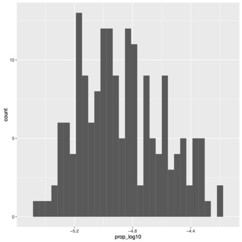
My two figures are presented below.

As you can tell the two figures look identical. The only difference is the x-axis range, which is a result of the base of the log transform. So, what you use as a base is not important for how it transforms the data, but it is important to know in case anyone wants to back transform your data into the original values. We’ll be continuing with the log 10 transform since that’s what people are more used to, but be sure to always specify the type of transform you used. We also see from these figures that the distribution is more or less normal, so we’re going to continue with our transformed values for our analyses. If your data is still not normal that means you probably should not being doing a linear regression with your data. Continue along for the sake of the exercise, but know that if you are analyzing real data you should probably look for another statistical test to use.
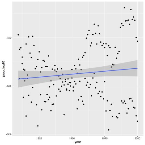
Let’s now make the figure for our first question about how the popularity of my name, “Page”, changes over time. Once again we have two variables we’re plotting, year and proportion log transformed, so we have two value for aes(). To make the plot a scatterplot we’ll use the geom_point() call. Finally, to add a regression line we use the call geom_smooth() and set method = "lm" to make a linear regression line. Copy the code below to make the plot for your name.
# Proportion of 'Page's by year (continuous predictor)
year.plot = ggplot(data_figs, aes(x = year, y = prop_log10)) +
            geom_point() +
            geom_smooth(method="lm")

# pdf("figures/year.pdf")
year.plot
# dev.off()Copy
As you can see in the figure below, there is not much of an effect of time on the proportion of the population with the name “Page”. There may be a slightly increase over time but it is very marginal.
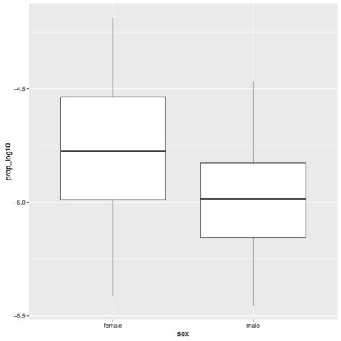
The next figure we’ll make is for our second question, seeing if there is a difference by sex in terms of popularity. For this figure we’ll once again make a boxplot. See and run the code below.
# Proportion of 'Page's by sex (categorical predictor)
sex.plot = ggplot(data_figs, aes(x = sex, y = prop_log10)) +
           geom_boxplot()

# pdf("figures/sex.pdf")
sex.plot
# dev.off()Copy
You may notice that the labels are just “F” and “M” in the plot. It’s useful to have the shorthand labels when analyzing the data, but for my figures I want more explicit labels. To do that I’m going to update the code for my “data_figs” data frame at the top of the script. See the updated code below.
data_figs = data_clean %>%
            mutate(sex = factor(sex, levels=c("F", "M"), labels=c("female", "male")))Copy
Once again we’re using a mutate() call to update an existing column, “sex”. We’re also using the factor() call again, but this time we are changing the labels. With this line of code we tell R to set “F” to “female” and “M” to “male”. If you rerun this chunk of code and then rerun the code for the figure you should get the figure below.
This is one of the reasons why it’s nice to have separate data frames for different scripts. Later on it will be easier to have short label names, but specifically for my figures I want longer, more expressive label names.
We’ve successfully made a figure for each of our analyses, one of which was a new type of figure for us, a scatterplot. As for Lesson 1, for code on how to “prettify” the figure see the full code linked to at the top of this lesson.
We’re done with making our figures. Save your script in the “scripts” folder and use a name ending in “_figures”, for example mine is called “rcourse_lesson2_figures”. Once the file is saved commit the change to Git. My commit message will be “Made figures script. Update cleaning script.” since I also added the log transform columns to my cleaning script. Finally, push the commit up to Bitbucket.
Statistics Script
With our figures in place we can finally make our statistics script. Open a new script and on the first line write the following, same as for our figures script.
## READ IN DATA ####
source("scripts/rcourse_lesson2_cleaning.R")Copy
Next add a place to load packages, such as shown below.
## LOAD PACKAGES #####
# [none currently needed]Copy
Note, for this script we’re actually not going to load any packages. You may wonder then, why bother making a section for it? Well for one it’s good practice to do this all the time, even when you don’t need it. Two, you may later decide to add a package and it’s good to already have a place for it in your script.
Also as before we’re going to make a new data frame for our statistics data.
## ORGANIZE DATA ####
data_stats = data_cleanCopy
Be sure to run all of these lines of code before beginning with the modeling. Our first model looks at the effect of year on popularity of your name. Copy the code below to build your model.
## BUILD MODEL - PROPORTION OF 'PAGE'S BY YEAR (CONTINUOUS PREDICTOR) ####
year.lm = lm(prop_log10 ~ year, data = data_stats)Copy
First I’m going to save my model to the name “year.lm”. Note, as for the use of “.plot” for figures, the use of “.lm” here is not required, it’s simply a convention I use to know what my objects are, in this case a linear model. The call itself (prop_log10 ~ year) is explained in more detail in the video above, and then finally we tell R what data frame to look at to find our variables.
With our model saved we use the summary() call to look at the actual results of our model. See the code below, once again I’ve opted to save this summary so it can be called on later.
year.lm_sum = summary(year.lm)
year.lm_sumCopy
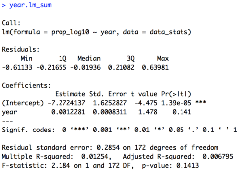
The summary of the model is provided below. In this particular case the exact numbers of the intercept and the estimate for “year” (the slope) are not very informative, since they are in log transformed values. Importantly for us though we see that there is no effect of year, as our t-value is 1.48 and our p-value is 0.14. So, we can say that the popularity of the name “Page” has not significantly changed over time.
We can also look at the residuals of our model with the resid() call. I’ve saved them to a new object and then called a head() to look at the first few data points. I haven’t included them here, but you should see them in your Console.
year.lm_resid = resid(year.lm)
head(year.lm_resid)Copy
We can now conduct our second analysis, looking at the categorical variable of sex. The model is almost identical to our model for year, except that we replace “year” with “sex” as shown in the code below.
## BUILD MODEL - PROPORTION OF 'PAGE'S BY SEX (CATEGORICAL PREDICTOR) ####
sex.lm = lm(prop_log10 ~ sex, data = data_stats)

sex.lm_sum = summary(sex.lm)
sex.lm_sumCopy
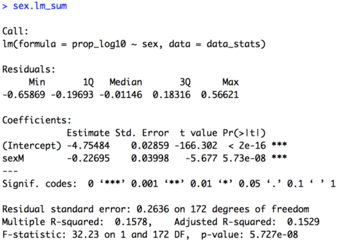
Below is the summary of the model. Here we do get a significant effect of sex (t = -5.68, p < 0.001). To understand the direction of the effect we look at the line that begins with “sexM”. R by default codes variables alphabetically, so our default level is “F” for female. We can also see this by the fact that “sexM” lets you known that “M” is the non-default level. If “F” were the non-default level it would appear as “sexF”. Again, the actual value of our estimate is not very useful due to our log transform, but the direction of it is. Our estimate is -0.23. The fact that it is negative let’s us know that “Page” is significantly less common of a name (lower proportion of the population) for males than females.
Finally, we can look at the residuals of our model and the first few values.
sex.lm_resid = resid(sex.lm)
head(sex.lm_resid)Copy
You’ve now successfully run two linear regressions in R, one with a continuous predictor and one with a categorical predictor. Save your script in the “scripts” folder and use a name ending in “_statistics”, for example mine is called “rcourse_lesson2_statistics”. Once the file is saved commit the change to Git. My commit message will be “Made statistics script.”. Finally, push the commit up to Bitbucket.
Write-up
As always, we’ll end the lesson by writing a summary of our results. First save your current working environment to a file such as “rcourse_lesson2_environment” to your “write_up” folder. If you forgot how to do this go back to Lesson 1. Open a new R Markdown document and follow the steps to get a new script. As before delete everything below the chuck of script enclosed in the two sets of ---. Then on the first line use the following code to load our environment.
```{r, echo=FALSE}
load("rcourse_lesson2_environment.RData")
```Copy
The echo=FALSE setting is new. This simple tells R not to print out the code we ran. That way you can load your environment without necessarily printing that in your write-up. Next we can make our sections for the write-up. I’m going to have three: 1) Introduction, 2) Results, 3) Conclusion, and within Results I have two sections: 1) Prevalence by Year, and 2) Prevalence by Sex. See below for structure.
# Introduction

# Results

## Prevalence by Year

## Prevalence by Sex

# ConclusionCopy
In each of my sections I can write a little bit for any future readers. For example below is my Introduction.
# Introduction
I looked at how common my name, "Page", is in the United States population both by year and sex.Copy
Turning to the results section. I can include both my figure and my model results. For example, below is the code for my first subsection of Results, Prevalence by Year.
## Prevalence by Year
Below is a plot for how the proportion of people with the name "Page" (log base 10 transformed) has changed over time. Overall the trend is pretty flat, with maybe a slight increase over time.
```{r, fig.align='center'}
year.plot
```
To test if there is a significant effect of year a linear model was built. Proportion of the population log base 10 transformed was the dependent variable and year the independent variable. As shown below, year was not significant, although the coefficients do show a positive slope.
```{r}
year.lm
```Copy
Remember, anything between the three ` ` ` is read as R code.
Go ahead and fill out the rest of the document as is appropriate for your results, or look at the full version of my write-up with the link provided at the top of the lesson. When you are ready, save the script to your “write_up” folder and compile the HTML or PDF file. Once your write-up is made, commit the change to Git. My commit message will be “Made write-up.”. Finally, push the commit up to Bitbucket. If you are done with the lesson you can go to your Projects menu and click “Close Project”.
Congrats! You’re all done with the lesson!
Conclusion and Next Steps
By now you have learned how to run a new statistic in R. We also made a new kind of figure in ggplot2 (a scatterplot) and used another dplyr verb (mutate()). If you go back to the video you’ll see some “food for thought for a future lesson”. Specifically, what happens when two variables interact. We’ll go over how to deal with this soon, but first we have to discuss logistic regression, that will be our next lesson.
