This is the second part of the Mastering R plot series. The standard plot function in R allows extensive tuning of every element being plotted. There are, however, many possible ways and the standard help file are hard to grasp at the beginning. In this article we will see how to control every aspects of the axis (labels, tick marks …) in the standard plot function.
Axis title and labels
Create some data and create a plot with default settings.
#some data
x<-1:100
y<-runif(100,-2,2)
#a usual plot with per default settings
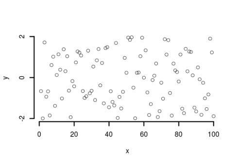
plot(x,y)
#changing the axis title is pretty straightforward
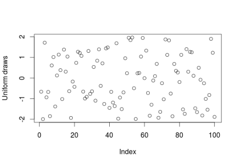
plot(x,y,xlab="Index",ylab="Uniform draws")
The settings of the plot are usually controlled by the par function (see ?par for the many possible arguments), once the arguments are set in par they apply to all subsequent plots. Some arguments in par (for example cex.axis) can also be set in other plot functions like axis or text. When these arguments are set in these other functions they will then apply only to the current plot. One can then control if he/she wants all plots to be affected by the change or only the current one.
#change the sizes of the axis labels and axis title
op<-par(no.readonly=TRUE) #this is done to save the default settings
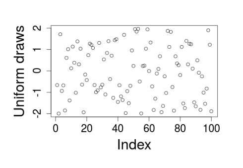
par(cex.lab=1.5,cex.axis=1.3)
plot(x,y,xlab="Index",ylab="Uniform draws")
#if we want big axis titles and labels we need to set more space for them
par(mar=c(6,6,3,3),cex.axis=1.5,cex.lab=2)
plot(x,y,xlab="Index",ylab="Uniform draws")
A handy function to gain deeper control into the axis is the axis function which can control among other things at which values the tick marks are drawn, what axis labels to put under the tick marks, the line type and width of the axis line, the width of the tick marks, the color of the tick marks and axis line.
#we can further control the axis using the axis function
par(op) #re-set the plot to the default settings
plot(x,y,xaxt="n") #this prevent the plotting of x-axis labels
axis(side=1,at=c(5,50,100)) #force the tick marks to be drawn at x=5, 50 and 100
#one can also specify the labels at the tick marks
plot(x,y,yaxt="n")
axis(side=2,at=c(-2,0,2),labels=c("Small","Medium","Big"))
#the axis function also control the axis line and tick marks
plot(x,y)
axis(side=3,at=c(5,25,75),lwd=4,lwd.ticks=2,col.ticks="red")
#some time you may want to remove the box around the plot and only show the axis lines
plot(x,y,bty="n",xaxt="n",yaxt="n")
axis(side=1,at=seq(0,100,20),lwd=3)
axis(side=2,at=seq(-2,2,2),lwd=3)
Also note that an R plot has four sides, starting on the bottom and going clockwise (ie side=3 correspond to the top of the graph).
Tick marks
Let’s turn now to the tick marks, they can also be controlled either from par or from axis.
#tick marks finer control goes through par or axis
par(tcl=0.4,mgp=c(1.5,0,0)) #tcl control the length of the tick marks
#positive values will make the tick being drawn inside the plot
#negative values will make tick go outside
#mgp takes three values, the first one control how much line between plot and axis title
#the second between plot and axis labels and the third between plot and axis line
plot(x,y)
#another example using axis
par(op)
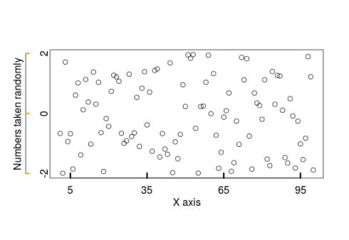
plot(x,y,xaxt="n",yaxt="n",xlab="",ylab="")
axis(side=1,at=seq(5,95,30),tcl=0.4,lwd.ticks=3,mgp=c(0,0.5,0))
mtext(side=1,text="X axis",line=1.5) #cannot set the axis title with axis so need to use mtext
axis(side=2,at=seq(-2,2,2),tcl=0.3,lwd.ticks=3,col.ticks="orange",mgp=c(0,0,2))
mtext(side=2,text="Numbers taken randomly",line=2.2)
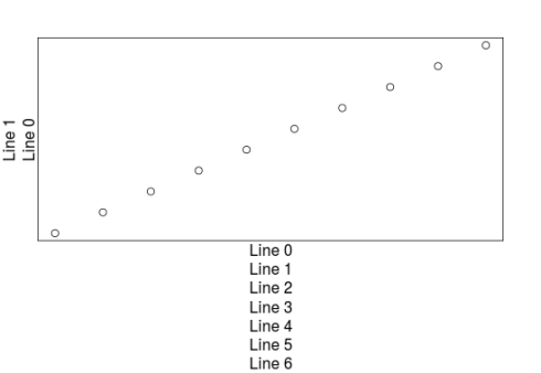
Here we saw a third additional function, mtext, which allow one to write text outside of the plotting area (I guess that mtext stands for “margin text”). We have to specify how far from the plotting region one wants to write the text with the line argument. This concept of lines is important to understand how to control spaces around the plotting region. We controlled it earlier in this post when I used the mar argument which sets how many lines are available on each sides of the plot. Let’s look at this in more details:
#understanding the lines
plot(1:10,1:10,xlab="",ylab="",xaxt="n",yaxt="n")
for(i in 0:4){
  mtext(side=1,text=paste0("Line ",i),line=i)
}
for(i in 0:3){
  mtext(side=2,text=paste0("Line ",i),line=i)
}
#of course this can be changed with the mar argument in par
par(mar=c(7,2,2,2))
plot(1:10,1:10,xlab="",ylab="",xaxt="n",yaxt="n")
for(i in 0:6){
  mtext(side=1,text=paste0("Line ",i),line=i)
}
for(i in 0:1){
  mtext(side=2,text=paste0("Line ",i),line=i)
}
From this last graph it is easy to grasp that on each side of the plot there are a certain number of lines, have a look at par()$mar for the default numbers. Using this, one can control how much space to create around the plot but also where to write axis labels or titles. Next time we’ll extend this concept of margins by talking about the outer margins from the plot, until then happy plotting!
