In this article, you will be exploring the Kaggle data science survey data which was done in 2017. Kaggle conducted a worldwide survey to know about the state of data science and machine learning. The survey received over 16,000 responses and one can learn a ton about who is working with data, what’s happening at the cutting edge of machine learning across industries, and how new data scientists can best break into the field etc.
The dataset can answer lots of amazing questions for data scientists and anyone interested to know the present state of data science worldwide. Available for download from Kaggle Data Science survey data.
In this article you will analyze and study the professional lives of the participants,time spend studying data science topics, which ML method they actually use at work the most, which tools they most prefer to use while at work, which blogs the participants prefer the most for studying data science, what the participants think about the most necessary skills for a data scientist and other related questions. The questions mentioned above will be answered in this article. Trust me it gets really interesting and exciting when you analyze and do such projects. You will get to know a lot about people’s perceptions and the present state in the industry. So many unexpected things will come out which will surprise you. So in this article, you will be mainly focusing on Descriptive and diagnostic analysis only.
You will be using Highcharter package in R for making plots. This is a very beautiful Javascript based visualization package. The syntax for highcharter is similar to qplot() form ggplot2 package .You can read more about this package and the respective functions used in this article to make plots here highcharter.
Importing the dataset in R
require(data.table)
require(dplyr) #data manipulation
require(tidyr) #data tidying
require(highcharter) #famous javascript based visualization package
require(tidyverse)

SurveyDf<-fread("../Datasets/kagglesurvey2017/multipleChoiceResponses.csv") #for faster data reading

##
Read 59.5% of 16817 rows
Read 16716 rows and 228 (of 228) columns from 0.023 GB file in 00:00:03
Most preferred blog sites for learning data science.
Let’s find the top 15 most preferred answers. This is a multiple answer field.
blogs = SurveyDf %>% group_by(BlogsPodcastsNewslettersSelect) %>%
  summarise(count=n()) %>%
  top_n(15) %>%
  arrange(desc(count))

#removing NA value
blogs[1,1]<-NA

#changing column names
colnames(blogs)%
  hc_exporting(enabled = TRUE) %>%
  hc_title(text="Barplot of most preferred blogs for learning",align="center") %>%
  hc_add_theme(hc_theme_elementary())
Output plot:
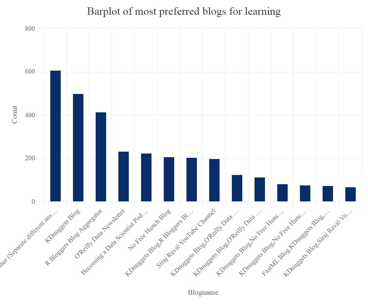
So one can see that one of the most famous and preferred blog sites are R bloggers and KDnuggets.
How long participants have been learning data science.
table(LearningDataScienceTime)
## LearningDataScienceTime
##       Other         < 1 year   1-2 years 10-15 years   15+ years   3-5 years
##       12367        2093        1566          14          30         540
##  5-10 years
##         106
We can see that mostly the participants have started learning data science recently. This is mainly due to the increasing demand of data scientists and the data explosion in the recent years and also the hype.
Age distribution of the participants
hcboxplot(x=SurveyDf$Age,var=SurveyDf$LearningDataScienceTime,outliers = F,color="#09870D",name="Age Distribution") %>%
hc_chart(type="column")  %>%
  hc_exporting(enabled = TRUE) %>% #enabling exporting options
  hc_title(text="Boxplot of ages and the learning time of participants",align="center") %>%
  hc_add_theme(hc_theme_elementary())  #adding theme
Gives this plot:
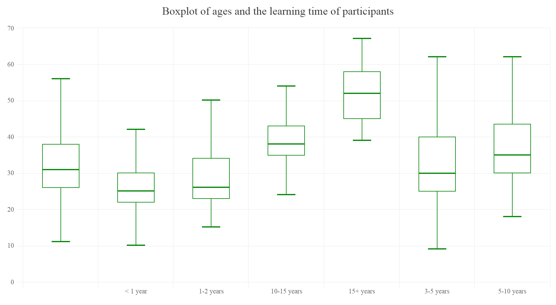
The above plot is quietly predictable as people with less time learning data science are younger.
What participants entered and feel which skills are important for becoming a data scientist?
Let’s do some data wrangling and transformations. Making a separate data frame for each variable, for easier understanding.
#let's make a function to ease things
#function takes argument as a dataframe and the categorical variable which we want summarize and group
aggr<-function(df,var)
{
  require(dplyr)
  var <- enquo(var) #quoting
  dfname%
    group_by_at(vars(!!var)) %>%  ## Group by variables selected by name:
    summarise(count=n()) %>%
    arrange(desc(count))

    dfname#function returns a summarized dataframe

}

RSkill<-aggr(SurveyDf,JobSkillImportanceR)
RSkill[1,]<-NA
SqlSkill<-aggr(SurveyDf,JobSkillImportanceSQL)
SqlSkill[1,]<-NA
PythonSkill<-aggr(SurveyDf,JobSkillImportancePython)
PythonSkill[1,]<-NA
BigDataSkill<-aggr(SurveyDf,JobSkillImportanceBigData)
BigDataSkill[1,]<-NA
StatsSkill<-aggr(SurveyDf,JobSkillImportanceStats)
StatsSkill[1,]<-NA
DegreeSkill<-aggr(SurveyDf,JobSkillImportanceDegree)
DegreeSkill[1,]<-NA
EnterToolsSkill<-aggr(SurveyDf,JobSkillImportanceEnterpriseTools)
EnterToolsSkill[1,]<-NA
MOOCSkill<-aggr(SurveyDf,JobSkillImportanceMOOC)
MOOCSkill[1,]<-NA
DataVisSkill<-aggr(SurveyDf,JobSkillImportanceVisualizations)
DataVisSkill[1,]<-NA
KaggleRankSkill<-aggr(SurveyDf,JobSkillImportanceKaggleRanking)
KaggleRankSkill[1,]<-NA
Let’s start with the R skills importance
hchart(na.omit(RSkill),hcaes(x=JobSkillImportanceR,y=count),type="pie",name="Count") %>%
  hc_exporting(enabled = TRUE) %>%
  hc_title(text="Piechart of importance of R skill",align="center") %>%
  hc_add_theme(hc_theme_elementary())
Gives this plot:

Python’s importance
hchart(na.omit(PythonSkill),hcaes(x=JobSkillImportancePython,y=count),type="pie",name="Count") %>%
hc_exporting(enabled = TRUE) %>%
  hc_title(text="Piechart of importance of Python skill",align="center") %>%
  hc_add_theme(hc_theme_elementary())
Gives this plot:

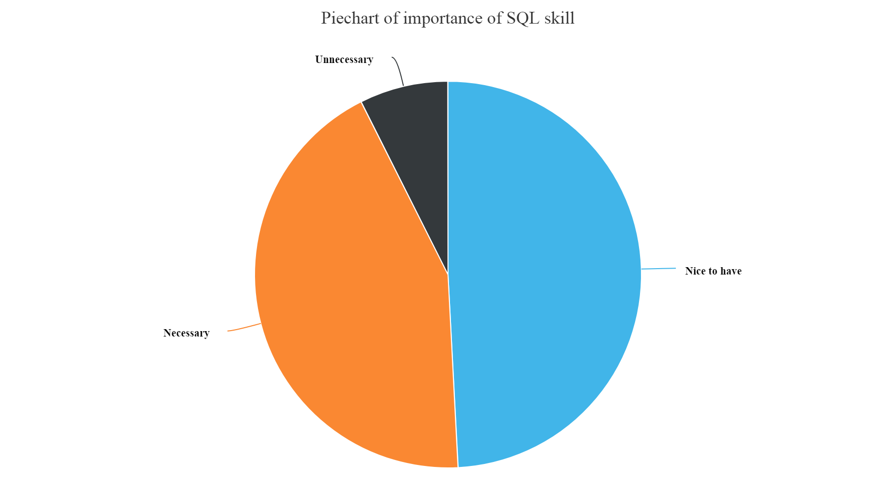
SQL skills importance
hchart(na.omit(SqlSkill),hcaes(x=JobSkillImportanceSQL,y=count),type="pie",name="Count") %>%
  hc_exporting(enabled = TRUE) %>%
  hc_title(text="Piechart of importance of SQL skill",align="center") %>%
  hc_add_theme(hc_theme_elementary())
Gives this plot:
Big data skills importance
Gives this plot:
hchart(na.omit(BigDataSkill),hcaes(x=JobSkillImportanceBigData,y=count),type="pie",name="Count") %>%
  hc_exporting(enabled = TRUE) %>%
  hc_title(text="Piechart of importance of Big Data skill",align="center") %>%
  hc_add_theme(hc_theme_elementary())
Gives this plot:

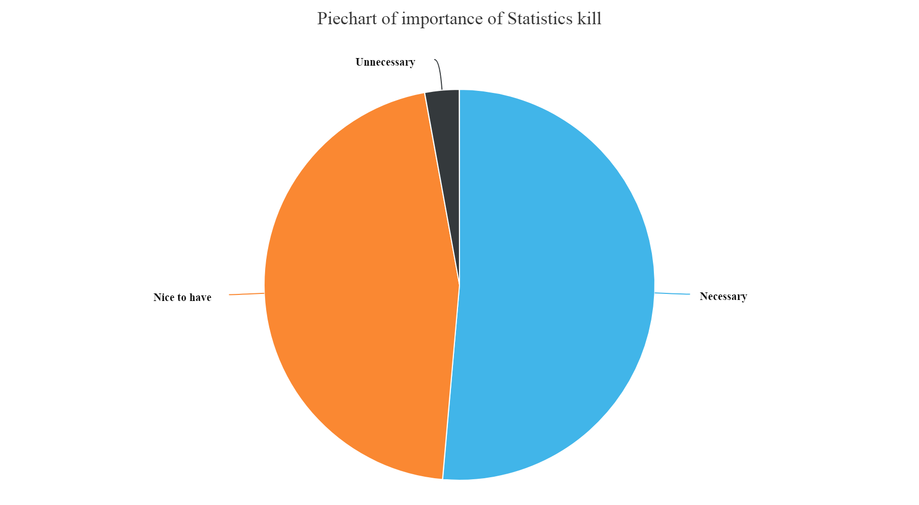
Statistics skills importance
hchart(na.omit(StatsSkill),hcaes(x=JobSkillImportanceStats,y=count),type="pie",name="Count") %>%
  hc_exporting(enabled = TRUE) %>%
  hc_title(text="Piechart of importance of Statistics kill",align="center") %>%
  hc_add_theme(hc_theme_elementary())
Gives this plot:
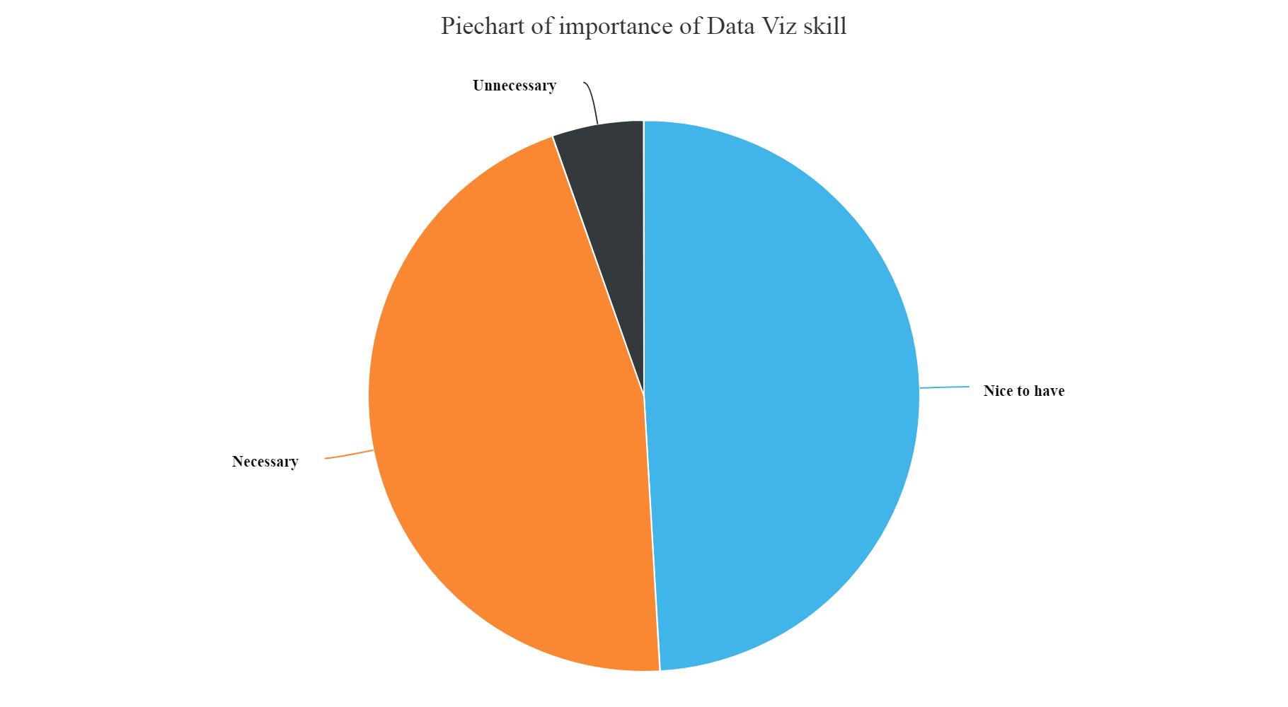
Data visualization skills importance
hchart(na.omit(DataVisSkill),hcaes(x=JobSkillImportanceVisualizations,y=count),type="pie",name="Count") %>%
  hc_exporting(enabled = TRUE) %>%
  hc_title(text="Piechart of importance of Data Viz skill",align="center") %>%
  hc_add_theme(hc_theme_elementary())
Gives this plot:
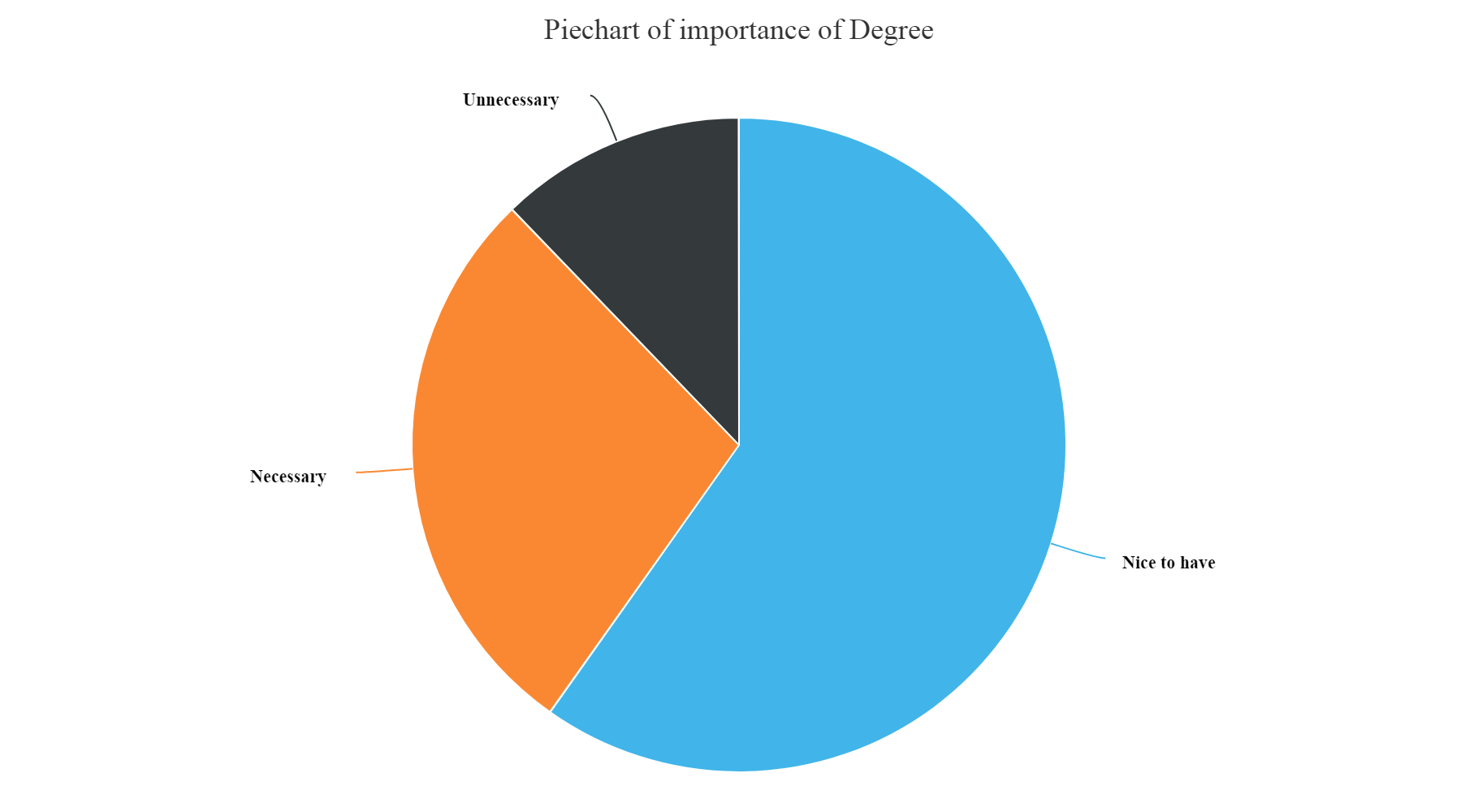
Professional Degree importance
hchart(na.omit(DegreeSkill),hcaes(x=JobSkillImportanceDegree,y=count),type="pie",name="Count") %>%
  hc_exporting(enabled = TRUE) %>%
  hc_title(text="Piechart of importance of Degree",align="center") %>%
  hc_add_theme(hc_theme_elementary())
Gives this plot:
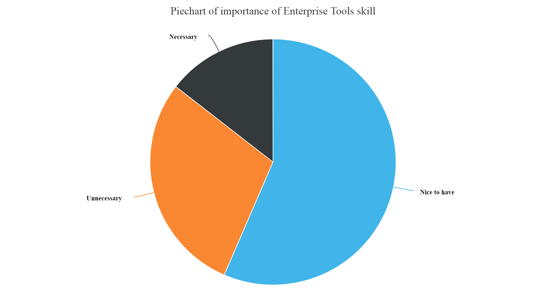
Enterprise tools skills importance
hchart(na.omit(EnterToolsSkill),hcaes(x=JobSkillImportanceEnterpriseTools,y=count),type="pie",name="Count") %>%
  hc_exporting(enabled = TRUE) %>%
  hc_title(text="Piechart of importance of Enterprise Tools skill",align="center") %>%
  hc_add_theme(hc_theme_elementary())
Gives this plot:
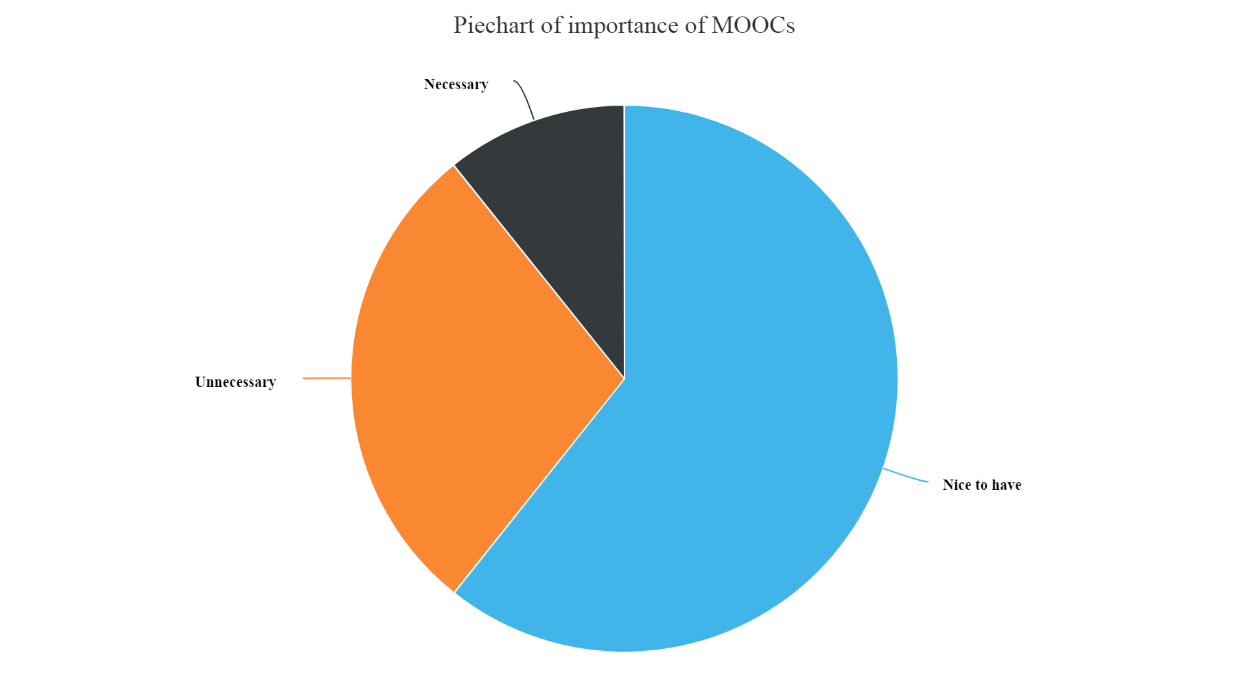
Importance of MOOCs
hchart(na.omit(MOOCSkill),hcaes(x=JobSkillImportanceMOOC,y=count),type="pie",name="Count") %>%
  hc_exporting(enabled = TRUE) %>%
  hc_title(text="Piechart of importance of MOOCs",align="center") %>%
  hc_add_theme(hc_theme_elementary())
Gives this plot:
Kaggle Rankings importance
hchart(na.omit(KaggleRankSkill),hcaes(x=JobSkillImportanceKaggleRanking,y=count),type="pie",name="Count") %>%
  hc_exporting(enabled = TRUE) %>%
  hc_title(text="Piechart of importance of Kaggle Rankings",align="center") %>%
  hc_add_theme(hc_theme_elementary())
Gives this plot:
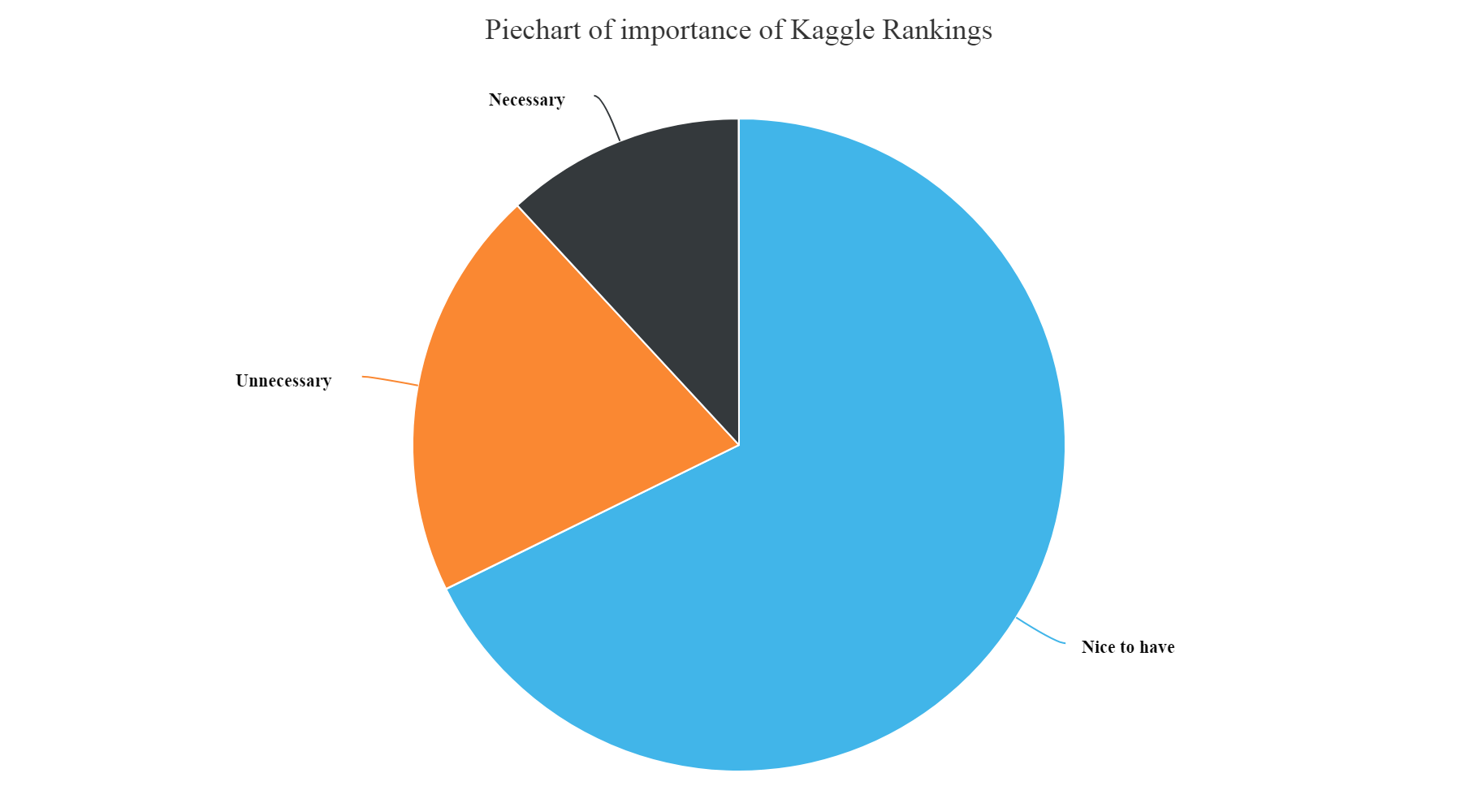
From the above plots we can infer that:
- We can see from the above plot that the most unnecessary skill amongst all is having a knowledge of Enterprise tools, Degree, Kaggle Rankings and MOOCs. These have higher count of unnecessary skills entered by the participants.
- Whereas, Knowledge of Statistics, Python, R and Big data skills are most necessary and nice to have skills as per answers entered by the survey participants.
What proves that you have good Data science knowledge?
knowlegdeDf% group_by(ProveKnowledgeSelect) %>%
  summarise(count=n()) %>%
  arrange(desc(count))

knowlegdeDf[1,]%
  hc_exporting(enabled = TRUE) %>%
  hc_title(text="Barplot of what proves you have Datascience knowledge",align="center") %>%
  hc_add_theme(hc_theme_elementary())
Gives this plot:
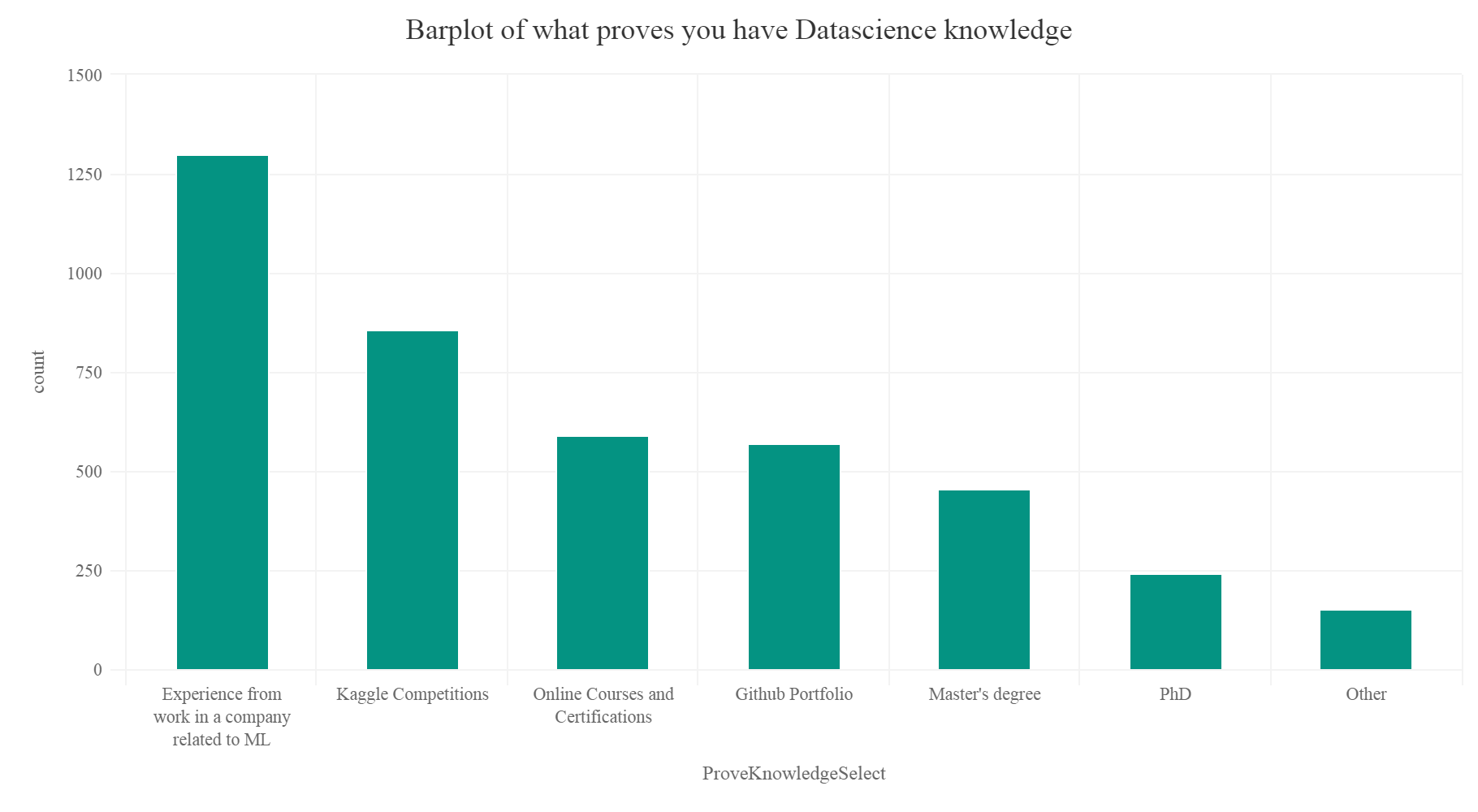
So according to the plot experience from working in a company, participation in Kaggle competitions, a good Github portfolio and online courses prove that you have good data science knowledge.
Most famous machine learning technique
Let’s make a new data frame.
Mltechique = SurveyDf %>% group_by(MLTechniquesSelect) %>%
  summarise(count=n()) %>%
  arrange(desc(count)) %>%
  top_n(20)

Mltechique[1,]%
  hc_exporting(enabled = TRUE) %>%
  hc_title(text="Barplot of competent ML techniques of participants",align="center") %>%
  hc_add_theme(hc_theme_elementary())
Gives this plot:
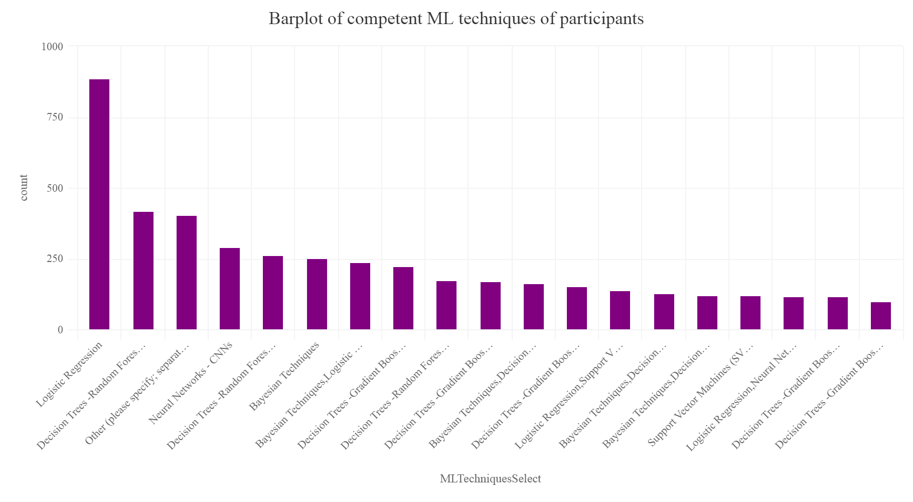
So we cant notice that Logistic regression, Decision trees, Random forests are the top 3 most competent techniques in which the participants consider themselves competent and can successfully implement and are most efficient in implementing. One can understand that complex techniques and algorithms like neural networks, Deep learning, CNN, RNN etc are quiet complicated require good amount of domain knowledge and understandings of a lot of mathematical and linear algebra concepts. So people consider themselves less competent in them.
Learning algorithm participants use at work
We are only interested to find the top 20 machine learning algorithms.
MLalgoWork% group_by(WorkAlgorithmsSelect) %>%
  summarise(count=n()) %>%
  arrange(desc(count)) %>%
  top_n(20)

MLalgoWork[c(1,3),]%
  hc_exporting(enabled = TRUE) %>%
  hc_title(text="Barplot of Most used ML algorithms at Work",align="center") %>%
  hc_add_theme(hc_theme_elementary())
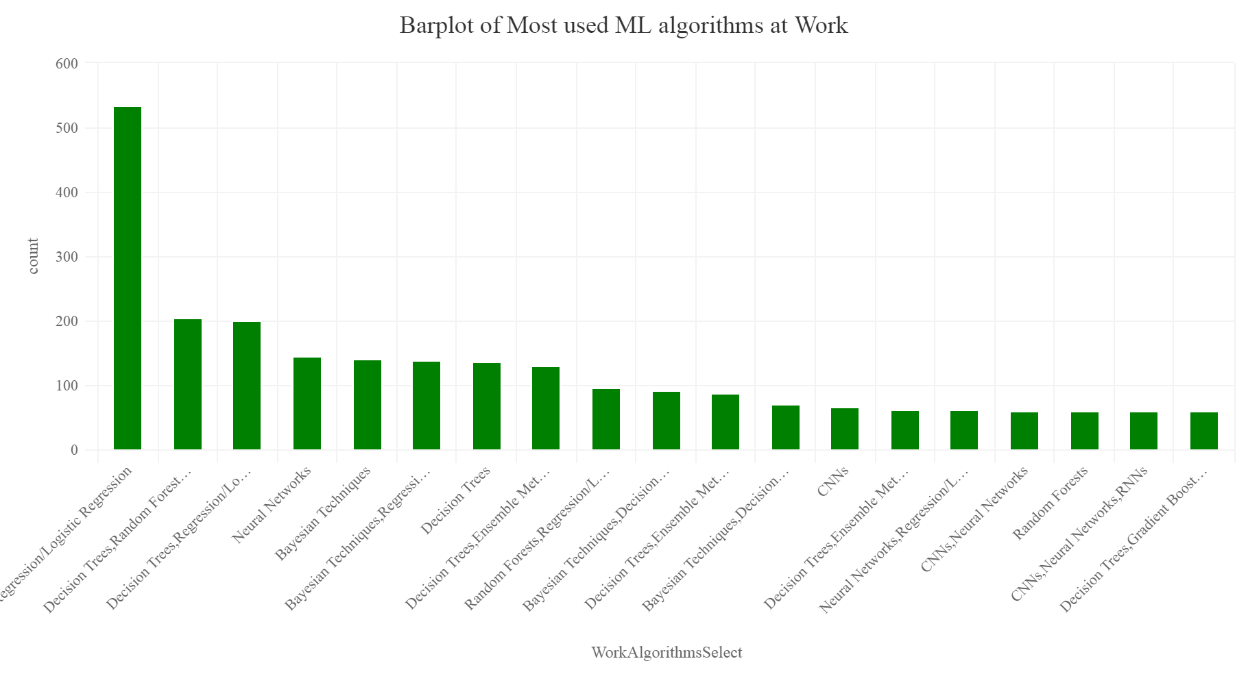
Again as we can see from the above plot, Regression, Logistic regression, and decision trees lead the pack as the most used learning algorithms which are used at work by the participants. This was shocking as one can predict that in present scenario Deep learning might be the most used technique, but actually, the survey explains a different perspective that data scientists still rely on basic machine learning algorithms and approaches at work to solve problems. This insight was one of the most interesting.
Tools are used most at work
We are interested to find the top 20 tools.
ToolatWork = SurveyDf %>% group_by(WorkToolsSelect) %>%
  summarise(count=n()) %>%
  arrange(desc(count)) %>%
  top_n(20)

ToolatWork[c(1),]=NA

hchart(na.omit(ToolatWork),hcaes(x=WorkToolsSelect,y=count),type="column",color="#7C0E3E",name="count") %>%
  hc_exporting(enabled = TRUE) %>%
  hc_title(text="Barplot of Most used data science tools used at Work",align="center") %>%
  hc_add_theme(hc_theme_elementary())
Gives this plot:
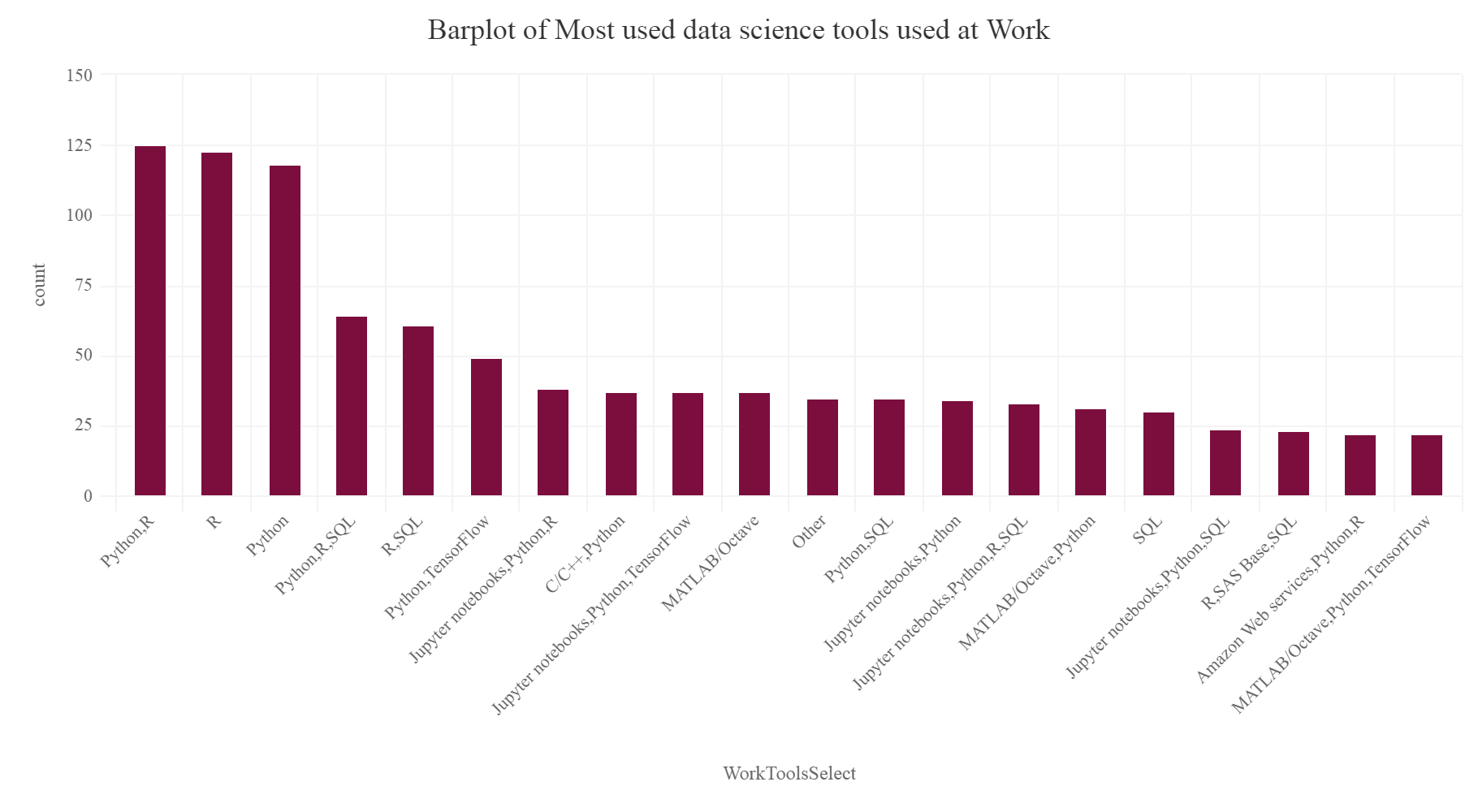
From the above plot we can see that Python and R are collectively used by data scientists the most as entered by the survey participants. Hence Python and R still tops the most used tools at work according to the survey.
Most used data science and machine learning methods
Let’s check which is the most used data science technique which the survey participants use at work-
MethodatWork = SurveyDf %>% group_by(WorkMethodsSelect
) %>%
  summarise(count=n()) %>%
  arrange(desc(count)) %>%
  top_n(20)

MethodatWork[c(1,3),] =NA

hchart(na.omit(MethodatWork),hcaes(x=WorkMethodsSelect
,y=count),type="column",color="#F14B5B",name="count") %>%
  hc_exporting(enabled = TRUE) %>%
  hc_title(text="Barplot of Most used ML and DS methods used at Work",align="center") %>%
  hc_add_theme(hc_theme_elementary())
Gives this plot:
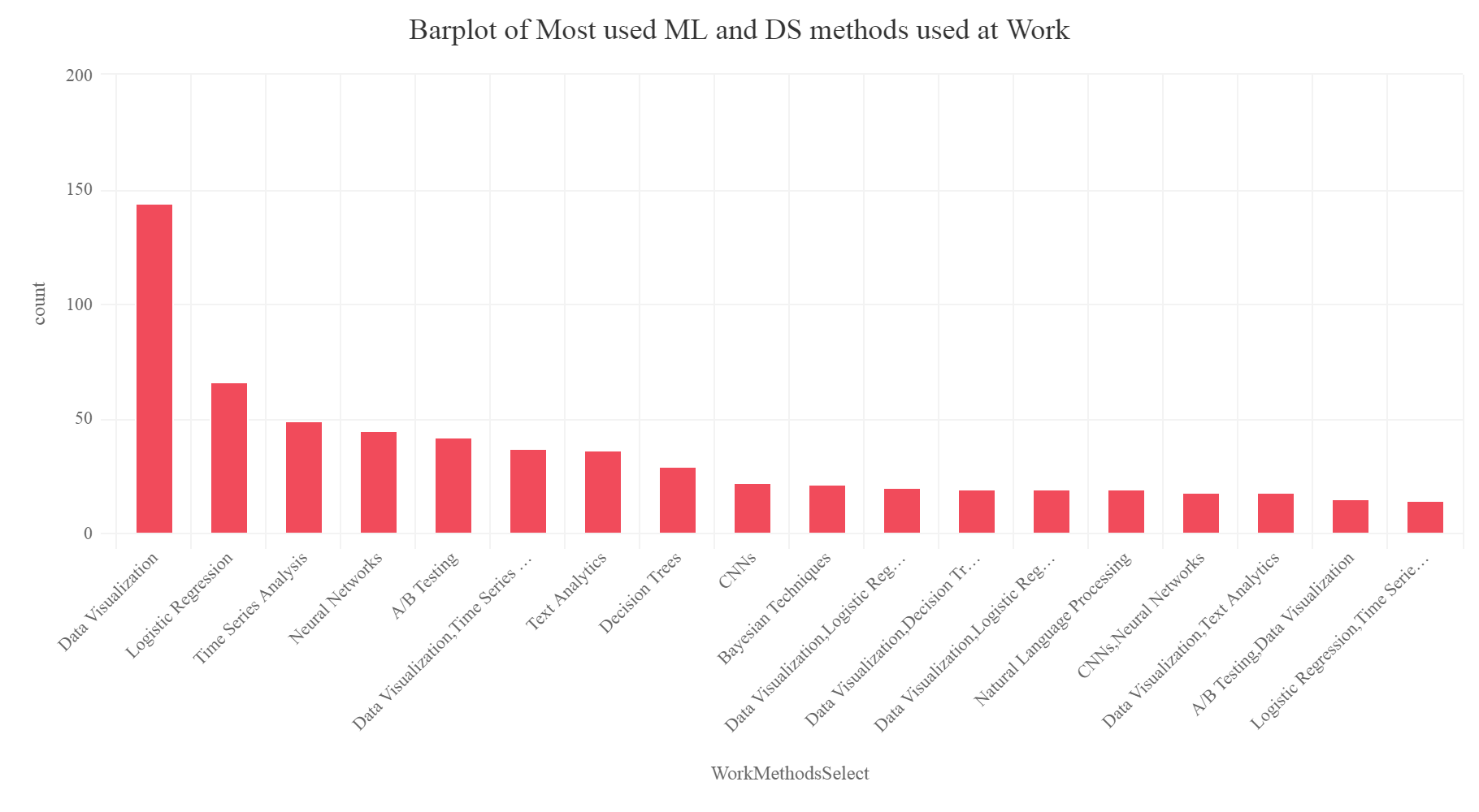
So we can notice that it is Data Visualization, Logistic regression, time series analysis which is most used by the participants at work.
Conclusion
So this was a simple article in which you did some data analysis and focused on getting insights about the data science trends and understanding the responses and the perceptions of the survey participants worldwide from the Kaggle Data science survey 2017. Then you learned how to use highcharter package to build beautiful plots in R. This can be a starting point of a really well data analytics project for the readers. I insist the readers to actually play with the data set as it has more than 200 variables and each variable can represent a lot of information and knowledge about the data science trends. So your homework is to find out more interesting insights which will surely surprise you and share them with the world and data science enthusiasts.
The Github repository for this project can be found here.
I hope you all liked the article. Make sure to like and share it. Cheers!