One of the most frustrating issues I face in my professional life is the plentitude of ineffective reports generated within my company. Wherever I look around me is plenty of junk charts, like barplot showing useless 3D effects or ambiguous and crowded pie charts.
I do understand the root causes of this desperate state of the art: people have always less time to dedicate to reports crafting, and even less to dedicate to their plot. In the crazy and speedy-going working life, my colleagues have no time and for learning data visualization principles. Even so, this remains quite a big problem since a lot of time and money-wasting consequences come from poorly crafted reports and plots:
- wrong conclusions about underlying phenomenon and wrong decisions?
- requests for more clarifications about unclearly showed data?
- ground for organizational politics due to lack of adequate evidence able to limit it
That is why once I realized this sad truth I have started wondering what could have I done about that. Two options came to my mind:
- sit down and blame the fate
- face the problem and try to carve out some helpful solution
Since I am a passionate follower of Steven Covey 7 habits, I decided to discard the first option and I devoted myself to find and put in place an helpful solution to the problem.
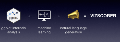
A the end of the journey I came out with the vizscorer package. This package contains a mix of machine learning and natural language generation. All of these techniques are employed to analyze a plot and quickly show to the user how effective it is and how he can improve it.
Three are the main tasks performed by vizscorer
- analysing ggplot plot internals (only ggplot plots are supported)
- scoring the plot based on its effectivenes
- providing customised suggestion about how to improve it
To unleash all this poweryou just have to run a simple function on your ggplot object:
scorer_bot(plot_object= your_ggplot_object)
Copy
But let us follow a decent chronological order, first of all showing you the route which led me to the package.
How to measure a good plot?
The first topic I faced in my quest for a better dataviz world was the clear-cut definition of a good plot. As Kant used to say: the aesthetic judgment is an individual judgment pretending to be universal (Immanuel Kant)
This means that everyone has its own tastes about beauty (Kant's quote sounds fancier, doesn't it?). Defining and measuring the beauty of a plot is thus a non-trivial task. Even so, if we switch from the idea of measuring a nice-looking plot to the one of measuring an effective plot, the theory of data visualization comes to our help. What theory I am talking about? When we talk about data viz two are the pillars you cannot ignore:
- The visual display of quantitative information by Edward R.Tufte
- Show me the numbers by Stephen Few
If you did not get the change to read them you can have a look at a reasoned summary of Tufte's theoretical framework I crafted within a previous post. Unfortunately, I couldn't find any effective summary of Few's ideas.
Anyway, looking at these books you will find out that an effective plot should respect some common principles. These principles are for instance integrity, readability and maximization of data to ink ratio.
This is all nice, at least for me, but how to measure the effectiveness of a plot given these principles?
Preparing a training dataset of plots
The first step I moved toward this direction was taking a handful of fewer than 100 ggplot plots and score them as good or bad. I assigned the score based on my expert judgment about the level of compliance with mentioned principles (No surprise about my passion for compliance, I am an auditor after all). You are thinking it is too rough, aren't you? Well, I will give you two different answers:
- this is the first step, and we will add on it more robust statistical tools and reasoning later
- this is not different from what Google do when dealing with quality of photo and images
Once this was done I need some way to associate the 0-1 flag with the attributes of each plot. That is why I wrote an R function able to look within ggplot object internals and get out from it precious info.
You can still find this function within the vizscorer package:
metadata_reader(plot_object = "your_ggplot_plot")
Copy
You can imagine it as a way to teach computers how to look at plots and describe them. A the beginning the function tests the plot to understand which type of plot it is. This is done looking for geometries and aesthetics. As a next step the function performs studies on data visualized from the ggplot object. These studies try to understand relationships among variables and the presence of outliers. Finally, some tests are performed to verify the respect of data visualization principles. This is done leveraging information from mentioned analyses.
Fifteen attributes related to four areas of data visualization effectiveness are then saved in a data frame:
- readability of the plot, like the correct specification of the number of bins given the distribution of data
- data density, like the presence of overplotting phenomenons
- data to ink ratio, like the use of meaningless filled bars in bar plot
- adequateness of labelling, like the presence of adequate labelling for axes
Once having run this function on my training plots, I came out with a training database. This database showed for each plot the 0-1 flag I assigned and all data drawn from the function.
Wasn't it a perfect occasion to apply some machine learning? I thought it was.
How to train Machine Learning to recognize a good plot?
What I was looking at that stage was a classification problem. The goal here was to predict if a given plot was good or bad based on a set of attributes related to the plot.
I could have resorted to different algos and models able to perform this task. In the end, I decided to apply a gradient boosting model. This model resulted able to provide the classification in the form of a probability.
This means that for each plot the algorithm is able to tell me how probable is for the plot to be a good one or a bad one.
No point in getting here into details with the algo, we can just remember that:
- it works fitting various decision trees on your data and summing their predictions.
- it is a boosting method. This means that after the first fitting round it takes the observed errors and fits another set of trees on these errors
You can find a nice interactive explanation by Alex Rogozhnikov on its personal website.
Can Machine learning talk back to humans?
We have now a model able to score a plot given a set of attributes. It was quite exciting to come that far, but still, this was not the end. I could indeed imagine my colleagues looking at the score given to one of their plots, then turning back to me and asking: and so what?
I was missing the last mile: teaching to the author of the plot how to improve it.
To do this I tried to develop a basic natural language generation engine. This engine performs three kinds of stuff:
- taking the final score of the model from gradient boosting algo
- analysing the internal data drawn for the plot desuming disregarded principles
- retrieving from a knowledge base information to describe the results and provide suggestions about how to improve the plot
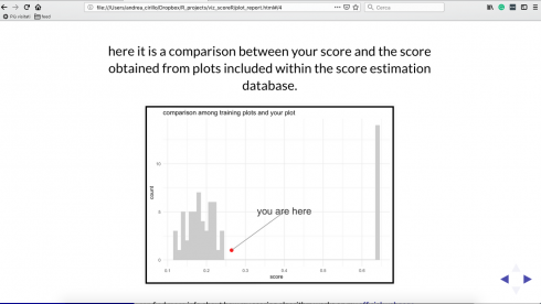
At the end of the process, leveraging knitr, a nice deck of revealjs slides is produced to help the user navigate evaluations and suggestions back and forward.
Putting all together: vizscorer and the scorer_bot
Once all of this was done, to make it available to my colleagues and the R users I developed the vizscorer package.
You can try the package for yourself installing it from Github with the following code:
devtools::install_github("andreacirilloac/vizscorer")
CopyAs you see, there is no that much to do for the user. He just has to submit its ggplot plot to the scorer_bot function and an easy-going deck of slides pops up. The slides coming out are packed with customized suggestions about how to improve the plot.
Where to go from here and how to help
The package is currently in a primordial phase. Even if it is able to perform the tasks described I can see several development directions:
- increasing the number of plots employed for training the gradient boosting model
- introducing a “console version” of the report, more usable and less annoying in the long run
- increasing the level of cleaverness of the bot to make it able to analyse more complex plots and provide even more useful suggestions
Vizscorer continues the effort started with paletteR to increase the level of quality of the average plots produced in companies where there is no time to study the data visualization theory
If you also think the quality and integrity of companies reports is a right reason to code for, you are more then welcome on the official Github repository of vizscorer.
Both in case you will contribute to it or not, comments are welcome about how helpful vizscorer can be and how to improve it.


