
This blog post explains, how to programmatically download the FOMC’s latest and historical economic projections, create an animated version of its famous Dot Plot in Python and host it on GitHub.
While excessive leverage in the U.S. banking system and the country’s housing market were the ultimate cause of the Great Financial Crisis in 2008, the Fed’s aggressive monetary policy tightening under its then-chairman Alan Greenspan played a role. Unfortunately, Greenspan was not exactly renowned for his exceptional communicational skills, and his 17 rate hikes between 2004 and 2006 gave markets and borrowers little time to prepare.
-
Dots are to be taken with a big, big grain of salt
(Jerome Powell)
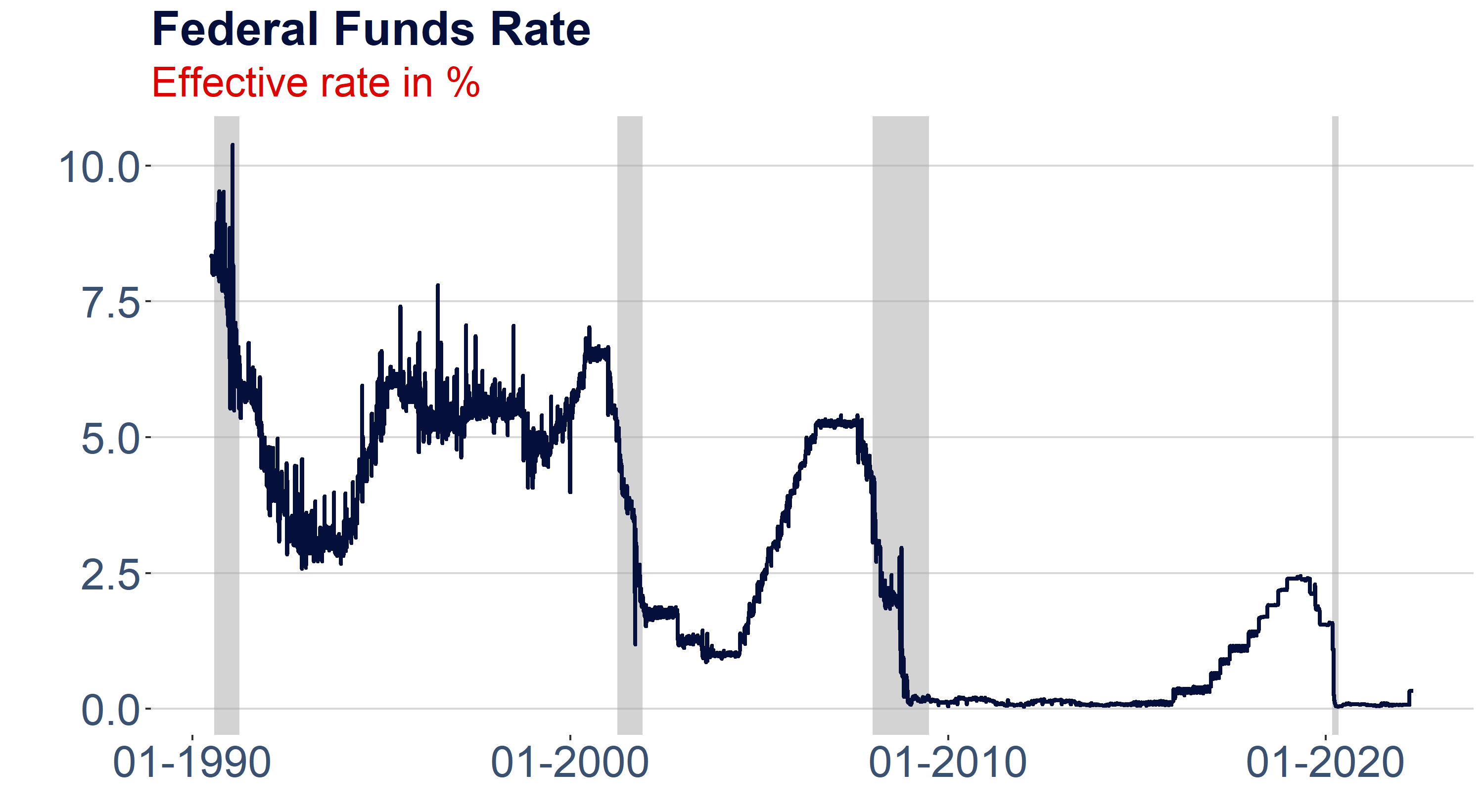
During the next crisis, which is widely considered the worst since the Great Depression in 1929, the central bank was quickly forced to reduce interest rates to zero, and the slow recovery meant they were pretty much stuck there for almost a decade. With interest rate policy constrained by the zero lower bound, the Fed resolved to alternative monetary policy tools, including outright purchasing government bonds to control longer-term benchmark interest rates.
-
I guess I should warn you, if I turn out to be particularly clear, you’ve probably misunderstood what I’ve said.
(Alan Greenspan)
Beyond that, having learned from the experiences made under Greenspan and as a complementary tool, the Federal Open Market Committee (FOMC) started to provide much more comprehensive forward guidance. This includes the regular publication of a set of economic projections, and the most famous part of this dataset is arguably the so-called Dot Plot. The Dot Plot provides an easy-to-understand overview of all FOMC members’ key interest rate expectations for the current and the following two years and their longer-term projections. Each point in the chart represents one committee member. Consequently, the plot also gives an idea of the dispersion of opinions within the committee. Towards the end of each year, the Dots for the current year will converge to the actual Federal Funds Rate.
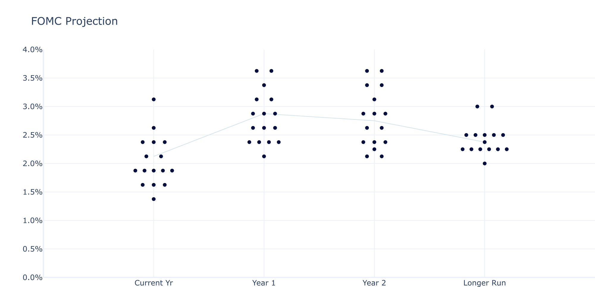
The well known Dot Plot by the Federal Open Market Committee (FOMC) as part of its economic projectio materials on a quarterly basis.
It is noteworthy that Jerome Powell warned investors of taking the Dots too literally. While the Dot Plot is widely followed, regular readers of the FOMC’s projections will quickly note how volatile the committee’s predictions are, given the generally high uncertainty about future economic developments. Nevertheless, there is still value in it.
First of all, the Dots for the current year help investors gauge the near-term development of the Federal Funds Rate and thus help fix short-term interest rates. The FOMC’s longer-run rate expectation, on the other hand, has so far remained pretty stable and reflects the bank’s assessment of long-term equilibrium growth and inflation dynamics.
“They’re not a committee forecast, they’re not a plan. The dots are not a great forecaster of future rate moves. And that’s because it’s so highly uncertain.” (Jerome Powell)
Obviously, you can see the Dot Plot in the FOMC’s materials, so why should you bother replicating it yourself?
This article addresses a whole bunch of challenges related to data retrieval, processing and visualization:
- How to automatically retrieve the FOMC’s projections and make them machine-readable in Python?
- How to construct the Dot Plot in Python using Plotly?
- How to export the Plotly graphic as a static image or dynamic HTML file?
- How to create a dynamic, animated version of it that allows us to put the current Dots historically into perspective?
- How to host the dynamic HTML version of our graphic on GitHub?
- How can we efficiently retrieve the FOMC’s projections and make them machine-readable in Python?
While the Dots are the most recognized part of the FOMC’s projections, the committee also provides a growing set of other predictions that can be relevant for the assessment of the current economic outlook and historical analysis. Of course, you can access the website and copy/paste the data into excel. This becomes pretty painful, though, once you want to access all historical datasets, making it hard to maintain.
I used to replicate the DotPlot in Excel years ago and had to regularly update it for marketing publications — a process that is painfully cumbersome and highly error-prone. Fortunately, Rubén Hernández-Murillo from the Federal Reserve Bank of Cleveland did the heavy lifting years ago and was so kind to share his Python script on his website.
He also published a javascript code for the creation of the Dot Plot. However, I prefer a pure Python implementation and implemented the DotPlot with Plotly.
While Hernández-Murillo’s code still works almost perfectly well after five years, there are a few small things that I had to amend and that users should pay attention to.
First of all, the structure of the FOMC’s projection materials changes over time as tables are added or removed.
In the function that downloads and processes the data, you will find the following line of code that selects the correct table. When Hernández-Murillo published his script, the table needed for the Dots was the last one in the dataset. This changed in June 2020, so I introduced a flexible variable that allows the user to point to the correct table.
#Restrict the data frame to 4 columns (Current, 1Yr, 2Yr, Longer-term) if(len(df.columns)==5): df=df.iloc[:,[0,1,2,4]]
Secondly, the number of columns changes over the course of each year. The FOMC publishes projections for the current and the next two years in March and June but adds another year in September and December. There are various ways of tackling this, but I simply added a procedure to my function that removes the third year in September and December. Of course, this results in loss of information, but the longer the horizon, the more unstable the forecasts, and for the dynamic version, this guarantees the required consistency.
Last but not least, I wrapped all this in a simple function. This allows us to easily download the data for different periods. We only need to provide the URL of the HTML version of the projection materials and point to the correct target table. The function also converts the data into a format that the chart can handle. For this, we need to “spread out” the dots on the x-axis.
This is the most tricky part of the exercise, turning the development of the Dot Plot into a nice intellectual challenge. In my function, I solved the problem with the help of NumPy’s linspace function, which returns evenly spaced numbers over a specified interval. A flexible variable ‘spacing’ allows the user to specify how tightly the dots should be grouped.
#Spreading the dots on the x-axis
xvalue=numpy.linspace(int(dl[‘year’].iloc[rows])-int(dl[‘value’].iloc[rows])/spacing,int(dl[‘year’].iloc[rows])+int(dl[‘value’].iloc[rows])/spacing, int(dl[‘value’].iloc[rows]))
The complete function can be found below.
# Download data for constructing the dotplot.
# The source URL has the following structure:
# https://www.federalreserve.gov/monetarypolicy/fomcprojtabl20161214.htm
# (the file name seems to reference the date of the release)
def request_dots(path='https://www.federalreserve.gov/monetarypolicy/fomcprojtable20220316.htm',spacing=30,target_table=21):
import pandas as pd
    import bs4
    import requests
    import numpy
#url = 'https://www.federalreserve.gov/monetarypolicy/fomcprojtable20220316.htm'
    #url = u'https://www.federalreserve.gov/monetarypolicy/fomcprojtabl20201216.htm'
    url=path
    # Download file
    res = requests.get(url)
    # Check for errors
    try:
        res.raise_for_status()
    except Exception as exc:
        print('There was a problem: %s' % (exc))
    # Save file to disk
    projectionFile = open('fomcprojtabl.htm','wb')
    for chunk in res.iter_content(100000):
        projectionFile.write(chunk)
    projectionFile.close()
    # Make the soup
    soup = bs4.BeautifulSoup(res.text,'lxml')
    # Find the public tables
    tables = soup.select('table[class="pubtables"]')
    # Parse table to generate a pandas DataFrame
    def parse_table(table):
        # Parse rows
        bdata = []
        rows = table.find_all('tr')
        for row in rows:
            # find first column header
            cols0 = row.find_all('th')
            cols0 = [ele.text.strip() for ele in cols0]
            cols = row.find_all('td')
            cols = [ele.text.strip() for ele in cols]
            cols = [ele for ele in cols0]+[ele for ele in cols]
            bdata.append(cols)
        # Convert to DataFrame
        bdata[0][0] = "MidpointTargetRange"
        bdata[0][-1]= "Longer Run"
        df = pd.DataFrame(bdata[1:], columns=bdata[0])
        df.set_index("MidpointTargetRange", inplace=True)
        return   df
    # Parse the target table only
    df = parse_table(tables[-target_table])
    # Expand count of participants to an array to identify
    # each dot individually
    dfsize = df.shape
    for rows in range(0,dfsize[0]-1):
        for cols in range (0,dfsize[1]):
            # print (df.ix[rows][cols])
            count = df.iloc[rows][cols]
            if count:
                array = range(1,int(count)+1)
            else:
                array = [0]
            df.iloc[rows][cols] = array

    # Write data to json file resetting the index, per the following stackoverflow question:
    # http://stackoverflow.com/questions/28590663/pandas-dataframe-to-json-without-index
    #df.transpose().reset_index().to_json("C:/FS/quantamental_platform/Publications/FOMC_Watch/dotplot.json",orient='records')

    #Restrict the dataframe to 4 columns (Current, 1Yr, 2Yr, Longer-term)
    if(len(df.columns)==5):
        df=df.iloc[:,[0,1,2,4]]
    df['Projection']=df.index
    str(df.columns[0:4])
    df.columns =['1', '2','3','Longer Run','Projection']
    dl = pd.melt(df,  id_vars='Projection',value_vars=['1', '2','3','Longer Run'])
    dl['year'] = dl['variable']
    dl.loc[dl['variable'] =='Longer Run', 'year'] = int(list(df.columns)[1])+2

    xvalue_res = []
    yvalue_res = []
    dl=dl[dl['value'] !="" ]
    dl['year']=dl['year'].astype(float)
    dl['Projection']=dl['Projection'].astype(float)

    #Spread the dots on the x-axis depending on how many there are
    for rows in range(0,len(dl['value'])):
        xvalue=numpy.repeat(dl['year'].iloc[rows], dl['value'].iloc[rows], axis=None)
        xvalue=xvalue.astype(int)
        yvalue=numpy.repeat(dl['Projection'].iloc[rows], dl['value'].iloc[rows], axis=None)
        if int(dl['value'].iloc[rows])==1:
            xvalue=numpy.linspace(int(dl['year'].iloc[rows])-0,int(dl['year'].iloc[rows])+0, int(dl['value'].iloc[rows]))
        else:
            xvalue=numpy.linspace(int(dl['year'].iloc[rows])-int(dl['value'].iloc[rows])/spacing,int(dl['year'].iloc[rows])+int(dl['value'].iloc[rows])/spacing, int(dl['value'].iloc[rows]))
        xvalue_res=numpy.concatenate([xvalue_res, xvalue])
        yvalue_res=numpy.concatenate([yvalue_res, yvalue])

    return dl, xvalue_res, yvalue_res
Let’s finally use this, to retrieve the latest Dots.
#Loading the March 2021 Dots
dots20220316=request_dots(‘https://www.federalreserve.gov/monetarypolicy/fomcprojtable20220316.htm',spacing=40,target_table=21)
How to construct the static Dot Plot?
Once the challenging part of bringing the data into the correct format has been solved, constructing the Dot Plot itself is a relatively simple exercise.
#Static Current Value Plot
#--------------------------------------------------------------------------------------------------------
import plotly.express as px
import numpy
fig = px.scatter(x=xvalue_res, y=yvalue_res/100,title='FOMC Projection',labels={"x": "","y": "",},template='plotly_white',
                 range_x=[0,5], range_y=[0,0.04])
fig.update_layout(
    xaxis = dict(
        tickmode = 'array',
        tickvals = numpy.unique(dl['year']),
        #ticktext = numpy.unique(dl['variable']).astype(str),
        ticktext = ['Current Yr','Year 1','Year 2','Longer Run'],
    )
)
#Calculate median values and add the median line to the plot
medians=dl.groupby('year')['Projection'].median()
fig.add_scatter(x=medians.index,y=medians/100, mode="lines", row=1, col=1)
fig.add_scatter(x=xvalue_res,y=yvalue_res/100,mode='markers')
#Customize the layout
fig.data[2]['marker'].update(color='#04103b')
fig.data[1]['line'].update(color='#D1E2EC')
fig.update_layout(showlegend=False)
fig.layout.yaxis.tickformat = ',.1%'
fig.update_layout(margin=dict(l=40,r=40,b=20,t=80))
How to export our Plotly graphic?
This graphic can now be saved as an image in png or SVG format using the functions provided here. However, I find that this tends to be a bit unstable, and sometimes the write_image part actually crashes my editor. In this case, it is good to know how to save the chart as an HTML file and manipulate Plotly’s toolbar so you can subsequently store it in your format of choice by clicking on the camera icon. The code below is universal and quite useful when working with Plotly graphics in web applications.
config = {
 ‘toImageButtonOptions’: {
 ‘format’: ‘svg’, # one of png, svg, jpeg, webp
 ‘filename’: ‘custom_image’,
 ‘height’: 500,
 ‘width’: 1000,
 ‘scale’: 1 # Multiply title/legend/axis/canvas sizes by this factor
 }
}
fig.write_html(“your path/StaticDotplot.html”,config=config)
What’s even more exciting, we can use the HTML file and host it somewhere to embed it into websites, blogs or other applications. An excellent blog post on Towards Data Science explains how to host Plotly graphics on Chart Studio or Github.
On top of that, I have published my step-by-step guide for hosting on GitHub here.
Personally, I GitHub over Chart Studio for hosting graphics, and you can find my animated, dynamic version of the DotPlot here. After that, we just need to add a little bit of code around the URL to convert it into an iframe that can be embedded in a website.
Enjoy the dance of the Dots.
How to build a dynamic, animated Dot Plot
This brings us to the last step of creating the animated Dot Plot. Obviously, there are various ways to put the latest data into perspective and visualise the Dot’s progression over time. You could also compare the median, min or max forecasts in a simple line chart. That’s rather boring, though, and this exercise can also be an excellent showcase of Plotly’s animation capabilities.
#Animated plot get data
# — — — — — — — — — — — — — — — — — — — — — — — — — — — — — — — — — — — — — — — — — — — — — — — — — — — —
#2017
dots20170315=request_dots('https://www.federalreserve.gov/monetarypolicy/fomcprojtabl20170315.htm',spacing=40,target_table=1)
dots20170614=request_dots(‘https://www.federalreserve.gov/monetarypolicy/fomcprojtabl20170614.htm',spacing=40,target_table=1)
dots20170920=request_dots(‘https://www.federalreserve.gov/monetarypolicy/fomcprojtabl20170920.htm',spacing=40,target_table=1)
dots20171213=request_dots(‘https://www.federalreserve.gov/monetarypolicy/fomcprojtabl20171213.htm',spacing=40,target_table=1)
#2018
dots20180321=request_dots(‘https://www.federalreserve.gov/monetarypolicy/fomcprojtabl20180321.htm',spacing=40,target_table=1)
dots20180613=request_dots(‘https://www.federalreserve.gov/monetarypolicy/fomcprojtabl20180613.htm',spacing=40,target_table=1)
dots20180926=request_dots(‘https://www.federalreserve.gov/monetarypolicy/fomcprojtabl20180926.htm',spacing=40,target_table=1)
dots20181219=request_dots(‘https://www.federalreserve.gov/monetarypolicy/fomcprojtabl20181219.htm',spacing=40,target_table=1)
#2019
dots20190320=request_dots(‘https://www.federalreserve.gov/monetarypolicy/fomcprojtabl20190320.htm',spacing=40,target_table=1)
dots20190619=request_dots(‘https://www.federalreserve.gov/monetarypolicy/fomcprojtabl20190619.htm',spacing=40,target_table=1)
dots20190918=request_dots(‘https://www.federalreserve.gov/monetarypolicy/fomcprojtabl20190918.htm',spacing=40,target_table=1)
dots20191211=request_dots(‘https://www.federalreserve.gov/monetarypolicy/fomcprojtabl20191211.htm',spacing=40,target_table=1)
#2020
dots20200610=request_dots(‘https://www.federalreserve.gov/monetarypolicy/fomcprojtabl20200610.htm',spacing=40,target_table=1)
dots20200916=request_dots(‘https://www.federalreserve.gov/monetarypolicy/fomcprojtabl20200916.htm',spacing=40,target_table=1)
dots20201216=request_dots(‘https://www.federalreserve.gov/monetarypolicy/fomcprojtabl20201216.htm',spacing=40,target_table=21)
dots20210317=request_dots(‘https://www.federalreserve.gov/monetarypolicy/fomcprojtabl20210317.htm',spacing=40,target_table=21)
#2021
dots20210616=request_dots(‘https://www.federalreserve.gov/monetarypolicy/fomcprojtabl20210616.htm',spacing=40,target_table=21)
dots20210922=request_dots(‘https://www.federalreserve.gov/monetarypolicy/fomcprojtabl20210922.htm',spacing=40,target_table=21)
dots20211215=request_dots(‘https://www.federalreserve.gov/monetarypolicy/fomcprojtabl20211215.htm',spacing=40,target_table=21)
dots20220316=request_dots(‘https://www.federalreserve.gov/monetarypolicy/fomcprojtable20220316.htm',spacing=40,target_table=21)
For this, we first need to download the historical datasets. Finding the URLs is only a little manual work as their structure doesn’t change and always contains the publication date at the end. Once we have loaded the data, we can concatenate it into one data frame and proceed to build the animated plot with the following code. My implementation may not be the prettiest, but I haven’t found a better way of doing it yet.
#Animated Graph Version 1
#---------------------------------------------------------------------------------------------------------
import plotly.graph_objects as go
fig = go.Figure(
    data=[go.Scatter(x=dots20170315[1], y=dots20170315[2]/100,mode='markers',line=dict(width=2, color="#04103b")   )],
    layout=go.Layout(
        xaxis=dict(range=[0, 5], autorange=False),
        yaxis=dict(range=[0, 0.05], autorange=False),
        template='plotly_white',
        title="FOMC Interes Rate Projections",
        updatemenus=[dict(
            type="buttons",
            buttons=[dict(label="Play",
                          method="animate",
                          args=[None])])]
    ),
    frames=[
            go.Frame(data=[go.Scatter(x=dots20170315[1], y=dots20170315[2]/100,mode='markers')]),
            go.Frame(data=[go.Scatter(x=dots20170614[1], y=dots20170614[2]/100,mode='markers')]),
            go.Frame(data=[go.Scatter(x=dots20170920[1], y=dots20170920[2]/100,mode='markers')]),
            go.Frame(data=[go.Scatter(x=dots20171213[1], y=dots20171213[2]/100,mode='markers')]),

            go.Frame(data=[go.Scatter(x=dots20180321[1], y=dots20180321[2]/100,mode='markers')]),
            go.Frame(data=[go.Scatter(x=dots20180613[1], y=dots20180613[2]/100,mode='markers')]),
            go.Frame(data=[go.Scatter(x=dots20180926[1], y=dots20180926[2]/100,mode='markers')]),
            go.Frame(data=[go.Scatter(x=dots20181219[1], y=dots20181219[2]/100,mode='markers')]),

            go.Frame(data=[go.Scatter(x=dots20190320[1], y=dots20190320[2]/100,mode='markers')]),
            go.Frame(data=[go.Scatter(x=dots20190619[1], y=dots20190619[2]/100,mode='markers')]),
            go.Frame(data=[go.Scatter(x=dots20190918[1], y=dots20190918[2]/100,mode='markers')]),
            go.Frame(data=[go.Scatter(x=dots20191211[1], y=dots20191211[2]/100,mode='markers')]),
            go.Frame(data=[go.Scatter(x=dots20191211[1], y=dots20191211[2]/100,mode='markers')]),
            go.Frame(data=[go.Scatter(x=dots20200610[1], y=dots20200610[2]/100,mode='markers')]),
            go.Frame(data=[go.Scatter(x=dots20200916[1], y=dots20200916[2]/100,mode='markers')]),
            go.Frame(data=[go.Scatter(x=dots20201216[1], y=dots20201216[2]/100,mode='markers')]),

            go.Frame(data=[go.Scatter(x=dots20210317[1], y=dots20210317[2]/100,mode='markers')]),
            go.Frame(data=[go.Scatter(x=dots20210616[1], y=dots20210616[2]/100,mode='markers')]),
            go.Frame(data=[go.Scatter(x=dots20210922[1], y=dots20210922[2]/100,mode='markers')]),
            go.Frame(data=[go.Scatter(x=dots20211215[1], y=dots20211215[2]/100,mode='markers')]),

            go.Frame(data=[go.Scatter(x=dots20220316[1], y=dots20220316[2]/100,mode='markers')],
                     layout=go.Layout(title_text="FOMC Interes Rate Projections",template='plotly_white'))]
)
fig.update_layout(
    xaxis = dict(
        tickmode = 'array',
        tickvals = numpy.unique(dl['year']),
        #ticktext = numpy.unique(dl['variable']).astype(str),
        ticktext = ['Current Yr','Year 1','Year 2','Longer Run'],
    )
)
fig.layout.yaxis.tickformat = ',.1%'
fig.update_layout(margin=dict(l=40,r=40,b=20,t=80))
fig.write_html("your_path/AnimatedDotPlot.html",config=config)

