P-values don’t mean what people think they mean; they rely on hidden assumptions that are unlikely to be fulfilled; they detract from the real questions. Here’s how to use the Bootstrap in R instead
This post was first published on Towards Data Science and is based on my book “Behavioral Data Analysis with R and Python”
A few years ago, I was hired by one of the largest insurance companies in the US to start and lead their behavioral science team. I had a PhD in behavioral economics from one of the top 10 economics departments in the world and half a decade of experience as a strategy consultant, so I was confident my team would be able to drive business decisions through well-crafted experiments and data analyses.
And indeed, I worked with highly-skilled data scientists who had a very sharp understanding of statistics. But after years of designing and analyzing experiments, I grew dissatisfied with the way we communicated results to decision-makers. I felt that the over-reliance on p-values led to sub-optimal decisions. After talking to colleagues in other companies, I realized that this was a broader problem, and I set up to write a guide to better data analysis. In this article, I’ll present one of the biggest recommendations of the book, which is to ditch p-values and use Bootstrap confidence intervals instead.
Ditch p-values
There are many reasons why you should abandon p-values, and I’ll examine three of the main ones here:
- They don’t mean what people think they mean
- They rely on hidden assumptions that are unlikely to be fulfilled
- They detract from the real questions
1. They don’t mean what people think they mean
When you’re running applied data analyses, whether in the private, non-profit or public sectors, your goal is to inform decisions. A big part of the problem we need to solve is uncertainty: the data tells us that the number is 10, but could it be 5 instead? Maybe 100? Can we rely on the number that the data analysis spouted? After years, sometimes decades, of educating business partners on the matter, they generally understand the risks of uncertainty. Unfortunately, they often jump from there to assuming that the p-value represents the probability that a result is due to chance: a p-value of 0.03 would mean that there’s a 3% chance a number we thought were positive is indeed null or negative. It does not. In fact, it represents the probability of seeing the result we saw assuming that the real value is indeed zero.
In scientific jargon, the real value being zero or negative is called the null hypothesis (abbreviated H0), and the real value being strictly above zero is called the alternative hypothesis (abbreviated H1). People mistakenly believe that the p-value is the probability of H0 given the data, P(H0|data), when in reality it is the probability of the data given H0, P(data|H0). You may be thinking: potato po-tah-to, that’s hair splitting and a very small p-value is indeed a good sign that a result is not due to chance. In many circumstances, you’ll be approximately correct, but in some cases, you’ll be utterly wrong.
Let’s take a simplified but revealing example: we want to determine Robert’s citizenship. Null hypothesis: H0, Robert is a US citizen. Alternative hypothesis: H1, he is not. Our data: we know that Robert is a US senator. There are 100 senators out of 330 million US citizens, so under the null hypothesis, the probability of our data (i.e., the p-value) is 100 / 300,000,000 ≈ 0.000000303. Per the rules of statistical significance, we can safely conclude that our null hypothesis is rejected and Robert is not a US citizen. That’s obviously false, so what went wrong? The probability that Robert is a US senator is indeed very low if he is a US citizen, but it’s even lower if he is not (namely zero!). P-values cannot help us here, even with a stricter 0.01 or even 0.001 threshold (for an alternative illustration of this problem, see xkcd).
2. They rely on hidden assumptions
P-values were invented at a time when all calculations had to be done by hand, and so they rely on simplifying statistical assumption. Broadly speaking, they assume that the phenomenon you’re observing obeys some regular statistical distribution, often the normal distribution (or a distribution from the same family). Unfortunately, that’s rarely true²:
- Unless you’re measuring some low-level psycho-physiological variable, your population of interest is generally made up of heterogeneous groups. Let’s say you’re a marketing manager for Impossible Burgers looking at the demand for meat substitutes. You would have to account for two groups: on the one hand, vegetarians, for whom the relevant alternative is a different vegetarian product; on the other hand, meat eaters, who can be enticed but will care much more about taste and price compared to meat itself.
- A normal distribution is symmetrical and extends to infinity in both directions. In real life, there are asymmetries, threshold and limits. People never buy negative quantities, nor infinite ones. They don’t vote at all before they’re 18 and the market of 120-year-old is much narrower than the market for 90-year-old and 60-year-old would suggest.
- Conversely, we see “fat-tailed” distributions, where extreme values are much more frequent than expected from a normal distribution. There are more multi-billionaires than you would expect from looking at the number of millionaires and billionaires.
This implies that the p-values coming from a standard model are often wrong. Even if you correctly treat them as P(data|H0) and not P(H0|data), they’ll often be significantly off.
3. They detract from the real questions
Let’s say that you have taken to heart the two previous issues and built a complete Bayesian model that finally allows you to properly calculate P(H0|data), the probability that the real value is zero or negative given the observed data. Should you bring it to your decision-maker? I would argue that you shouldn’t, because it doesn’t reflect economic outcomes.
Let’s say that a business decision-maker is pondering two possible actions, A and B. Based on observed data, the probability of zero or negative benefits is:
- 0.08 for action A
- 0.001 for action B
Should the decision-maker pick action B based on these numbers? What if I told you that the corresponding 90% confidence intervals are:
- [-$0.5m; $99.5m] for action A
- [$0.1m; $0.2m] for action B
Action B may have a lower probability of leading to a zero or negative outcome, but its expected value for the business is much lower, unless the business is incredibly risk-averse. In most situations, “economic significance” for a decision-maker hangs on two questions:
How much money are we likely to gain? (aka, the expected value)
In a “reasonably-likely worst-case scenario”, how much money do we stand to lose? (aka, the lower bound of the confidence interval)
Confidence intervals are a much better tool to answer these questions than a single probability number.
Use the Bootstrap instead
Let’s take a concrete example, adapted and simplified from my book¹. A company has executed a time study of how long it takes its bakers to prepare made-to-order cakes depending on their level of experience. Having an industrial engineer measure how long it takes to make a cake in various stores across the country is expensive and time-consuming, so the data set has only 10 points, as you can see in the following figure.
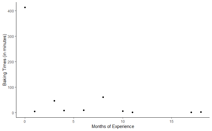
In addition to the very small size of the sample, it contains an an outlier, in the upper left corner: a new employee spending most of a day working on a complex cake for a corporate retreat. How should the data be reported to business partners? One could discard the extreme observation. But that observation, while unusual, is not an aberration per se. There was no measurement error, and those circumstances probably occur from time to time. An other option would be to only report the overall mean duration, 56 minutes, but that would also be misleading because it would not convey the variability and uncertainty in the data.
Alternatively, one could calculate a normal confidence interval (CI) based on the traditional statistical assumptions. Normal confidence intervals are closely linked to the p-value: an estimate is statistically significant if and only if the corresponding confidence interval does not include zero. As you’ll learn in any stats class, the lower limit of a normal 95%-CI is equal to the mean minus 1.96 times the standard error, and the upper limit is equal to the mean plus 1.96 times the standard error. Unfortunately, in the present case the confidence interval is [-23;135] and we can imagine that business partners would not take too kindly to the possibility of negative baking duration…
This issue comes from the assumption that baking times are normally distributed, which they are obviously not. One could try to fit a better distribution, but using a Bootstrap confidence interval is much simpler.
<3>1. The Bootstrap works by drawing with replacement
To build Bootstrap confidence intervals, you simply need to build “a lot of similar samples” by drawing with replacement from your original sample. Drawing with replacement is very simple in R, we just set “replace” to true:
boot_dat <- slice_sample(dat, n=nrow(dat), replace = TRUE)
Why are we drawing with replacement? To really grasp what’s happening with the Bootstrap, it’s worth taking a step back and remembering the point of statistics: we have a population that we cannot fully examine, so we’re trying to make inferences about this population based on a limited sample. To do so, we create an “imaginary” population through either statistical assumptions or the Bootstrap. With statistical assumptions we say, “imagine that this sample is drawn from a population with a normal distribution,” and then make inferences based on that. With the Bootstrap we’re saying, “imagine that the population has exactly the same probability distribution as the sample,” or equivalently, “imagine that the sample is drawn from a population made of a large (or infinite) number of copies of that sample.” Then drawing with replacement from that sample is equivalent to drawing without replacement from that imaginary population. As statisticians will say, “the Bootstrap sample is to the sample what the sample is to the population.”
We repeat that process many times (let’s say 2,000 times):
mean_lst <- list()

B <- 2000

N <- nrow(dat)

for(i in 1:B){

 boot_dat <- slice_sample(dat, n=N, replace = TRUE)

 M <- mean(boot_dat$times)

 mean_lst[[i]] <- M}

mean_summ <- tibble(means = unlist(mean_lst))
The result of the procedure is a list of Bootstrap sample means, which we can plot with an histogram:
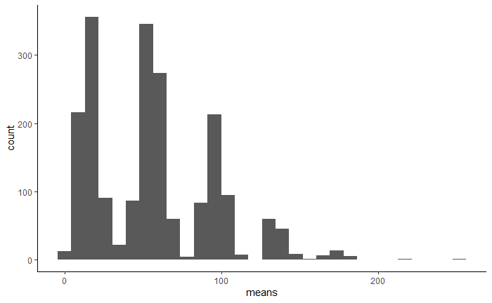
As you can see, the histogram is very irregular: there is a peak close to the mean of our original data set along with smaller peaks corresponding to certain patterns. Given how extreme our outlier is, each of the seven peaks corresponds to its number of repetitions in the Bootstrap sample, from zero to six. In other words, it doesn’t appear at all in the samples whose means are in the first (leftmost) peak, it appears exactly once in the samples whose means are in the second peak, and so on.
2. Calculating the confidence interval from the Bootstrap samples
From there, we can calculate the Bootstrap confidence interval (CI). The bounds of the CI are determined from the empirical distribution of the preceding means. Instead of trying to fit a statistical distribution (e.g., normal), we can simply order the values from smallest to largest and then look at the 2.5% quantile and the 97.5% quantile to find the two-tailed 95%-CI. With 2,000 samples, the 2.5% quantile is equal to the value of the 50th smallest mean (because 2,000 * 0.025 = 50), and the 97.5% quantile is equal to the value of the 1950th mean from smaller to larger, or the 50th largest mean (because both tails have the same number of values). Fortunately, we don’t have to calculate these by hand:
LL_b <- as.numeric(quantile(mean_summ$means, c(0.025)))

UL_b <- as.numeric(quantile(mean_summ$means, c(0.975)))
The following figure shows the same histogram as before but adds the mean of the means, the normal CI bounds and the Bootstrap CI bounds.
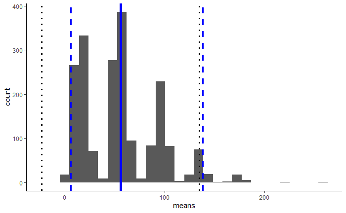
Distribution of the means of 2,000 samples, with mean of the means (thick blue line), normal 95%-CI bounds (dotted black lines), and Bootstrap CI bounds (dashed blue lines)[/caption]
The Bootstrap 95%-CI is [7.50; 140.80] (plus or minus some sampling difference), which is much more realistic. No negative values as with the normal assumptions!
3. The Bootstrap is more flexible and relevant for business decisions
Once you start using the Bootstrap, you’ll be amazed at its flexibility. Small sample size, irregular distributions, business rules, expected values, A/B tests with clustered groups: the Bootstrap can do it all!
Let’s imagine, for example, that the company in our previous example is considering instituting a time promise - ”your cake in three hours or 50% off” - and wants to know how often a cake currently takes more than three hours to be baked. Our estimate would be the sample percentage: it happens in 1 of the 10 observed cases, or 10%. But we can’t leave it at that, because there is significant uncertainty around that estimate, which we need to convey. Ten percent out of 10 observations is much more uncertain than 10% out of 100 or 1,000 observations. So how could we build a CI around that 10% value? With the Bootstrap, of course!
The histogram of Bootstrap estimates also offers a great visualization to show business partners: “This vertical line is the result of the actual measurement, but you can also see all the possible values it could have taken”. The 90% or 95% lower bound offers a “reasonable worst case scenario” based on available information.
Finally, if your boss or business partners are dead set on p-values, the Bootstrap offers a similar metric, the Achieved Significance Level (ASL). The ASL is simply the percentage of Bootstrap values that are zero or less. That interpretation is very close to the one people wrongly assign to the p-value, so there’s very limited education needed: “the ASL is 3% so there’s a 3% chance that the true value is zero or less; the ASL is less than 0.05 so we can treat this result as significant”.
Conclusion
To recap, even though p-values remain ubiquitous in applied data analysis, they have overstayed their welcome. They don’t mean what people generally think they mean; and even if they did, that’s not the answer that decision-makers are looking for. Even in academia, there’s currently a strong push towards reducing the blind reliance on p-values (see the ASA statement below⁴).
Using Bootstrap confidence intervals is both easier and more compelling. They don’t rely on hidden statistical assumptions, only on a straightforward one: the overall population looks the same as our sample. They provide information on possible outcomes that is richer and more relevant to business decisions.
But wait, there’s more!
Here comes the final shameless plug. If you want to learn more about the Bootstrap, my book will show you:
- How to determine the number of Bootstrap samples to draw;
- How to apply the Bootstrap to regression, A/B test and ad-hoc statistics;
- How to write high-performance code that will not have your colleagues snickering at your FOR loops;
- And a lot of other cool things about analyzing customer data in business.
References
[1] F. Buisson, Behavioral Data Analysis with R and Python (2021). My book, obviously! The code for the example is available on the book’s Github repo.
[2] R. Wilcox, Fundamentals of Modern Statistical Methods: Substantially Improving Power and Accuracy (2010). We routinely assume that our data is normally distributed “enough.” Wilcox shows that this is unwarranted and can severely bias analyses. A very readable book on an advanced topic.
[3] See my earlier post on Medium “Is Your Behavioral Data Truly Behavioral?”.
[4] R. L. Wasserstein & N. A. Lazar (2016) “The ASA Statement on p-Values: Context, Process, and Purpose”, The American Statistician, 70:2, 129–133, DOI:10.1080/00031305.2016.1154108.