In this post, I will describe how to use R to build heatmaps. The ggplot2 package is required for this, so go ahead and install it if you don’t already have it. You can install it using the following command: install.packages('ggplot2')
I will be using the Motor Vehicle Theft Data from Chicago, which can be obtained on the City of Chicago Data Portal.
The code will consist of the following steps:
- Reading in the data. Depending on how fast your computer is, this may take some time.
- Converting the date to a format recognizable by R. The date in the dataset is of the character class, but R has a separate class to deal with dates. We will use the strptime method for this.
- Sorting the weekdays. We want the weekdays in the graph to appear in the correct chronological order. If we don’t do this, the plot will have weekdays in the alphabetical order, which can be rather confusing.
- Plotting. Finally, to the good part! We will make a plot to first explore how many thefts are being committed each day, and then a heatmap showing the the number of thefts committed during various parts of the day.
Here is the code:
library(ggplot2)
#Reading in the data
chicagoMVT <- read.csv('motor_vehicle_theft.csv', stringsAsFactors = FALSE)
#Converting the date to a recognizable format
chicagoMVT$Date <- strptime(chicagoMVT$Date, format = '%m/%d/%Y %I:%M:%S %p')
#Getting the day and hour of each crime
chicagoMVT$Day <- weekdays(chicagoMVT$Date)
chicagoMVT$Hour <- chicagoMVT$Date$hour
#Sorting the weekdays
dailyCrimes <- as.data.frame(table(chicagoMVT$Day, chicagoMVT$Hour))
names(dailyCrimes) <- c('Day', 'Hour', 'Freq')
dailyCrimes$Hour <- as.numeric(as.character(dailyCrimes$Hour))
dailyCrimes$Day <- factor(dailyCrimes$Day, ordered = TRUE,
                         levels = c('Sunday', 'Monday', 'Tuesday', 'Wednesday', 'Thursday', 'Friday', 'Saturday'))
#Plotting the number of crimes each day (line graph)
ggplot(dailyCrimes, aes(x = Hour, y = Freq)) + geom_line(aes(group = Day, color = Day)) + xlab('Hour') + ylab('Number of thefts') + ggtitle('Daily number of Motor Vehicle Thefts')
This will generate the following line graph:
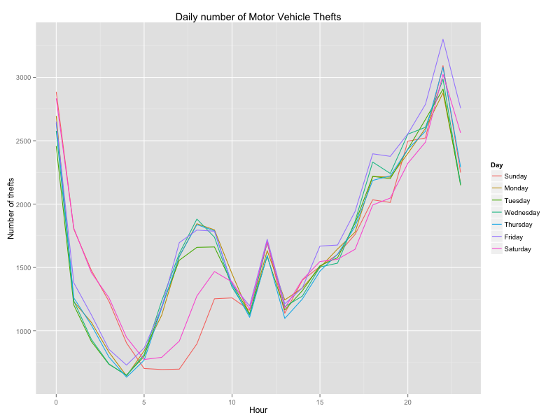
From this graph, it is clear that most of the thefts occur at night, between 8 pm and 12 midnight. However, there is a lot of overlapping between the lines. A heat map would be a better way to visualise this. The heatmap can be generated as follows:
ggplot(dailyCrimes, aes(x = Hour, y = Day)) + geom_tile(aes(fill = Freq)) + scale_fill_gradient(name = 'Total Motor Vehicle Thefts', low = 'white', high = 'red') + theme(axis.title.y = element_blank())
The heatmap generated looks like this:
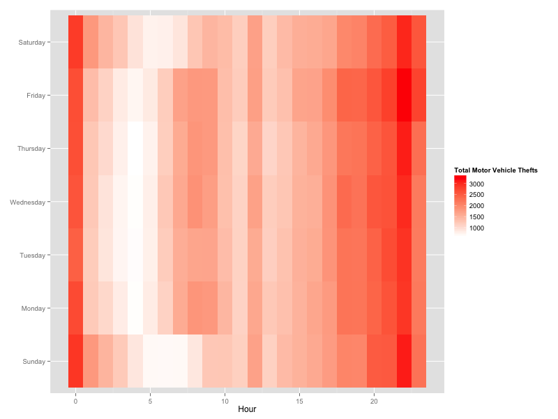
Periods of high activity of theft are denoted by the red tiles, and the periods of low activity are denoted by white tiles.
That’s it for now, thanks for reading, and I hope you found this helpful! Feel free to leave a comment if you have any questions or contact me on Twitter!
Note: I learnt this technique in The Analytics Edge course offered by MIT on edX. It is a great course and I highly recommend that you take it if you are interested in Data Science!