In today’s lesson we’ll take care of the baseline issue we had in the last lesson when we have a linear model with an interaction. To do that we’ll be learning about analysis of variance or ANOVA. We’ll also be going over how to make barplots with error bars, but not without hearing my reasons for why I prefer boxplots over barplots for data with a distribution. I’ll be taking for granted some of the set-up steps from Lesson 1, so if you haven’t done that yet be sure to go back and do it. The other lessons can be found in there: Lesson 0; Lesson 2; Lesson 3; Lesson 4; Lesson 6, Part 1; Lesson 6, Part 2.
By the end of this lesson you will:
- Have learned the math of an ANOVA.
- Be able to make two kinds of figures to present data for an ANOVA.
- Be able to run an ANOVA and interpret the results.
- Have an R Markdown document to summarise the lesson.
There is a video in end of this post which provides the background on the math of ANOVA and introduces the data set we’ll be using today. There is also some extra explanation of some of the new code we’ll be writing. For all of the coding please see the text below. A PDF of the slides can be downloaded here. Before beginning please download these text files, it is the data we will use for the lesson. Note, there are both two text files and then a folder with more text files. Seeing as it is currently election season in the United States, we’ll be using data from past United States presidential elections collected from The American Presidency Project. All of the data and completed code for the lesson can be found here.
Lab Problem
As mentioned, the lab portion of the lesson uses data from past United States presidential elections. Specifically, we’ll be looking at data from presidential elections when one of the candidates was an incumbent. For example, in the 2008 election of Barack Obama vs. John McCain there was no incumbent, since George W. Bush was the current president, but in the 2012 election of Barack Obama vs. Mitt Romney, Obama was the incumbent, as he was the current president. It is a well established that incumbents tend to have an advantage in elections. We’ll be testing the strength of this advantage given two specific variables with an ANOVA. To do this we’ll be including some historical information on the United States regarding the American Civil War, which has had a lasting effect on American politics. Our research questions are below.
- Incumbent Party: Do Democrats or Republicans get a higher percentage of the vote when they are an incumbent?
- Civil War Country: Do Union or Confederate states vote differently for incumbents?
- Incumbent Party x Civil War Country: Is there an interaction between these variables?
Setting up Your Work Space
As we did for Lesson 1 complete the following steps to create your work space. If you want more details on how to do this refer back to Lesson 1:
- Make your directory (e.g. “rcourse_lesson5”) with folders inside (e.g. “data”, “figures”, “scripts”, “write_up”).
- Put the data files for this lesson in your “data” folder, keep the folder “elections” intact. So your “data” folders should have the elections folder and the two other text files.
- Make an R Project based in your main directory folder (e.g. “rcourse_lesson5”).
- Commit to Git.
- Create the repository on Bitbucket and push your initial commit to Bitbucket.
Okay you’re all ready to get started!
Cleaning Script
Make a new script from the menu. We start the same way we usually do, by having a header line talking about loading any necessary packages and then listing the packages we’ll be using. As in the previous lesson, today in addition to loading dplyr we’ll also use the package purrr. Copy the code below to your script and and run it.
## LOAD PACKAGES ####
library(dplyr)
library(purrr)
We’ll start be reading our data in the “elections” folder. In this folder is a separate text file, one for each of the elections we’re looking at, with the percentage of votes that went to the incumbent from each state. We’ll read in all of these files at once using purrr. Just as we did in the last lesson. The only part of the code that’s different is our path isn’t just “data” it’s “data/elections” since our data is in a subfolder of the folder “data”. For a reminder on how this code works see Lesson 4. Copy and run the code below to read in the files.
## READ IN DATA ####
# Full data on election results
data_election_results = list.files(path = "data/elections", full.names = T) %>%
                        map(read.table, header = T, sep = "\t") %>%
                        reduce(rbind)
Take a look at “data_election_results”. You may notice that for the first row for the 1964 election there are “NA”s in the columns “votes_incumbent” and “perc_votes_incumbent”. This is because the incumbent for president that year (Lyndon B. Johnson) was not on the ballot in Alabama, so it was not possible to vote for the incumbent in Alabama for that election. (SPOILER: Why that would be will become more clear later.)
In addition to reading in our election data we also have our two other files to read in. In the “rcourse_lesson5_data_elections.txt” file is some more information about each of our elections, such as if the incumbent party was Democrat or Republican. The “rcourse_lesson5_data_states.txt” file has state specific information, such as if a state was in the Union or the Confederacy. Copy and run the code below to read in these single files.
# Read in extra data about specific elections
data_elections = read.table("data/rcourse_lesson5_data_elections.txt", header=T, sep="\t")

# Read in extra data about specific states
data_states = read.table("data/rcourse_lesson5_data_states.txt", header=T, sep="\t")
As always we’ll have to clean our data, but before doing that let’s look and see how many states were in the Union and how many were in the Confederacy with an xtabs() call. If you run the code below you’ll see we have 11 Confederacy states and 25 Union states. Now, this doesn’t add up to 50, the number of states in the United States. If you look at “data_states” you’ll see that some states are coded as “NA” for the “civil_war” variable. This is because these states were not a part of the United States at the time of the civil war. Remember that xtabs() calls will only give you counts for levels in a variable, and “NA” is not considered a level. Copy and run the code below to see summary yourself.
# See how many states in union versus confederacy
xtabs(~civil_war, data_states)
Now we can start cleaning our data. I’m going to start with our data about the individual states. We’re going to do two things: 1) drop any states that have an “NA” for “civil_war”, and 2) drop some of the Union states so that we have a balanced data set for our ANOVA (recall currently we have 25 Union states and only 11 Confederacy states). For our first filter() call we’ll use the !is.na() call so that we only include states that were in the civil war. This call should be familiar from the previous lesson. Copy and run the code below.
## CLEAN DATA ####
# Make data set balanced for Union and Confederacy states
data_states_clean = data_states %>%
                    filter(!is.na(civil_war))
For our second filter() call we’ll also do something that should be familiar from Lesson 4. To make our data set balanced we only want 11 Union states, but how should we do that? We’ll I’ve decided that I’m going to include the first 11 Union states that joined the United States and drop the rest. To do this I’ll group the data by my “civil_war” variable, order them by “order_enter”, low numbers mean entered the United States earlier, and then filter to only include the first 11 of each group. Note, since there were only 11 states in the Confederacy no states will actually be dropped for that group. Update and run the code below.
data_states_clean = data_states %>%
                    filter(!is.na(civil_war)) %>%
                    group_by(civil_war) %>%
                    arrange(order_enter) %>%
                    filter(row_number() <= 11) %>%
                    ungroup()
Now that I’m done balancing out my data set I’m just going to double check it all worked correctly by running a new xtabs() call. There should now be 11 states for both the Union and the Confederacy.
# Double check balanced for 'civil_war' variable
xtabs(~civil_war, data_states_clean)
We still have a little bit of cleaning to do. To get all of our variables for our analysis in one data frame we need to do an inner_join() with our new “data_states_clean” and our other two data frames. We’ll also do a mutate() call to drop the states we’re not using. To do this copy and run the code below.
# Combine three data frames
data_clean = data_election_results %>%
             inner_join(data_elections) %>%
             inner_join(data_states_clean) %>%
             mutate(state = factor(state))
As a last step I’ll check if my two independent variables are balanced with an xtabs() call, and indeed it is balanced with 44 data points in each cell.
# Double check all of numbers are balanced
xtabs(~incumbent_party+civil_war, data_clean)
Before we move to our figures script be sure to save your script in the “scripts” folder and use a name ending in “_cleaning”, for example mine is called “rcourse_lesson5_cleaning”. Once the file is saved commit the change to Git. My commit message will be “Made cleaning script.”. Finally, push the commit up to Bitbucket.
Figures Script
Make a new script from the menu. You can close the cleaning script or leave it open, we’re done with it for this lesson. This new script is going to be our script for making all of our figures. We’ll start with using our source() call to read in our cleaning script, and then we’ll load our packages, in this case ggplot2. For a reminder of what source() does go back to Lesson 2. Assuming you ran all of the code in the cleaning script there’s no need to run the source() line of code, but do load ggplot2. Copy the code below and run as necessary.
## READ IN DATA ####
source("scripts/rcourse_lesson5_cleaning.R")

## LOAD PACKAGES ####
library(ggplot2)
Now we’ll clean our data specifically for our figures. To start I want to make some histograms to see if the data is normally distributed and okay for an ANOVA (remember, an ANOVA is just a wrapper for a linear model). I do want to make a couple changes though. I want to switch the order of “civil_war” to “union” and “confederacy” and I want to capitalize the levels of all of my variables. I’ll do this with two mutate() calls. Copy and run the code below.
## ORGANIZE DATA ####
data_figs = data_clean %>%
            mutate(civil_war = factor(civil_war,
                                      levels = c("union", "confederacy"),
                                      labels = c("Union", "Confederacy"))) %>%
            mutate(incumbent_party = factor(incumbent_party,
                                            levels = c("democrat", "republican"),
                                            labels = c("Democrat", "Republican")))
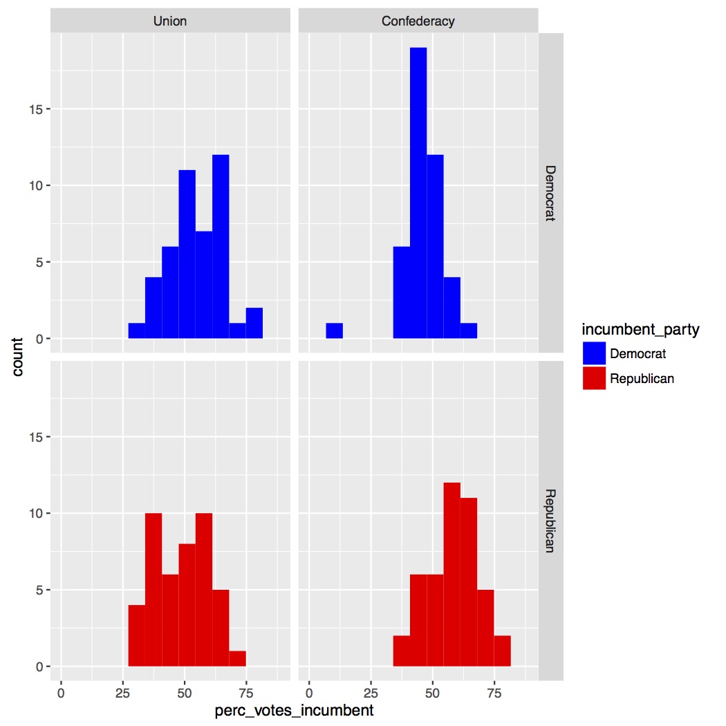
Now we can make our histogram. All of the calls should be familiar to you except the facet_grid() call. This call allows us to look at the four separate histograms for each grouping of our data: 1) Union – Democrat, 2) Confederacy – Democrat, 3) Union – Republican, and 4) Confederacy – Republican. I’ve also used a scale_fill_manual() call so that the Democrat data is blue and the Republican data is red to match the colors in United States politics. Copy and run the code to make the figure and save it to a PDF. You’ll get an error message about dropping one data point. That’s okay, that because of that “NA” for Alabama in 1964.
## MAKE FIGURES ####
# Histogram of full data set
incumbent_histogram_full.plot = ggplot(data_figs, aes(x = perc_votes_incumbent,
                                                      fill = incumbent_party)) +
                                geom_histogram(bins = 10) +
                                facet_grid(incumbent_party ~ civil_war) +
                                scale_fill_manual(values = c("blue", "red"))

pdf("figures/incumbent_histogram_full.pdf")
incumbent_histogram_full.plot
dev.off()
Below are our histograms. Overall they look pretty normal. Not perfect, but better than the Page data in Lesson 2, so I’m not going to do any kind of transform on the data.
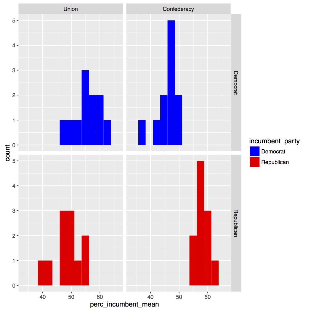
However, there’s one problem with this. We’re not running on statistics on the full data set. When we run our ANOVA it will be averaging over year, so really we should look at the histograms when we average the data over year. To do this first go back to top of your script in the “ORGANIZE DATA” section and at the bottom of the section we’re going to make a new data frame called “data_figs_state_sum” where we’ll average over year but still keep our state information. To do this we’ll do group_by() by “state” and our two independent variables (“incumbent_party”, “civil_war”), find the mean of our dependent variable (“perc_votes_incumbent”), and end by ungroup()ing. You’ll notice that the mean() call includes na.rm = T. When you calculate descriptive statistics in R such as mean, maximum, minimum, and there are “NA”s in the data R will by default return “NA”. To turn this off we say we want to remove (rm) the “NAs” (na) or na.rm = T. When you’re ready copy and run the code below.
# Average data over years but not states
data_figs_state_sum = data_figs %>%
                      group_by(state, incumbent_party, civil_war) %>%
                      summarise(perc_incumbent_mean =
                                      mean(perc_votes_incumbent, na.rm = T)) %>%
                      ungroup()
Now we can make our histograms on the data we’ll be running our ANOVA on. Go back down to the bottom of the script to add the new figure. The call is the same as our first plot just with a different data frame for data = . Now we won’t get the error message about dropping a row since we’ve averaged all of the years for the Alabama data. Copy and run the code below.
# Histogram of data averaged over years
incumbent_histogram_sum.plot = ggplot(data_figs_state_sum, aes(x = perc_incumbent_mean,
                                                               fill = incumbent_party)) +
                               geom_histogram(bins = 10) +
                               facet_grid(incumbent_party ~ civil_war) +
                               scale_fill_manual(values = c("blue", "red"))

pdf("figures/incumbent_histogram_sum.pdf")
incumbent_histogram_sum.plot
dev.off()
Our updated histograms have far fewer data points and look less normal than the full data set. However, I’m going to continue with the data as is since it’s not terrible skewed.
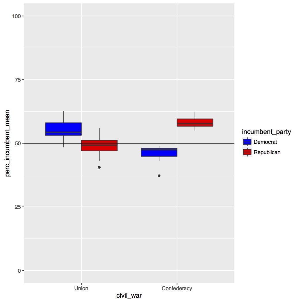
Now that we’ve confirmed our data is normal enough to run our ANOVA we can make a few more figures. We’ll start by making a grouped boxplot, similar to the grouped barplot we made in Lesson 4. All of the code below should be familiar to you. I’m setting the range of my y-axis from 0 to 100 since it is a percentage and I’m adding a horizontal line at 50%. Copy and run the code below.
# Boxplot
incumbent_boxplot.plot =
ggplot(data_figs_state_sum, aes(x = civil_war, y = perc_incumbent_mean, fill = incumbent_party)) +
                         geom_boxplot() +
                         ylim(0, 100) +
                         geom_hline(yintercept = 50) +
                         scale_fill_manual(values = c("blue", "red"))

pdf("figures/incumbent_boxplot.pdf")
incumbent_boxplot.plot
dev.off()
The boxplot is presented below. As you can see it looks like we have an interaction. States that were previously in the Union vote for incumbent Democrats much more than incumbent Republicans, but for states from the Confederacy it is the reverse. In fact, the difference is also larger for past Confederacy states than past Union states, suggesting that Confederacy states’ preference for Republicans is stronger than Union states’ preference for Democrats. Remember how Alabama was missing that one data point for Lyndon B. Johnson in 1964? Well Johnson was an incumbent Democrat.
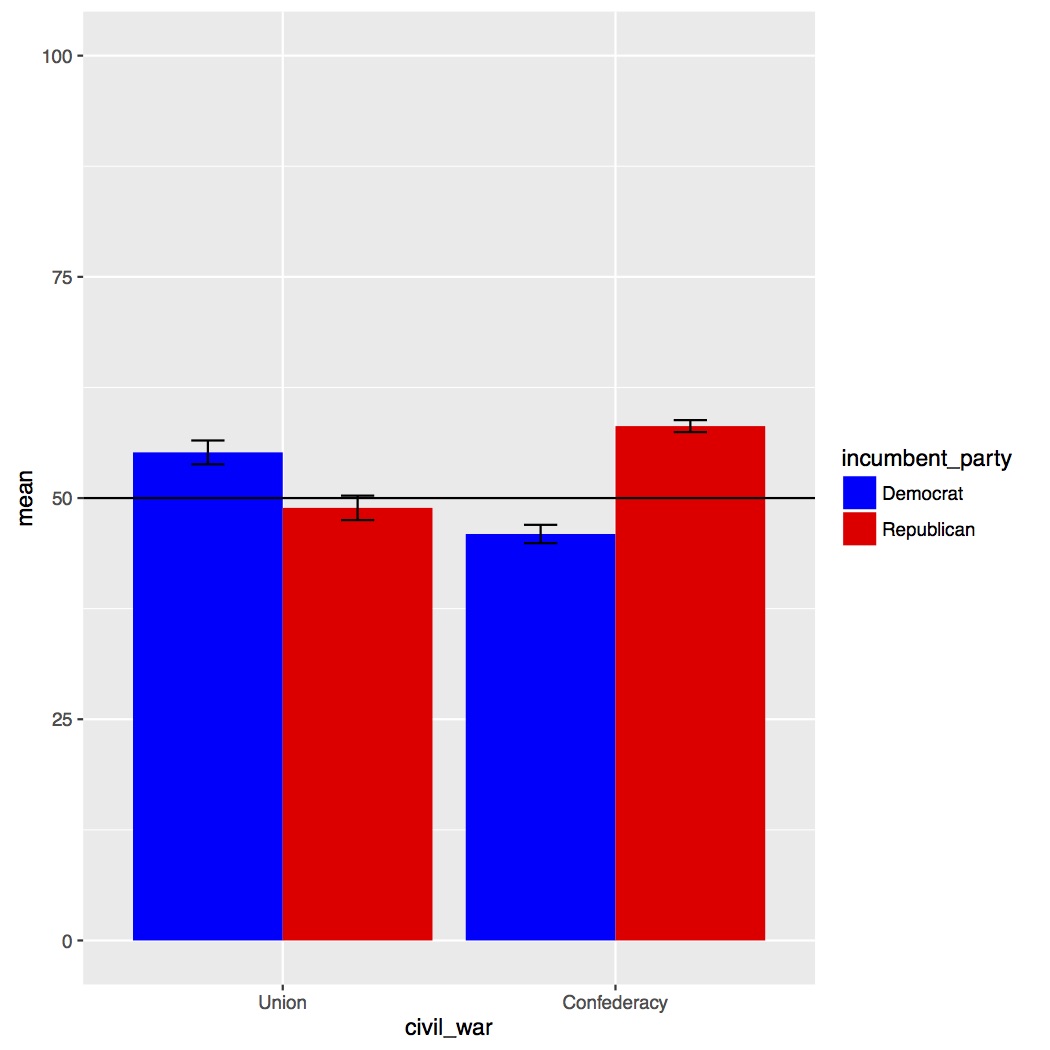
In addition to making a boxplot we’re also going to make a barplot with standard error bars, which in my experience is the most common type of plot in a paper with an ANOVA. I have strong feelings how in this situation a boxplot is preferred over a barplot (see the video to learn more), but you should still be able to make a barplot with error bars if needed. This can be kind of difficult in R though. I’ll be showing you my preferred method, but there are several other methods on the internet that work just as well. To make my barplot I need to start by making a new data frame where I take my data averaged over year (the data frame we used to make our second set of histograms and the boxplot) and now average over state as well. This will give me the means for each of the bars in my barplot. In addition to getting the means though I need some other information to be able to make my error bars, the standard deviation, sd(), and the number of data points in each group, n(). We can do all of this within a single summarise() call. Note, we know that all four bars have the same number of data points because we made sure it was balanced, but using n() instead of typing in the number directly is a good way to double check our work. Go back to the top of the script to the “ORGANIZE DATA” section and at the bottom of the section paste and run the code below.
# Data averaged over year and states for barplot
data_figs_sum = data_figs_state_sum %>%
                group_by(incumbent_party, civil_war) %>%
                summarise(mean = mean(perc_incumbent_mean, na.rm = T),
                          sd = sd(perc_incumbent_mean, na.rm = T),
                          n = n()) %>%
                ungroup()
As it stands we not have our four bars and three pieces of information: 1) mean, 2) standard deviation, and 3) number of data points. We still need some more information though to plot error bars. We’ll get this with three mutate() calls. In the first I’m going to compute the standard error for each of the bars, which is the standard deviation divided by the square root of the number of data points, or sd / sqrt(n). Next, I need to compute where to put the top and bottom of the bars. To do this we’ll add the mean and standard error together to get the high part of the error bar and subtract the standard error from the mean to get the low part of the error bar. All of this is just extending knowledge you already have about dplyr commands. When you’re ready, update and run the code below.
data_figs_sum = data_figs_state_sum %>%
                group_by(incumbent_party, civil_war) %>%
                summarise(mean = mean(perc_incumbent_mean, na.rm = T),
                          sd = sd(perc_incumbent_mean, na.rm = T),
                          n = n()) %>%
                ungroup() %>%
                mutate(se = sd / sqrt(n)) %>%
                mutate(se_high = mean + se) %>%
                mutate(se_low = mean - se)
Now we can make our barplots with error bars. Go back down to the bottom of the script to the figures section. The only new line of code should be for making the error bars themselves, the geom_errorbar() call. In the call we set the top and bottom of the bar and then a few addition features, like the width of the error bars and where to position them. For a more detailed explanation of the code watch the video. When you’re ready copy and run the code below.
# Barplot
incumbent_barplot.plot = ggplot(data_figs_sum, aes(x = civil_war,
                                                   y = mean,
                                                   fill = incumbent_party)) +
                         geom_bar(stat = "identity", position = "dodge") +
                         geom_errorbar(aes(ymin = se_low, ymax = se_high),
                                       width = 0.2,
                                       position = position_dodge(0.9)) +
                         ylim(0, 100) +
                         geom_hline(yintercept = 50) +
                         scale_fill_manual(values = c("blue", "red"))

pdf("figures/incumbent_barplot_sub.pdf")
incumbent_barplot.plot
dev.off()
Below is our barplot with error bars. Overall the picture is the same, as we clearly have an interaction of our two variables. However, by plotting like this we’ve lost a lot of information, such as the spread of our data or if there are any outliers.
In the script on GitHub you’ll see I’ve added several other parameters to my figures, such as adding a title, customizing how my axes are labeled, and changing where the legend is placed. Play around with those to get a better idea of how to use them in your own figures.
Save your script in the “scripts” folder and use a name ending in “_figures”, for example mine is called “rcourse_lesson5_figures”. Once the file is saved commit the change to Git. My commit message will be “Made figures script.”. Finally, push the commit up to Bitbucket.
Statistics Script
Open a new script and on the first few lines write the following, same as for our figures script. Unlike in previous lessons, this time we will be loading two new packages, tidyr and ez. If you haven’t used these packages before be sure to install them first using the code below. Note, this is a one time call, so you can type the code directly into the console instead of saving it in the script.
install.packages("tidyr")
install.packages("ez")
Once you have the packages installed, copy the code below to your script and and run it.
## READ IN DATA ####
source("scripts/rcourse_lesson5_cleaning.R")

## LOAD PACKAGES ####
library(tidyr)
library(ez)
We’ll also make a header for organizing our data. To get my data ready for the analysis I’m first going to reorder the levels for “civil_war” so it matches my figures. Next, I’m going to summarise over “year” the same way I did in the figures script. Copy and run the code below.
## ORAGANIZE DATA ####
# Make data for statistics
data_stats = data_clean %>%
             mutate(civil_war = factor(civil_war, levels = c("union", "confederacy"))) %>%
             group_by(state, incumbent_party, civil_war) %>%
             summarise(perc_incumbent_mean = mean(perc_votes_incumbent, na.rm = T)) %>%
             ungroup()
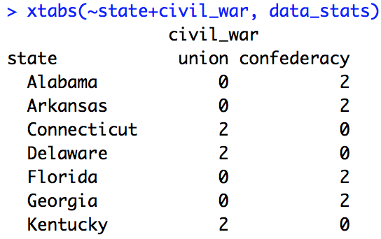
Before building my ANOVA I need to double check which variables are within-state and which are between-state. To do this I’ll simply use two xtabs() calls, each with “state” and then each of our variables. If I get 0s in some cells that means it’s between-state, if there is at least 1 in all cells the variable is within-state. Copy and run the code below.
# Check if incumbent party is within-state
xtabs(~state+incumbent_party, data_stats)

# Check if civil war is within-state
xtabs(~state+civil_war, data_stats)
Below are screenshots of the two xtabs() calls. Based on these outputs we can say that “incumbent_party” is a within-state variable, but “civil_war” is a between-state variable. This makes sense given that all states vote in (almost) all elections, but a state was either in the Union or the Confederacy during the civil war.

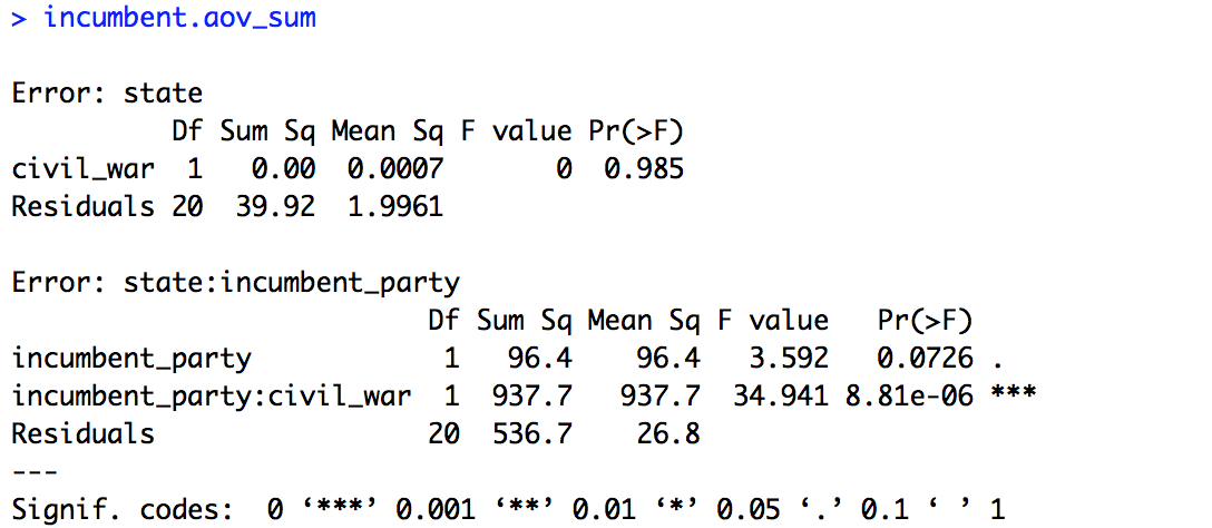
Now we can move to building our models. First we’ll use the built in R aov() call. We build our model like we would for any other model but then we add an error term for “state” by “incumbent_party”. We then save the summary output. Copy and run the code below.
## BUILD MODELS ####
# ANOVA (base R)
incumbent.aov = aov(perc_incumbent_mean ~ incumbent_party * civil_war +
                    Error(state/incumbent_party), data = data_stats)

incumbent.aov_sum = summary(incumbent.aov)
incumbent.aov_sum
The summary of the model is provided below. Going through our variables in order, it appears there is no effect of “civil_war” (p = 0.985) and there is a trending effect of “incumbent_party” (p = 0.0726). However, the interaction is very strong (p < 0.001). Remember, an ANOVA looks at variance between groups, but does not give us estimates the way a linear model does, so for this model we can’t know what direction our effects are going.
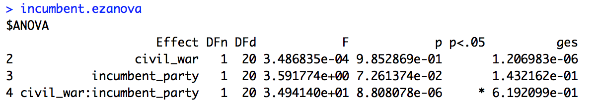
Before unpacking the interaction let’s build this same model but using the ezANOVA() call. All of the principles of the model are the same, only we’re going to make sure it computes a Type 3 sum of squares. Also with ezANOVA() we don’t need to save the summary call. Copy and run the code below.
# ezANOVA
incumbent.ezanova = ezANOVA(data.frame(data_stats),
                            dv = perc_incumbent_mean,
                            wid = state,
                            within = incumbent_party,
                            between = civil_war,
                            type = 3)

incumbent.ezanova
Below is the summary of the ANOVA. If you compare it to the model above, for example by looking at the F- or p-values, you’ll see they are identical. However, if our data set had been unbalanced we would see differences between these two methods. To see for yourself at the end of the lesson you can try running the two ANOVAs with data where you don’t filter out Union states to only include the first 11.
We’ve confirmed that we have a significant interaction as predicted from our figures. Now we want to do some follow-up analyses to test what our interaction really means. To do that we’ll run a series of t-tests, four in total: 1) Union states, Democrat vs. Republican, 2) Confederate states, Democrat vs. Republican, 3) Democrat incumbents, Union vs. Confederacy, and 4) Republican incumbents, Union vs. Confederacy. T-tests are a simple way to compare two groups. You can compare paired data (where a specific value in Group A has a specific paired value in Group B and the difference between each of those paired values is compared and summarised) or unpaired data (where Group A as a whole is compared to Group B as a whole). Also, since we’re running four addition tests I’m going to use Bonferroni correction and divide my original p-value for significance (0.05) by four, giving me a new p-value of 0.0125.
Before I run my t-tests though I need to prepare my data which will vary depending on if we’re running a paired or unpaired t-test. First I’ll filter out any unneeded part of the data, for example for the first t-test I’ll filter to only include Union states. For my first two t-tests I’ll want to do paired t-tests, since each state has both a value for Democrats and a value for Republicans, and I want to be sure that a given state has those two values paired together in the comparison. In my experience the best way to ensure that a t-test is pairing the correct values is to reformat your data such that you have one variable for the first value and one variable for the other value, then your paired values are in the same row in the data, just different columns. Now this is different from how our data is currently organized, where all of our data points from the dependent variable are in the same column. To reformat the data we’ll use the package tidyr and specifically the verb spread() which will spread out our data based on a key (the value to make columns out of) and a value (the value to put in the columns). To better understand what spread() is doing watch the video. Copy and run the code below.
# Prepare data for t-test
data_union_stats = data_stats %>%
                   filter(civil_war == "union") %>%
                   spread(incumbent_party, perc_incumbent_mean)
If you view the data frame “data_union_stats” you’ll see that there is now one row per state with separate columns for Democrats and Republicans. We’ll want to do the same thing for the Confederacy states. Copy and run the code below.
data_confederacy_stats = data_stats %>%
                         filter(civil_war == "confederacy") %>%
                         spread(incumbent_party, perc_incumbent_mean)
For our final two t-tests we don’t need them to be paired, since a state is either in the Union or the Confederacy, “civil_war” being our variable for comparison. We’ll still filter() our data, but there is no need to spread() it. Copy and run the code below.
data_democrat_stats = data_stats %>%
                      filter(incumbent_party == "democrat")

data_republican_stats = data_stats %>%
                        filter(incumbent_party == "republican")
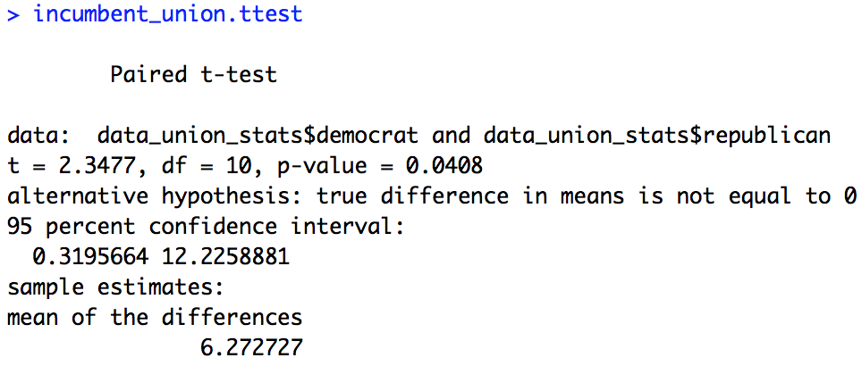
There are two possible syntaxes for a t-test in R. For our paired t-tests we’ll be using the version where we compare two columns. This is instead of writing it out as a y ~ x equation, since now our dependent variable is spread out over two columns, so this syntax wouldn’t make sense. We’ll also make sure to set paired = T. Copy and run the code below.
## FOLLOW-UP T-TESTS ####
# Effect of incumbent party, separated by civil war
incumbent_union.ttest = t.test(data_union_stats$democrat,
                               data_union_stats$republican,
                               paired = T)
incumbent_union.ttest

incumbent_confederacy.ttest = t.test(data_confederacy_stats$democrat,
                                     data_confederacy_stats$republican,
                                     paired = T)
incumbent_confederacy.ttest
Below are the results of the two t-tests. Based on these two t-tests we see that with p-value correction there is a significant effect of “incumbent_party” only for Confederacy states (Union: p = 0.0408, Confederacy: p < 0.001). A more interesting thing to look at is the mean of the differences. As you can see it is almost twice as large (and negative) for Confederacy states as compared to Union states. So, as we predicted based on our figures, the bias Confederacy states have for Republicans is much larger than the bias Union states have for Democrats.

Moving on to our next two t-tests, since we didn’t reformat the data we’re able to use the y ~ x syntax while being sure to set paired = F. Copy and run the code below.
# Effect of incumbent party, separated by civil war
incumbent_democrat.ttest = t.test(perc_incumbent_mean ~ civil_war,
                                  paired = F,
                                  data = data_democrat_stats)
incumbent_democrat.ttest

incumbent_republican.ttest = t.test(perc_incumbent_mean ~ civil_war,
                                    paired = F,
                                    data = data_republican_stats)
incumbent_republican.ttest
Below are the results of the two t-tests. Even with p-value correction we see a large effect of civil war country for both Democrat incumbents and Republican incumbents (p < 0.001). As predicted based on our figures the effect is also reversed for each, with Union states voting more for Democrats and Confederacy states more for Republicans.
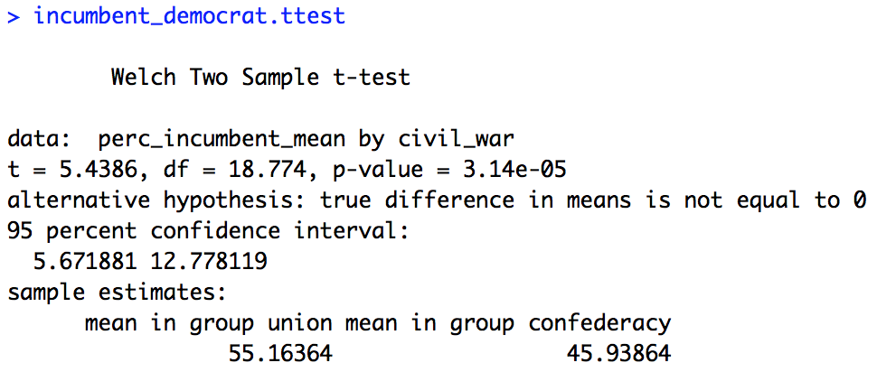
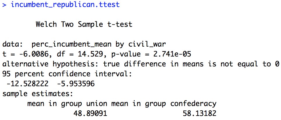
In the end our expectations based on the figure are confirmed statistically, there was an interaction of “incumbent_party” and “civil_war”. Via our t-tests we found that indeed the incumbency preference was flipped for previously Union and Confederacy states, and that the bias for one party was larger for Confederacy states than Union states.
You’ve now run an ANOVA and four t-tests in R! Save your script in the “scripts” folder and use a name ending in “_statistics”, for example mine is called “rcourse_lesson5_statistics”. Once the file is saved commit the change to Git. My commit message will be “Made statistics script.”. Finally, push the commit up to Bitbucket.
Write-up
Let’s make our write-up to summarise what we did today. First save your current working environment to a file such as “rcourse_lesson5_environment” to your “write_up” folder. If you forgot how to do this go back to Lesson 1. Open a new R Markdown document and follow the steps to get a new script. As before delete everything below the chuck of script enclosed in the two sets of ---. Then on the first line use the following code to load our environment.
```{r, echo=FALSE}
load("rcourse_lesson5_environment.RData")
```
Let’s make our sections for the write-up. I’m going to have four: 1) Introduction, 2) Data, 3) Results, and 4) Conclusion. See below for structure.
# Introduction


# Data


# Results


# Conclusion
In each of my sections I can write a little bit for any future readers. For example below is my Introduction.
# Introduction

Today I looked at election data from eight United States presidential elections (1964, 1972, 1980, 1984, 1992, 1996, 2004, 2012). Specifically, I looked at elections where an incumbent was running for president. I wanted to see if the percentage of the population that voted for the incumbent varied by the political party of the incumbent (Democrat, Republic) and whether the state was part of the Union or the Confederacy during the civil war.
I added my Data section to explain the fact that I filtered out some data points to make sure my ANOVA is balanced as described below.
# Data

Since I'm using an ANOVA today, I needed to make sure my data set was balanced. So, instead of taking all states that were officially states during the civil war, I made sure it was the same number in each group (Union, Confederacy). There were only 11 Confederacy states, so to get a matched sample of Union states I used data from the first 11 Union states that were admitted to the United States. For example, California was not included because it joined the United States later than other states.
I won’t present the entire results section but there’s one part I wanted to bring to your attention. In addition to being able to write R code in the ``` chunks you can also write it directly in the text with `r `. For example, in the text below I use the inline `r ` call to both compute my new p-value with Bonferroni correction, and to print the p-value of one of my t-tests. You’ll see I used the round() call to make sure my p-value only prints 4 digits out.
To better understand the interaction of incumbent party and civil war, I ran t-tests looking at my two main effects within subsets of the data. To account for my multiple tests, I did Bonferroni correction, making my new p-value for significance `r 0.05 / 4`. Looking first within civil war country, I ran paired t-tests to see if either group showed a difference of incumbent party. I found that for Union states there was not a significant effect given my p-value correction (*p* = `r round(incumbent_union.ttest$p.value, 4)`). However, for states from the Confederacy the effect was very strong (*p* < 0.001), showing that Confederacy states have a strong preference for Republican incumbents. By looking at the mean of the differences for each test we can further say that Confederacy states' preference is indeed much larger than Union states' preference.
Go ahead and fill out the rest of the document to include the full results and a conclusion , you can also look at the full version of my write-up with the link provided at the top of the lesson. When you are ready, save the script to your “write_up” folder (for example, my file is called “rcourse_lesson5_writeup”) and compile the HTML or PDF file. Once your write-up is made, commit the changes to Git. My commit message will be “Made write-up.”. Finally, push the commit up to Bitbucket. If you are done with the lesson you can go to your Projects menu and click “Close Project”.
Congrats! You can now do an ANOVA and follow-up t-tests in R!
Conclusion and Next Steps
Today you learned how to run an ANOVA, thus taking care of our baseline issues in a model with an interaction. You were also introduced to the packages tidyr and ez to modify a data frame’s format and run ANOVAs of different types, and as always expanded your knowledge of dplyr and ggplot2 calls. There are a several issues that may still come to mind. In the video I list a few of these potential problems. Next time we’ll be able to get around these various issues with linear mixed effects models.