Visualization has become a key application of data science in the telecommunications industry. Specifically, telecommunication analysis is highly dependent on the use of geospatial data.
This is because telecommunication networks in themselves are geographically dispersed, and analysis of such dispersions can yield valuable insights regarding network structures, consumer demand, and availability.
Data
To illustrate this point, a k-means clustering algorithm is used to analyze geographical data for free public WiFi in New York City. The dataset is available from NYC Open Data.
Specifically, the k-means clustering algorithm is used to form clusters of WiFi usage based on latitude and longitude data associated with specific providers.
From the dataset itself, the latitude and longitude data is extracted using R:
#1. Prepare data
newyork<-read.csv("NYC_Free_Public_WiFi_03292017.csv")
attach(newyork)
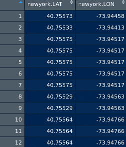
newyorkdf<-data.frame(newyork$LAT,newyork$LON)
Here is a snippet of the data:
Determine number of clusters
Now, the number of clusters need to be determined using a scree plot.
#2. Determine number of clusters
wss <- (nrow(newyorkdf)-1)*sum(apply(newyorkdf,2,var))
for (i in 2:20) wss[i] <- sum(kmeans(newyorkdf,
                                     centers=i)$withinss)
plot(1:20, wss, type="b", xlab="Number of Clusters",
     ylab="Within groups sum of squares")
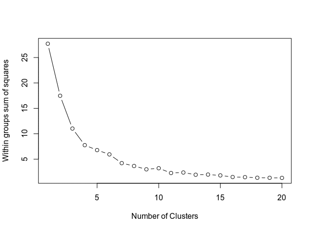
From the above, the curve levels out at approximately 11 clusters. Therefore, this is the number of clusters that will be used in the k-means model.
K-Means Analysis
The K-Means analysis itself is conducted:
#3. K-Means Cluster Analysis
set.seed(20)
fit <- kmeans(newyorkdf, 11) # 11 cluster solution
# get cluster means
aggregate(newyorkdf,by=list(fit$cluster),FUN=mean)
# append cluster assignment
newyorkdf <- data.frame(newyorkdf, fit$cluster)
newyorkdf
newyorkdf$fit.cluster <- as.factor(newyorkdf$fit.cluster)
library(ggplot2)
ggplot(newyorkdf, aes(x=newyork.LON, y=newyork.LAT, color = newyorkdf$fit.cluster)) + geom_point()
In the data frame newyorkdf, the latitude and longitude data, along with the cluster label is displayed:
> newyorkdf
     newyork.LAT newyork.LON fit.cluster
1       40.75573   -73.94458           1
2       40.75533   -73.94413           1
3       40.75575   -73.94517           1
4       40.75575   -73.94517           1
5       40.75575   -73.94517           1
6       40.75575   -73.94517           1
.....
80      40.84832   -73.82075          11
81      40.84923   -73.82105          11
82      40.84920   -73.82106          11
83      40.85021   -73.82175          11
84      40.85023   -73.82178          11
85      40.86444   -73.89455          11
Here is a visual illustration:
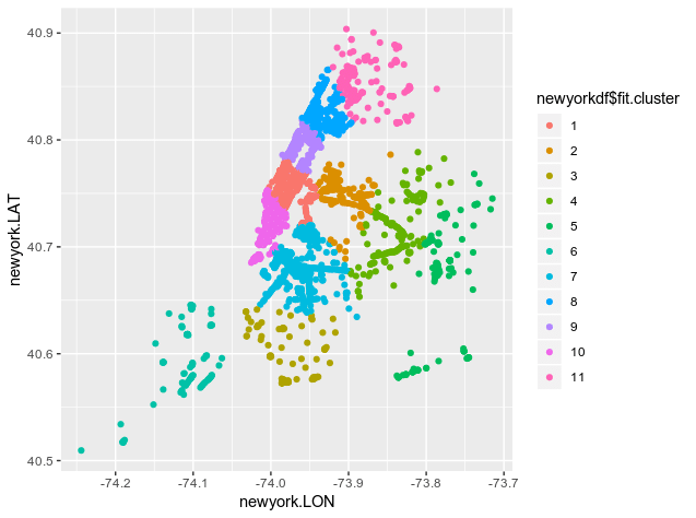
This illustration is useful, but the ideal scenario would be to append these clusters to a map of New York City itself.
Map Visualization
To generate a map of New York City, the nycmaps library is used, installable from the Github repo as indicated below.
devtools::install_github("zachcp/nycmaps")
library(nycmaps)
map(database="nyc")

#this should also work with ggplot and ggalt
nyc <- map_data("nyc")
gg  <- ggplot()
gg  <- gg +
  geom_map(
    data=nyc,
    map=nyc,
    aes(x=long, y=lat, map_id=region))
gg +
  geom_point(data = newyorkdf, aes(x = newyork.LON, y = newyork.LAT),
             colour = newyorkdf$fit.cluster, alpha = .5) + ggtitle("New York Public WiFi")
Upon running the above, a map of NYC is generated, along with the associated clusters:
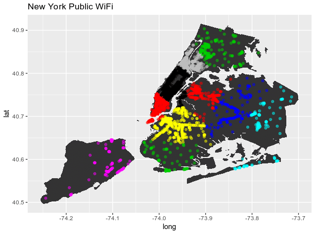
This type of clustering gives great insights into the structure of a WiFi network in a city. For instance, there are 650 separate points in cluster 1, whereas 100 points exist in cluster 6.
This indicates that the geographic region marked by cluster 1 shows heavy WiFi traffic. On the other hand, a lower number of connections in cluster 6 indicates low WiFi traffic.
K-Means Clustering in itself does not tell us why traffic for a specific cluster is high or low. For instance, it could be the case that cluster 6 has a high population density, but poor internet speeds result in fewer connections. However, this clustering algorithm provides a great starting point for further analysis – and makes it easier to gather additional information to determine why traffic density for one geographic cluster might be higher than another.
Conclusion
This example demonstrated how k-means clustering can be used with geographical data in order to visualize WiFi access points across New York City. In addition, we have also seen how k-means clustering can also indicate high and low-density zones for WiFi access, and the potential insights that can be extracted from this regarding population, WiFi speed, among other factors.
Thank you for your time!