In Linear regression statistical modeling we try to analyze and visualize the correlation between 2 numeric variables (Bivariate relation). This relation is often visualize using scatterplot. The aim of understanding this relationship is to predict change independent or response variable for a unit change in the independent or feature variable. Though the correlation coefficient is the not the only measure to conclude that 2 numeric variables are correlated even though they change with time.
The first step which is involved after data gathering, manipulation is creating your linear model by selecting the 2 numeric variables.
For a small dataset and with a little bit of domain knowledge we can find out such critical variables and start our analysis. But at times doing some pre-examination can make our variable selection simpler. This step can be referred to as a selection of prominent variables for our “LM” model.
So in this post, we will discuss 2 such very straightforward methods which can visually help us to identify a correlation between all available variables in our data set.
We will try to analyze the most basic and universal dataset iris
summary(iris)
##   Sepal.Length    Sepal.Width     Petal.Length    Petal.Width
##  Min.   :4.300   Min.   :2.000   Min.   :1.000   Min.   :0.100
##  1st Qu.:5.100   1st Qu.:2.800   1st Qu.:1.600   1st Qu.:0.300
##  Median :5.800   Median :3.000   Median :4.350   Median :1.300
##  Mean   :5.843   Mean   :3.057   Mean   :3.758   Mean   :1.199
##  3rd Qu.:6.400   3rd Qu.:3.300   3rd Qu.:5.100   3rd Qu.:1.800
##  Max.   :7.900   Max.   :4.400   Max.   :6.900   Max.   :2.500
##        Species
##  setosa    :50
##  versicolor:50
##  virginica :50
##
##
##
str(iris)
## 'data.frame': 150 obs. of 5 variables:
## $ Sepal.Length: num 5.1 4.9 4.7 4.6 5 5.4 4.6 5 4.4 4.9 ...
## $ Sepal.Width : num 3.5 3 3.2 3.1 3.6 3.9 3.4 3.4 2.9 3.1 ...
## $ Petal.Length: num 1.4 1.4 1.3 1.5 1.4 1.7 1.4 1.5 1.4 1.5 ...
## $ Petal.Width : num 0.2 0.2 0.2 0.2 0.2 0.4 0.3 0.2 0.2 0.1 ...
## $ Species : Factor w/ 3 levels "setosa","versicolor",..: 1 1 1 1 1 1 1 1 1 1 ...
Use of pairs(dataset) method
pairs(iris)
Gives this plot:
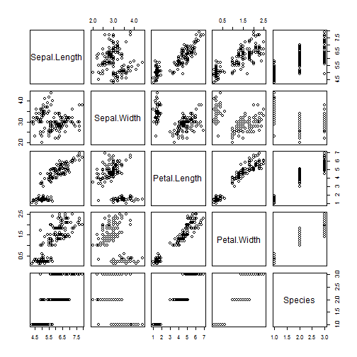
From the above results for mtcars and iris we can see that pairs() method produces a matrix of scatterplots between all possible variables of our dataset. How to read this matrix to gain insights? Every variable constitutes 1 row and 1 column of our pairs matrix. For example, we want to see the scatterplot and correlation between Sepal.Length and Petal.Length. Sepal.Length constitutes the 1st row and 1st column of the matrix. Similarly Petal.Length constitutes 3rd row and 3rd column of the matrix. The plot which is at the intersection of a 1st row and 3rd column or 3rd row and 1st column shows a correlation in terms of scatterplots between Sepal.Length and PetalLength. (refer plots on position (1,3) for Sepal.Length on Y axis and Petal.Length on X axis. And refer plot on position (3,1) for Petal.Length on Y axis and Sepal.Length on X axis).
Note: Interchanging of axes will only impact visualization of the plot but the correlation coefficient remains unchanged.
cor(iris$Sepal.Length,iris$Petal.Length)
## [1] 0.8717538
cor(iris$Petal.Length,iris$Sepal.Length)
## [1] 0.8717538
From the above matrix for iris we can deduce the following insights:
- Correlation between
Sepal.LengthandPetal.Lengthis strong and dense. Sepal.LengthandSepal.Widthseems to show very little correlation as datapoints are spreaded through out the plot area.Petal.LengthandPetal.Widthalso shows strong correlation.
Note: The insights are made from the interpretation of scatterplots(with no absolute value of the coefficient of correlation calculated). Some more examination will be required to be done once significant variables are obtained for linear regression modeling. (with help of residual plots, the coefficient of determination i.e Multiplied R square we can reach closer to our results)
As we saw in the matrix we are just provided with scatterplots which shows the relationship between various variables of our dataset. We have to visually beleive that correlation details shown are true or use cor(x,y) function to evaluate our insights further.
To overcome this we have one more very simple to implement method ggpairs(dataset). This method belongs to GGally package which also needs ggplot2 to be imported.
install.packages("ggplot2")
install.packages("GGally")
library(GGally)
library(ggplot2)
Now just one more line of code and it is done.
ggpairs(iris)
##
 plot: [1,1] [=>-------------------------------------------]  4% est: 0s
 plot: [1,2] [===>-----------------------------------------]  8% est: 2s
 plot: [1,3] [====>----------------------------------------] 12% est: 3s
 plot: [1,4] [======>--------------------------------------] 16% est: 3s
 plot: [1,5] [========>------------------------------------] 20% est: 3s
 plot: [2,1] [==========>----------------------------------] 24% est: 3s
 plot: [2,2] [============>--------------------------------] 28% est: 3s
 plot: [2,3] [=============>-------------------------------] 32% est: 3s
 plot: [2,4] [===============>-----------------------------] 36% est: 3s
 plot: [2,5] [=================>---------------------------] 40% est: 2s
 plot: [3,1] [===================>-------------------------] 44% est: 2s
 plot: [3,2] [=====================>-----------------------] 48% est: 2s
 plot: [3,3] [======================>----------------------] 52% est: 2s
 plot: [3,4] [========================>--------------------] 56% est: 2s
 plot: [3,5] [==========================>------------------] 60% est: 2s
 plot: [4,1] [============================>----------------] 64% est: 1s
 plot: [4,2] [==============================>--------------] 68% est: 1s
 plot: [4,3] [===============================>-------------] 72% est: 1s
 plot: [4,4] [=================================>-----------] 76% est: 1s
 plot: [4,5] [===================================>---------] 80% est: 1s
 plot: [5,1] [=====================================>-------] 84% est: 1s `stat_bin()` using `bins = 30`. Pick better value with `binwidth`.
##
 plot: [5,2] [=======================================>-----] 88% est: 0s `stat_bin()` using `bins = 30`. Pick better value with `binwidth`.
##
 plot: [5,3] [========================================>----] 92% est: 0s `stat_bin()` using `bins = 30`. Pick better value with `binwidth`.
##
 plot: [5,4] [==========================================>--] 96% est: 0s `stat_bin()` using `bins = 30`. Pick better value with `binwidth`.
##
 plot: [5,5] [=============================================]100% est: 0s
The plot:
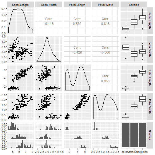
We have all necessary results above, and it even gives us some more insights. Compared to pairs() we are not just limited to scatterplots, but with ggpairs() we can see various plots for numeric/categorical variables.
What ggpairs provides use more thaAlong withairs()
- Alongwith scatterplots correlation coefficients are also providing in the same panel.
- Density plots for every numeric continuous variable help us to identify skewness, kurtosis and distribution information.
- Box plots are used to represent statistical summary for categorical and respective numeric variable.
- Bar charts
- Histograms
Additionaly you can also explore ggcorr() method of GGally which gives graphical representation of only correlation coefficients without any plots.
So we can conculde that the panel gives ample of necesaary insights but the process is a little bit time consuming compared to pairs() method.
Using some level of pre-examination over your dataset at the primary stage can help us identify significant variables for suitable regression models.