I don’t do a lot of plotting in my job, but I recently heard about a website called Plotly that provides a plotting service for anyone’s data. They even have a plotly package for Python (among others)! So in this article we will be learning how to plot with their package. Let’s have some fun making graphs!
Getting Started
You will need the plotly package to follow along with this article. You can use pip to get the package and install it:
pip install plotly
Now that you have it installed, you’ll need to go to the Plotly website and create a free account. Once that’s done, you will get an API key. To make things super simple, you can use your username and API key to create a credentials file. Here’s how to do that:
import plotly.tools as tls

tls.set_credentials_file(
        username="your_username",
        api_key="your_api_key")

# to get your credentials
credentials = tls.get_credentials_file()
If you don’t want to save your credentials, then you can also sign in to their service by doing the following:
import plotly.plotly as py
py.sign_in('your_username','your_api_key')
For the purposes of this article, I’m assuming you have created the credentials file. I found that makes interacting with their service a bit easier to use.
Creating a Graph
Plotly seems to default to a Scatter Plot, so we’ll start with that. I decided to grab some data from a census website. You can download any US state’s population data, along with other pieces of data. In this case, I downloaded a CSV file that contained the population of each county in the state of Iowa. Let’s take a look:
import csv
import plotly.plotly as py

#----------------------------------------------------------------------
def plot_counties(csv_path):
    """
    http://census.ire.org/data/bulkdata.html
    """
    counties = {}
    county = []
    pop = []

    counter = 0
    with open(csv_path) as csv_handler:
        reader = csv.reader(csv_handler)
        for row in reader:
            if counter  == 0:
                counter += 1
                continue
            county.append(row[8])
            pop.append(row[9])

    trace = dict(x=county, y=pop)
    data = [trace]
    py.plot(data, filename='ia_county_populations')

if __name__ == '__main__':
    csv_path = 'ia_county_pop.csv'
    plot_counties(csv_path)
If you run this code, you should see a graph that looks like this:
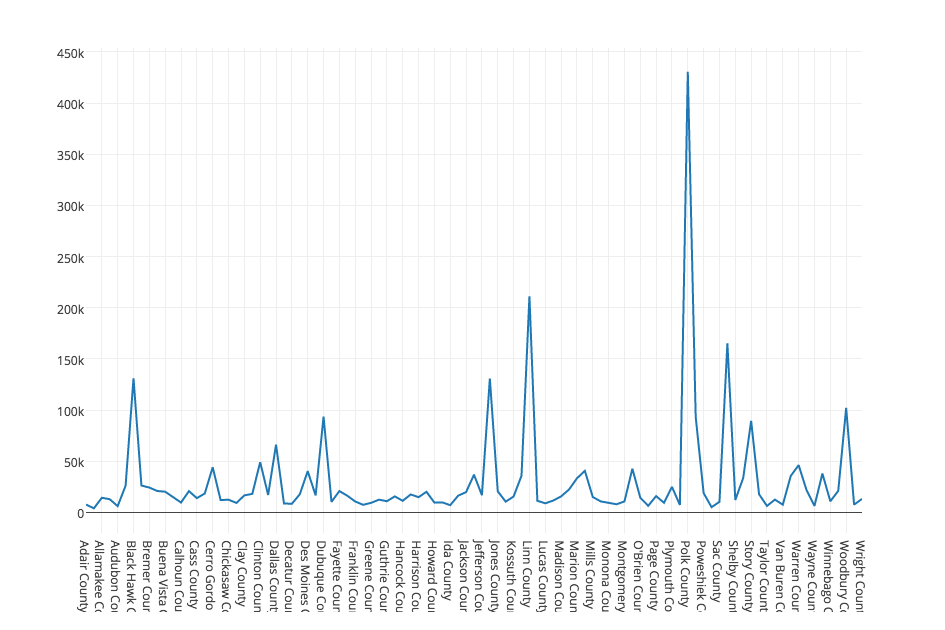
You can also view the graph here. Anyway, as you can see in the code above, all I did was read the CSV file and extract out the county name and the population. Then I put that data into two different Python lists. Finally I created a dictionary of those lists and then wrapped that dictionary in a list. So you end up with a list that contains a dictionary that contains two lists! To make the Scatter Plot, I passed the data to plotly’s plot method.
Converting to a Bar Chart
Now let’s see if we can change the ScatterPlot to a Bar Chart. First off, we’ll play around with the plot data. The following was done via the Python interpreter:
>>> scatter = py.get_figure('driscollis', '0')
>>> print scatter.to_string()
Figure(
    data=Data([
        Scatter(
            x=[u'Adair County', u'Adams County', u'Allamakee County', u'..', ],
            y=[u'7682', u'4029', u'14330', u'12887', u'6119', u'26076', '..'  ]
        )
    ])
)
This shows how we can grab the figure using the username and the plot’s unique number. Then we printed out the data structure. You will note that it doesn’t print out the entire data structure. Now let’s do the actual conversion to a Bar Chart:
from plotly.graph_objs import Data, Figure, Layout

scatter_data = scatter.get_data()
trace_bar = Bar(scatter_data[0])
data = Data([trace_bar])
layout = Layout(title="IA County Populations")
fig = Figure(data=data, layout=layout)
py.plot(fig, filename='bar_ia_county_pop')
This will create a bar chart at the following URL: https://plot.ly/~driscollis/1.
Here’s the image of the graph:
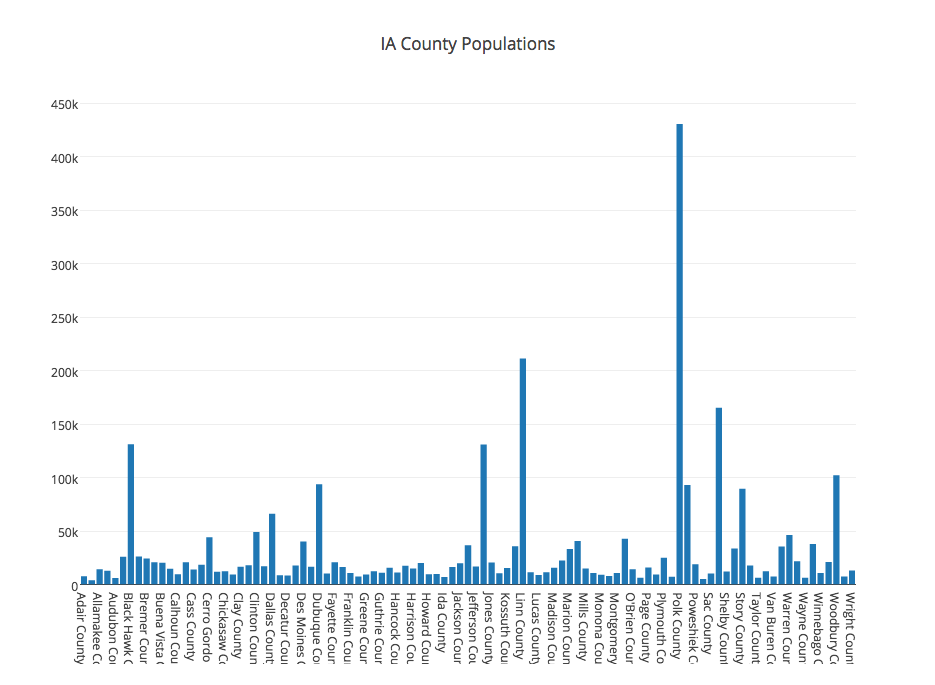
This code is slightly different than the code we used originally. In this case, we explicitly created a Bar object and passed it the scatter plot’s data. Then we put that data into a Data object. Next we created a Layout object and gave our chart a title. Then we created a Figure object using the data and layout objects. Finally we plotted the bar chart.
Saving the Graph to Disk
Plotly also allows you to save your graph to your hard drive. You can save it in the following formats: png, svg, jpeg, and pdf. Assuming you still have the Figure object from the previous example handy, you can do the following:
py.image.save_as(fig, filename='graph.png')
If you want to save using one of the other formats, then just use that format’s extension in the filename.
Wrapping Up
At this point you should be able to use the plotly package pretty well. There are many other graph types available, so be sure to read Plotly’s documentation thoroughly. They also support streaming graphs. As I understand it, Plotly allows you to create 10 graphs for free. After that you would either have to delete some of your graphs or pay a monthly fee.
Additional Reading
- Plotly Python documentation
- Plotly User Guide
If you have question you can leave a comment below.