Coding is fun, especially when your “weapon of choice” is Python! So, I would like to take you through this Python Matplotlib tutorial. In this tutorial, I will be talking about various platforms in matplotlib.
Matplotlib is a widely used python based library; it is used to create 2d Plots and graphs easily through Python script, it got another name as a pyplot. By using pyplot, we can create plotting easily and control font properties, line controls, formatting axes, etc. It also provides a massive variety of plots and graphs such as bar charts, histogram, power spectra, error charts, etc.
For matplotlib Tutorial, you will learn how to visualize data and new data structures along the way you will master control structures which you will need to customize the flow of your scripts and algorithms.
This tutorial is all about data visualization, with the help of data, Matlab creates 2d Plots and graphs, which is an essential part of data analysis. Recent years we have seen data visualization has got massive demand like never before. Organizations realized that without data visualization it would be challenging them to grow along with the growing completion in the market.
What is Data Visualization
Data visualization is a modern visualization communication. It involves the creation and study of the visual representation of data. Which is used to make the decision-making process and helps to quickly understand the analytics presented visually so everyone can grasp difficult concepts or identify new patterns.
Why we need data visualization
Let us assume you are working as a data analyst in an organization, and you must possess the skill set to make specific analysis and present it to your boss for his better understanding purpose, to make it more transparent and easy to understand by the reader we need to use specific tools, one among them is matplotlib.
Now let us go ahead in this post and try to find various kinds of plots available in matplotlib.
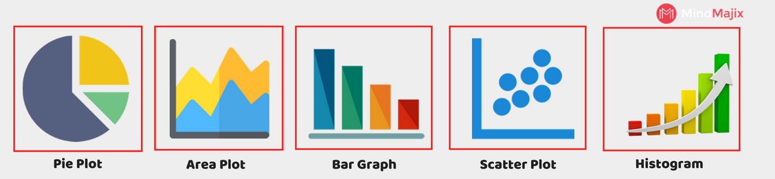
Python Matplotlib: Types of Plots
Here I presented different kind of plots which is created by python Matlab, below are few among them.
I will present each one in detail, before that we need to understand the basic concepts (Coding Part) in matplotlib to Create a graph.
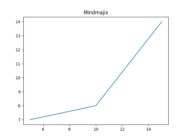
import matplotlib.pyplot as xyz
xyz.plot([5,10,15],[7,8,14])
xyz.title('Mindmajix')
xyz.show()
Gives this plot:
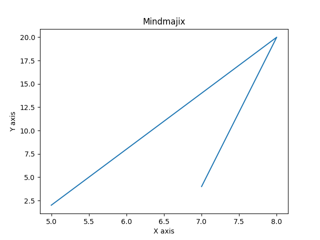
With the small code, we can create a simple graph through python matplotlib. Now we can jump into how to add labels and titles to the graph.
import matplotlib.pyplot as xyz
a = [5,9,7]
b = [2,20,4]
xyz.plot(a,b)
xyz.title('Mindmajix')
xyz.ylabel('y axis')
xyz.xlabel('x axis')
xyz.show()
Gives this plot:
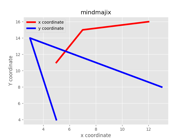
In python matplotlib we can create unusual ways to create simple graphs and plots, here we can change the color and width of graph line or grid lines where we want to style. So here I demonstrate to you how to add styles to a graph using matplotlib.
import matplotlib.pyplot as xyz
from matplotlib import style
style.use('ggplot')
a = [5,7,12]
b= [11,15,16]
ab = [5,3,13]
cd = [4,14,8]
xyz.plot(a,b,label='x coordinate', linewidth=4,color='red')
xyz.plot(ab,cd,label='y coordinate',linewidth=4,color='blue')
xyz.title('mindmajix')
xyz.ylabel('Y coordinate')
xyz.xlabel('x coordinate')
xyz.legend()
xyz.show()
Gives this plot:
Next, I demonstrated here python matplotlib, we will know the multiple types of plots. First, start with the bar graph!
Python Matplotlib: Bar Graph
Here we understand what the use of a bar graph is. A bar graph is used to compare different types of data sets, with bar graphs we can measure the changes over a period. It can be portrayed vertically or horizontally. Now it’s time for practical implementation using python matplotlib.
import matplotlib.pyplot as xyz
xyz.bar([0.24,1.20,2.24,3.20,4.22],[40,30,60,70,10],
label="car",width=.5)
xyz.bar([.65,1.65,2.55,3.85,4.85],[70,10,20,40,30],label="bus",width=.5)
xyz.legend()
xyz.xlabel('Days')
xyz.ylabel('Distance (kms)')
xyz.title('mindmajix')
xyz.show()
Above plot is portrayed the difference between the two vehicles over a period of 5 days. Now we can move on Histogram
Python Matplotlib – Histogram
Here we need to understand the difference between bar graph and histogram, In bar graphs are basically we used to display categorical data that is data that fits into different data sets.
On the other hand, Histograms is used to portray “continuous data,” that is data that represents measured quantity, the numbers can take on any value in a specific range.
import matplotlib.pyplot as xyz
avarage_age_of_population = [21,54,66,44,31,42,54,62,92,9,102,95,5,45,11,32,54,98,87,67,76,65,97,54,35,13,48,41,4]
bins = [0,5,15,20,25,30,35,40,45,50]
xyz.hist(avarage_age_of_population, bins, histtype='bar',rwidth=0.9)
xyz.xlabel('age groups')
xyz.ylabel('Number of people')
xyz.title('Histogram')
xyz.show()
Gives this plot:

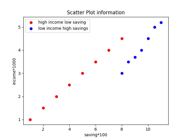
Python Matplotlib:Scatter Plot
Using Scatter plots we need compare variables in plots, Consider the below example
import matplotlib.pyplot as xyz
a = [2,4,6,8,10,12,14,16]
b = [1,1.5,2,2.5,3,3.5,4,4.5]
ab=[8,8.5,9,9.5,10,10.5,11]
cd=[3,3.5,3.7,4,4.5,5,5.2]
xyz.scatter(a,b,label='high income low saving',color='r')
xyz.scatter(ab,cd,label='low income high savings',color='b')
xyz.xlabel('saving*100')
xyz.ylabel('income*1000')
xyz.title('Scatter Plot information')
xyz.legend()
xyz.show()
Gives this plot:
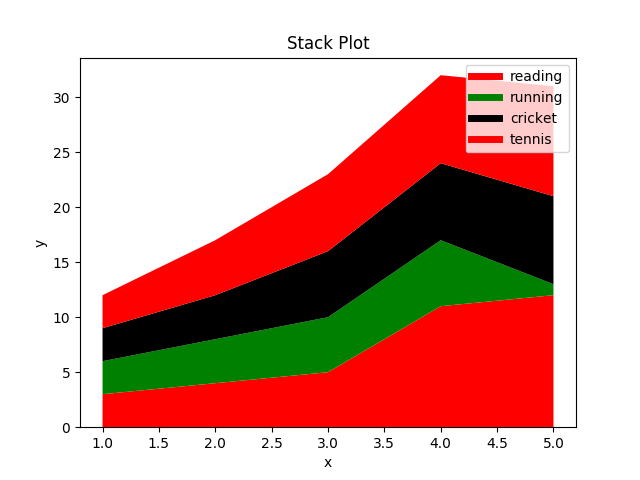
7 Python Matplotlib:Area Plot
import matplotlib.pyplot as xyz
weeks = [4,2,3,7,6]
reading=[4,5,6,11,12]
running = [2,5,7,6,1]
cricket=[3,4,6,7,8]
tennis = [3,4,7,8,10]
xyz.plot([],[],color='r', label='reading', linewidth=5)
xyz.plot([],[],color='g', label='running', linewidth=5)
xyz.plot([],[],color='k', label='cricket', linewidth=5)
xyz.plot([],[],color='r', label='tennis', linewidth=5)
xyz.stackplot(days,reading,running,cricket,tennis, colors=['r','g','k','r'])
xyz.xlabel('x')
xyz.ylabel('y')
xyz.title('Stack Plot')
xyz.legend()
xyz.show()
Gives this plot:
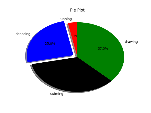
8 Python Matplotlib:Pie Chart
Pie charts are used to track changes over a period for one are more related data that make hole category. Here are a few examples.
import matplotlib.pyplot as xyz
weeks = [3,2,4,2,6]
running =[1,3,5,12,4]
dancing = [1,2,3,5,4]
swimming =[3,4,5,6,7]
drawing = [9,2,3,4,13]
slices = [3,23,32,34]
activities = ['running','dancing','swimming','drawing']
cols = ['r','b','k','g']
xyz.pie(Slces,
Labels=activities,
Colors=cols,
Startangle=80,
Shadow= True,
Explode=(0,0.1,0,0),
Autopct='%1.1f%%')
xyz.title('Pie Plot')
xyz.show()
Gives this plot:
With this, we have completed our python matplotlib tutorial and we have covered all basics of matplotlib. I hope you are clear with the topic now, and soon I will come up with a few more blogs on python. Until then you can find a python blog post at Mindmajix.