A reader asked in a comment to my post on interpreting two-way interactions if I could also explain interaction between two categorical variables and one continuous variable. Rather than just dwelling on this particular case, here is a full blog post with all possible combination of categorical and continuous variables and how to interpret standard model outputs.
Do note that three-way interactions can be (relatively) easy to understand conceptually but when it comes down to interpreting the meaning of individual coefficients it will get pretty tricky.
Three categorical variables
The first case is when all three interacting variables are categorical, something like: country, sex, education level.
The key insight to understand three-way interactions involving categorical variables is to realize that each model coefficient can be switched on or off depending on the level of the factors. It is worth considering the equation for such a model:
$$y = Intercept + F12 * (F1 == 2) + F22 * (F2 == 2) + F23 * (F2 == 3) + F24 * (F2 == 4) + \\ F32 * (F3 == 2) + F12:F22 * (F1 == 2) * (F2 == 2) + F12:F23 * (F1 ==2) * (F2 == 3) + \\ F12:F24 * (F1 == 2) * (F2 == 4) + F12:F32 * (F1 == 2) * (F3 == 2) + F22:F32 * (F2 == 2) * (F3 == 2) + \\ F23:F32 * (F2 == 3) * (F3 == 2) + F24:F32 * (F2 == 4) * (F3 == 2) + F12:F22:F32 * (F1 == 2) * (F2 == 2) * (F3 == 2) + \\ F12:F23:F32 * (F1 == 2) * (F2 == 3) * (F3 == 2) + F12:F24:F32 * (F1 == 2) * (F2 == 4) * (F3 == 2)$$
This might seem overwhelming at first but bear with me a little while longer. In this equation the (FX == Y) are so-called indicator functions, for instance (F1 == 2) returns a 1 when the level of the factor F1 is equal to 2 and return 0 in all other cases. These indicator function will switch on or off the regression coefficient depending on the particular combination of factor levels.
Got it? No? Then let’s simulate some data to see how an example can help us get a better understanding:
set.seed(20170925) #to get stable results for nicer plotting
#three categorical variables
dat <- data.frame(F1=gl(n = 2,k = 50),
                  F2=factor(rep(rep(1:4,times=c(12,12,13,13)),2)),
                  F3=factor(rep(c(1,2),times=50)))
#the model matrix
modmat <- model.matrix(~F1*F2*F3,dat)
#effects
betas <- runif(16,-2,2)
#simulate some response
dat$y <- rnorm(100,modmat%*%betas,1)
#check the design
xtabs(~F1+F2+F3,dat)
#model
m <- lm(y~F1*F2*F3,dat)
summary(m)
Call: lm(formula = y ~ F1 * F2 * F3, data = dat)
 Residuals: Min 1Q Median 3Q Max
-2.23583 -0.49807 0.01231 0.60524 2.31008

  Coefficients: Estimate Std. Error t value Pr
(Intercept)   1.2987     0.3908   3.323  0.00132 **
F12           1.1204     0.5526   2.027  0.04579 *
F22          -0.7929     0.5526  -1.435  0.15507
F23          -1.6522     0.5325  -3.103  0.00261 **
F24           1.4206     0.5526   2.571  0.01191 *
F32           0.2779     0.5526   0.503  0.61637
F12:F22      -1.5760     0.7815  -2.017  0.04694 *
F12:F23      -0.9997     0.7531  -1.327  0.18797
F12:F24      -0.2002     0.7815  -0.256  0.79846
F12:F32      -0.5022     0.7815  -0.643  0.52224
F22:F32      -0.3491     0.7815  -0.447  0.65627
F23:F32      -2.2512     0.7674  -2.933  0.00432 **
F24:F32      -0.5596     0.7674  -0.729  0.46791
F12:F22:F32   0.9872     1.1052   0.893  0.37430
F12:F23:F32   1.6078     1.0853   1.481  0.14224
F12:F24:F32   1.8631     1.0853   1.717  0.08972 .
---
Signif. codes:  0 ‘***’ 0.001 ‘**’ 0.01 ‘*’ 0.05 ‘.’ 0.1 ‘ ’ 1
Residual standard error: 0.9572 on 84 degrees of freedom
Multiple R-squared: 0.8051, Adjusted R-squared: 0.7703
F-statistic: 23.13 on 15 and 84 DF, p-value: < 2.2e-16
The understanding raw model outcome is made easier by going through specific cases by setting the different variables to different levels.
For instance say we have an observation where F1 == 1, F2 == 1 and F3 == 1, in this case we have:
$$y_i = Intercept + F12 * 0 + F22 * 0 + F23 * 0 + F24 * 0 + F32 * 0 and so on …$$
So in this case our model predicted a value of:
coef(m)[1]
(Intercept)
1.298662
Now if we have F1 == 2, F2 == 1 and F3 == 1 we have:
$$y_i = Intercept + F12 * 1 + F22 * 0 + F23 * 0 + F24 * 0 + F32 * 0 and so on …$$
Model prediction in this case is:
coef(m)[1] + coef(m)[2]

(Intercept)
2.419048
Let’s get a bit more complicated, for cases where: F1 == 2, F2 == 3 and F3 == 2:
$$y_i = Intercept + F12 * 1 + F22 * 0 + F23 * 1 + F24 * 0 + F32 * 1 + F12:F22 * 0 + F12:F23 * 1 + F12:F32 * 1 + F22:F32 * 0 + F23:F32 * 1 + F24:F32 * 0 + F12:F22:F32 * 0 + F12:F23:F32 * 1 + F12:F24:F32 * 0$$
Model prediction in this case is:
coef(m)[1] + coef(m)[2] + coef(m)[4] + coef(m)[6] + coef(m)[8] + coef(m)[10] + coef(m)[12] + coef(m)[16]
(Intercept)
-0.8451774
The key message from all this tedious writing is that the interpretation of model coefficient involving interactions cannot be easily done when considering coefficient in isolation. One needs to add coefficients together to get predicted values in different cases and then one can compare how going from one level to the next affect the response variable.
When plotting interactions you have to decide which variables you want to focus on, as depending on how you specify the plot certain comparison will be easier than others. Here I want to focus on the effect of F1 on my response:
#model prediction
pred <- expand.grid(F1=factor(1:2),F2=factor(1:4),F3=factor(1:2))
pred$y <- predict(m,pred)
#plot
ggplot(dat,aes(x=F2,y=y,fill=F1))+geom_boxplot(outlier.size = 0,color=NA)+
facet_grid(~F3,labeller="label_both")+
geom_linerange(data = pred[1:2,],aes(ymin=y[1],ymax=y[2]),color="orange",size=2) +
geom_text(data = pred[1,],aes(label="F12",hjust=0.4,vjust=4))+
geom_linerange(data=pred[3:4,],aes(ymin=y[1],ymax=y[2]),color="orange",size=2)+
geom_text(data = pred[3,],aes(label="F12+\nF12:F22",hjust=0.35,vjust=2))+
geom_linerange(data=pred[5:6,],aes(ymin=y[1],ymax=y[2]),color="orange",size=4)+
geom_text(data = pred[5,],aes(label="F12+\nF12:F23",hjust=0.35,vjust=-0.5))+
geom_linerange(data=pred[7:8,],aes(ymin=y[1],ymax=y[2]),color="orange",size=2)+
geom_text(data = pred[7,],aes(label="F12+\nF12:F24",hjust=0.35,vjust=2))+
geom_linerange(data = pred[9:10,],aes(ymin=y[1],ymax=y[2]),color="orange",size=2) +
geom_text(data = pred[9,],aes(label="F12",hjust=0.4,vjust=-3))+
geom_linerange(data = pred[11:12,],aes(ymin=y[1],ymax=y[2]),color="orange",size=2) +
geom_text(data = pred[11,],aes(label="F12+F12:F22+\nF12:F32\n+F12:F22:F32",hjust=0.4,vjust=0))+
geom_linerange(data = pred[13:14,],aes(ymin=y[1],ymax=y[2]),color="orange",size=2) +
geom_text(data = pred[13,],aes(label="F12+F12:F23+\nF12:F32\n+F12:F23:F32",hjust=0.4,vjust=1.2))+
geom_linerange(data = pred[15:16,],aes(ymin=y[1],ymax=y[2]),color="orange",size=2) +
geom_text(data = pred[15,],aes(label="F12+F12:F24+\nF12:F32\n+F12:F24:F32",hjust=0.7,vjust=1))+
geom_point(data=pred)
Gives this plot:
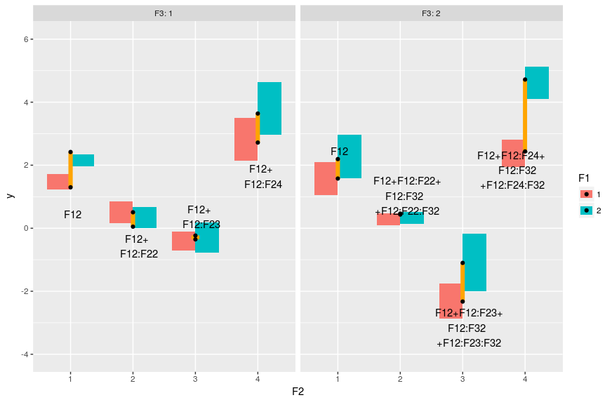
The boxes represent the distribution in the data, the black dots represent the model predicted values and the orange line the differences between F1==1 and F1==2, the text is the model coefficients that make up these differences. So basically the two-way interaction coefficients change the effect of F1 on the response, and the three-way interactions change the changes of the effect.
Two categorical variables and on continuous variable
In this case we have one continuous variable (like height) and two categorical ones, again we’ll simulate some data and explore the model output:
dat <- data.frame(F1=gl(n = 2,k = 50),F2=factor(rep(1:2,times=50)),X1=runif(100,-2,2))

modmat <- model.matrix(~F1*F2*X1,dat)
#the coefs
betas <- runif(8,-2,2)
#simulate some data
dat$y <- rnorm(100,modmat%*%betas,1)
#fit a model
m <- lm(y ~ X1*F1*F2, dat)
summary(m)
We will split up the interpretation of such model in two parts: (i) interpret the intercept (when X1 = 0) and (ii) interpret the slopes, the effect of X1 on y.
#model predictions
pred <- expand.grid(X1 = c(min(dat$X1),0,max(dat$X1)),F1=factor(1:2),F2=factor(1:2))
pred$y <- predict(m,pred)

#intercept for F1=1 & F2=1
coef(m)[1]
#intercept for F1=2 & F2=1
coef(m)[1] + coef(m)[3]
#intercept for F1=1 & F2=2
coef(m)[1] + coef(m)[4]
#intercept for F1=2 & F2=2
coef(m)[1] + coef(m)[3] + coef(m)[4] + coef(m)[7]

#understanding the estimates: the intercepts
ggplot(dat,aes(x=X1,y=y,color=F1))+geom_point()+
facet_grid(.~F2,labeller = "label_both")+
stat_smooth(method="lm",se=FALSE)+
geom_linerange(data=pred[c(2,5),],aes(ymin=y[1],ymax=y[2]),
size=2,color="orange")+
geom_text(data=pred[2,],aes(label="F12"),vjust=4,color="black")+
geom_linerange(data=pred[c(8,11),],aes(ymin=y[1],ymax=y[2]),
size=2,color="orange")+
geom_text(data=pred[8,],aes(label="F12+\nF12:F22"),vjust=2,color="black") +
geom_point(data=pred[pred$X==0,],color="black")
Gives this plot:
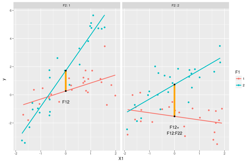
Again the black dots represent the estimated reponse values when X1 = 0. This way of ploting emphasize the effect of X1 and F1 on y. In this case we clearly see that the effect of F12:F22 is to add up some extra deviation on top of F12 and F22. We could go through the expected effect of the two categorical variables, but as this is very similar to what we did just before we’ll go through the changes of slopes:
#understanding the estimates: the slopes
#slope for F1=1 & F2=1
coef(m)[2] #slope of the red line in the left-hand side panel below
#slope for F1=2 & F2=1
coef(m)[2] + coef(m)[5] #slope of the blue line on the left-hand side panel below
#slope for F1=1 & F2=2
coef(m)[2] + coef(m)[6] #slope of the red line on the right-hand side panel below
#slope for F1=2 & F2=2
coef(m)[2] + coef(m)[5] + coef(m)[6] + coef(m)[8] #slope of the blue line on the right-side panel below

#putting this in a graph
ggplot(dat,aes(x=X1,y=y,color=F1))+geom_point()+
facet_grid(.~F2,labeller = "label_both")+
stat_smooth(method="lm",se=FALSE)+
geom_point(data=pred[pred$X!=0,],color="black")+
geom_line(data=pred[c(1,4),],arrow=arrow(),color="orange")+
geom_line(data=pred[c(3,6),],arrow=arrow(),color="orange")+
geom_line(data=pred[c(7,10),],arrow=arrow(),color="orange")+
geom_line(data=pred[c(9,12),],arrow=arrow(),color="orange")+
geom_text(data=pred[1,],aes(label="X1:F12",hjust=-3,vjust=-4),color="black")+
geom_text(data=pred[9,],aes(label="X1:F12+X1:F12:F22",hjust=1.5,vjust=3),color="black")
Gives this plot:
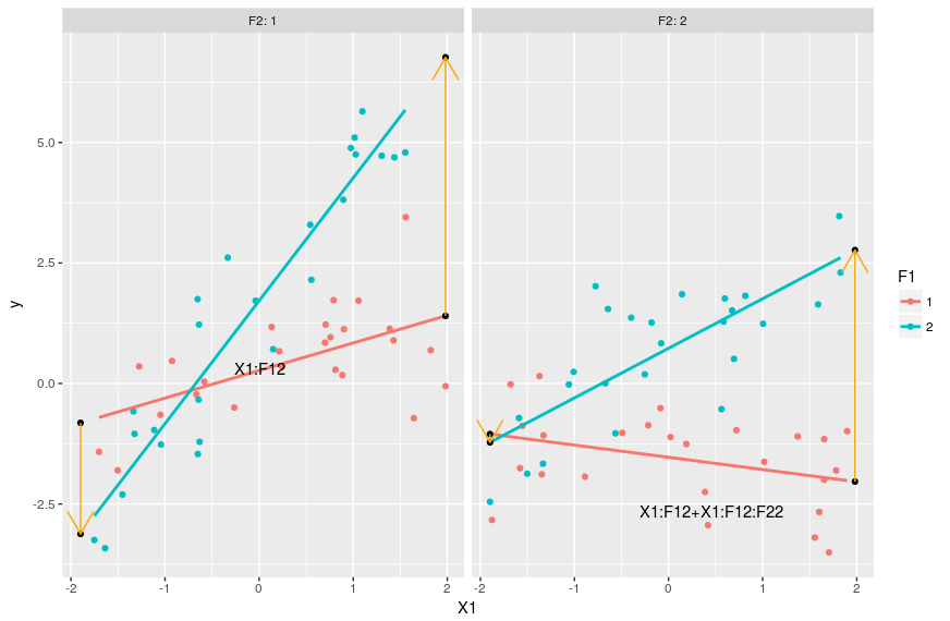
The slope coefficient for these four lines are given in the code above, computing it consist in just adding terms with “X1” in them and some interaction based on the levels of the categorical variables. The orange arrows show the changes in the slope between F1=1 and F1=2 and on which coefficient these changes depends. With this graph we see that we can interprete coefficient X1:F12 as changing the X1 slope when F2=1 and F1=2 compared to the X1 slope when both F1 and F2 are 1. The parameter X1:F12:F22 then allow for extra variation in the X1 slope when both F1 and F2 are 2. Again these coefficient can be pretty tricky to interprete in isolation, the best way to grasp their meanings and effects is by combining them.
2 continuous variables and one categorical variable
The third case concern models that include 3-way interactions between 2 continuous variable and 1 categorical variable. Interaction between continuous variables can be hard to interprete as the effect of the interaction on the slope of one variable depend on the value of the other. Again an example should make this clearer:
dat <- data.frame(X1=runif(100,-2,2),X2=runif(100,-2,2),F1=gl(n = 2,k = 50))
modmat <- model.matrix(~X1*X2*F1,dat)
betas <- runif(8,-2,2)
dat$y <- rnorm(100,modmat%*%betas,1)

m <- lm(y~X1*X2*F1,dat)
#model prediction
pred <- expand.grid(X1=c(min(dat$X1),0,max(dat$X1)),X2=c(min(dat$X2),0,max(dat$X2)),F1=factor(1:2))
pred$y <- predict(m,pred)
#understanding the estimates: the intercept
#X1=0 & X2=0 & F1=1
coef(m)[1]
#X1=0 & X2=0 & F1=2
coef(m)[1] + coef(m)[4]

#understanding the estimate: the slopes
#slope of X1 when X2=0 and F1=1
coef(m)[2]
#slope of X1 when X2=0 and F1=2
coef(m)[2] + coef(m)[6]
#slope of X1 when X2= -1 and F1=1
coef(m)[2] + coef(m)[5] * -1 #note here that the effect of the interaction term on the X1 slope depend on the value of X2
#slope of X1 when X2=2 and F1=2
coef(m)[2] + coef(m)[5] * 2 + coef(m)[6] + coef(m)[8] * 2
Now this is getting trickier. Again one can use the coefficient to derive different things: the predicted response values, the intercepts, the slopes … To get the slopes one select a focal continuous variable of interest and adds all coefficient with this focal vairable name in it. The tricky point is that when adding interaction coefficient with continous variable one need to specify the value of this interacting continuous variable as well to get the new slope for the focal variable. With interaction between continuous variable it is not enough any more to just add up coefficient. We need to multiply all interaction terms between the two continous variable by the value of the non-focal variable to get the slope for the focal variable. Play a bit around with the coefficients from the example model to get a better grasp of this concept. Below is a plot that shows how the slope of X1 varies with different F1 and X2 values:
#plot
ggplot(dat,aes(x=X1,y=y,color=X2))+geom_point()+facet_grid(~F1)+
geom_line(data=pred,aes(group=X2))
Gives this plot:

Interaction between 3 continuous variables
Message to the unwary analyst/scientist who wanders in these areas: beware! Three-way interactions between continuous variables create a 4D surface between all continuous variables and the response variable. Human mind cannot grasp 4D surface so we have to rely on simplifications (similar in ways to what can be done for two-way interactions) to explore three-way interactions.
#three continuous variables
dat <- data.frame(X1=runif(100,-2,2),X2=runif(100,-2,2),X3=runif(100,-2,2))
modmat <- model.matrix(~X1*X2*X3,dat)
betas <- runif(8,-2,2)
dat$y <- rnorm(100,modmat%*%betas,1)

m <- lm(y ~ X1 * X2 * X3, dat)

#compute predictions
pred <- expand.grid(X1=seq(-2,2,0.1),X2=c(-2,0,2),X3=c(-2,0,2))
pred$y <- predict(m,pred)

#understanding the parameters: the slopes of X1
#X2=0 & X3=0, green line in the middle panel in the figure below
coef(m)[2]
#X2 = -2 & X3=0, red line in the middle panel below
coef(m)[2] + coef(m)[5] * -2
#X2 = 0 & X3 = 2, green line in the right panel below
coef(m)[2] + coef(m)[6] * 2

#X2 = -2 & X3 = -2
coef(m)[2] + coef(m)[5] * -2 + coef(m)[6] * -2 + coef(m)[8] * 4 #the red line in the left panel below
#X2 = 2 & X3 = -2
coef(m)[2] + coef(m)[5] * 2 + coef(m)[6] * -2 + coef(m)[8] * -4 #the blue line in the left panel below
The trick, as before, is to set one variable as focal variable and explore the changes of its slopes as one varies the values of the other two interacting variables. A plot will make it all clearer:
ggplot(pred,aes(x=X1,y=y,color=factor(X2),group=X2))+geom_line()+
facet_grid(~X3,labeller = "label_both")
Gives this plot:
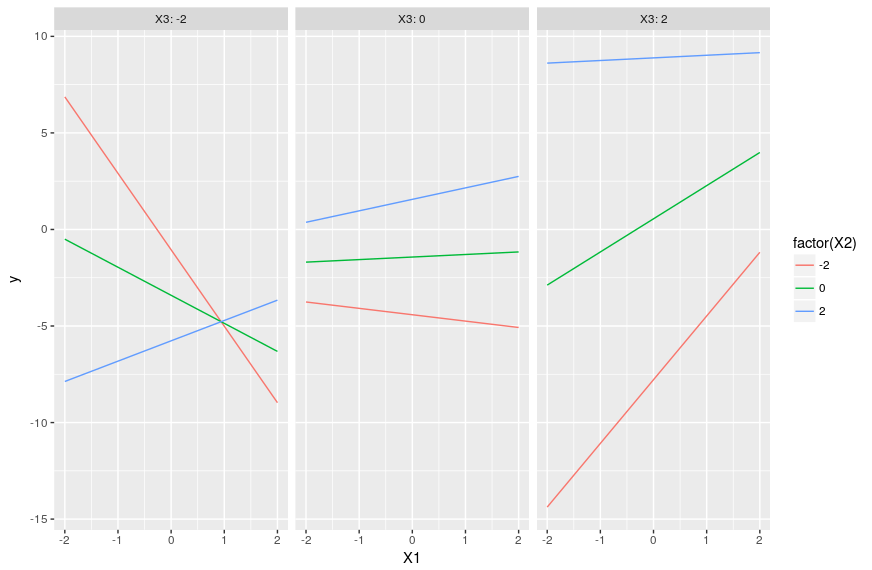
Note that there is no way to add the actual observations on such a plot because we separate everything between fixed values of X3 that are not necessarily observed. This means that we cannot directly visualize the fit of the model to the data and must rely on other diagnostics.
Thanks, Lionel, for your clarification below. I have a follow-up question regarding the three-way interaction between one continuous and two categorical variables.
I’ve done a linear regression with this type of three-way interaction, and I’ve plotted the four slopes in a similar way as you’ve done in your example above. What I’m unclear about is how to report the p-values for each of those four slopes. I assumed that the p-value for the main effect of the continuous variable corresponds to the slope where both categorical factors are held at their ‘baseline’ level (i.e. the slope of X1 when F1=1 and F2=1 in your example). I’m wondering if this is this correct, and how you would report the p-values for the three remaining slopes. Are the p-values combined in the same way as the values for each interaction term are combined to calculate the four slopes?
Thanks for your help,
Sarah
Hi Sarah,
Thanks for spotting this, the relevant line has been corrected in the post!
Lionel
Hi Lionel,
Thanks so much for putting together this incredibly helpful article. I found the example for one continuous and two categorical variables to be particularly useful for my own work. That being said, I have a question about how the slope of the interaction term was calculated for that example (2 categorical, one continuous).
In the code for ‘understanding the estimates: the slopes’, under ‘slope for F1=2 & F2=2’ (the last slope calculated), can you confirm that the last coefficient that should be added should actually be coef(m)[8] instead of coef(m)[7]? I see that in your explanation below this code block, you write, ‘The slope coefficient for these four lines are given in the code above, computing it consist in just adding terms with “X1” in them…’ So I assumed it was a simple typo, but I want to confirm with you as this minor change in the coefficient really changes the interpretation of my own results!
Thank you,
Sarah
Excellent guide!
I am wondering if you could give me some specific advise for my study.
My current study looks at how Chinese and English view different advertisements that were manipulated on the length and type as follows:
creative+long
creative+short
informative+long
informative+short
In sum, this is a 2 x 2 x 2 Mixed ANOVA design, with the following independent variables (within subject) ad length and ad type; and (between subject) nationality; dependent variable is TV_Title. Here is my data set https://www.dropbox.com/s/y7p8ifsprzgv0ti/20180511%20Title%20Data_CH%2BEN%20question.xlsx?dl=0
My main question is how can I produce the the interaction plots in R similar to those shown below. Can anyone provide the code based on my dataset? Many thanks!
https://www.researchgate.net/publication/259570368_MSE1/figures
http://ifcuriousthenlearn.com/blog/2015/09/01/Industrial-Design-of-Experiments-with-r/
https://stats.stackexchange.com/questions/62756/2x2x5-repeated-measures-anova-significant-3-way-interaction
Could you please provide the code in creating those plots?