Statistical computing is really helping us on creating a high-quality graphics. Selecting the right type of graph can help us to analyze our data better. In this article, I will explain how you can use R to get the best visual from a single variable data.
There are 4 types of plots that we can use to observe a single variable data:
· Histograms
· Index plots
· Time-series plots
· Pie Charts
Histograms
How to create a histogram in R? And what information that we can get from histogram?
Histogram shows a frequency distribution. It is a great graph for showing the mode, the spread, and the symmetry (skewness) of your data. Here is a histogram of 1,000 random points drawn from a normal distribution with a mean of 2.5
# How to create Histogram in R
# by Michaelino Mervisiano
datavar <-rnorm(1000,2.5)
hist(datavar,main="Awesome Histogram", col="Blue",prob=TRUE,
     xlab="Random Numbers from a Normal Distribution with Mean 2.5")
Figure 1: Histogram result in R
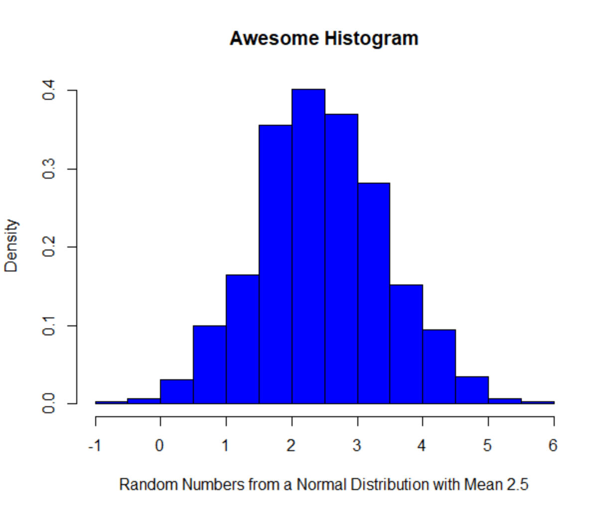
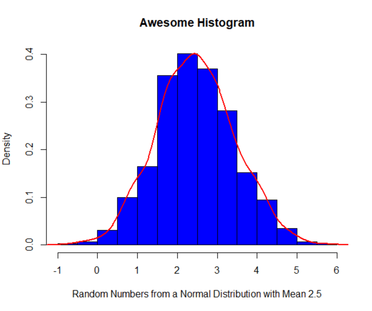
Figure 1 shows us the distribution of the data. We can see that the data is spread evenly between the left and right tail. Also, the frequency is showing us the mode of the data is around 2 and 3. Next, you can add a line below to get a density curve along your histogram
hist(datavar,main=”Awesome Histogram”, col=”Blue”,prob=TRUE,
     xlab=”Random Numbers from a Normal Distribution with Mean 2.5")
lines(density(datavar), col = “red”)
Figure 2: Histogram + Density Line
Index Plots
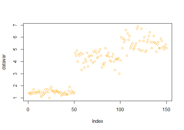
The other plot that is effective to analyze a single variable data is index plot. This type of plot displays a single continuous variable and plots the values on the vertical axis, while plot the order of the number in vector on the horizontal axis. I personally like to use this plot for error checking. For this example, I will use our favorite sample data, Iris. There are 150 observations in this data set and we will take the petal length variable as our single variable to analyze.
datavar <-iris$Petal.Length
plot(datavar,col=”orange”)
Figure 3 exhibits all observations from our single variable data. If there’s an outlier in our data, then it will stand out like a sore thumb. Then, we can check if this might be related to data entry error or need to be analyzed separately.
Figure 3: Index Plot Result using Iris Petal Length data
Time-Series Plots
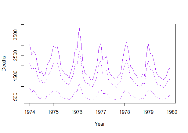
If you have a complete data for time series, then it will be very straightforward to plot it. You can joining each observation in an ordered set of y values. However, the problem will occur if you have missing values in the time series. You can use a simple interpolation or forecasting model to cope with the missing values issue. For illustration, we will use UK Lung Deaths from 1974–1980.
data(UKLungDeaths)
ts.plot(ldeaths, mdeaths, fdeaths,
        xlab=”Year”, ylab=”Deaths”,col=”purple”,lty=c(1:3))
Figure 4 shows three different lines: the upper, solid line shows total deaths, the heavier dashed line shows male deaths and the faint dotted line shows female deaths. We can clearly see the different number of deaths between sexes. Additionally, there is a strong seasonality effect in the data as you can easily observed number of deaths are peaking in midwinter.
Figure 4: Time-Series Plot using UK Lung Deaths Data
Pie Charts
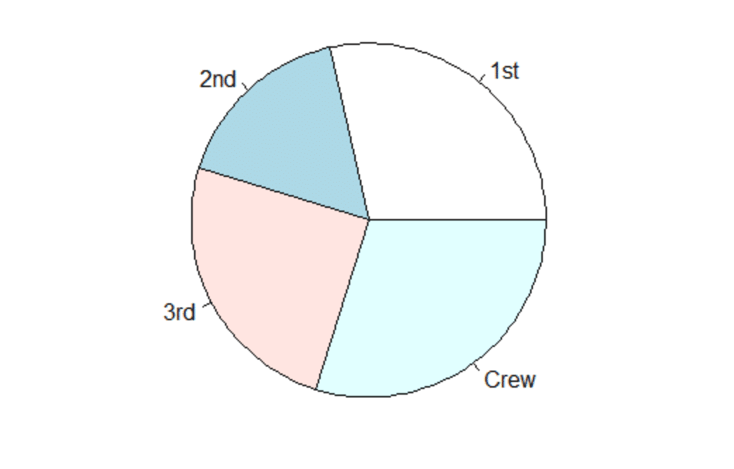
One of the good use of a pie chart is to show the relationship between parts or percentages of a whole. In R, function pie takes a vector of numbers change them into proportions and divides up the circle based on total proportion. For the next example, we will use Titanic (it’s also my favorite movie!) sample data and see the proportion passenger class ticket. We can see easily the proportion of passengers in Figure 5. More than one-third of the passengers are the Crew. The proportion between first and second class passengers are very close.
df<-data.frame(Titanic)
df <-df[df$Survived==’Yes’,]
datavar<-xtabs(df$Freq~df$Class)
datavar
pie(datavar)
Figure 5: Pie Chart using Titanic Passengers Data
That’s all about single variable plots in this post. I hope you find it useful and feel free to share it with others.
Cheers,
Michaelino Mervisiano