The following is a complete tutorial to download macroeconomic data from St. Louis FRED economic databases, draw a scatter plot, perform OLS regression, plot the final chart with regression line and regression statistics, and then save the chart as a PNG file for documentation.
Step 1
Load the necessary packages for this tutorial
# load the necessary packages
library(alfred)
library(tidyverse)
library(Hmisc)
library(broom)
Step 2
Define the start and end dates of the analysis
# --- set the designed time period of data for analysis
startdate <- "1980-01-01"
enddate <- "2018-04-01"
Step 3
Download specific macroeconomic data from FRED St. Louis economic databases and ETL the data. Many other data series can be found at the FRED’s website.
# get unemployment data time series from FRED St. Louis
dfunrate <- get_fred_series("UNRATE", "unrate", observation_start = startdate, observation_end = enddate)

# get University of Michigan consumer sentiment index data time series from FRED St. Louis
dfumcsent <- get_fred_series("UMCSENT", "umcsent", observation_start = startdate, observation_end = enddate)

# combine the two time series data into one data frame
dfall <- cbind(dfunrate,dfumcsent)

# strip or remove redundant month field from data downloaded from FRED St. Louis
dfall <- dfall[,c(1,2,4)]

# obtain the number of data points in the dataframe
mdx <- (1:nrow(dfall))

# convert FRED date field from string to R's date type
dfall$date <- as.Date(dfall$date)
Step 4
Perform OLS regression on the macroeconomic dataset
# simple linear regression and output regression statistics into a data frame
dffit <- lm(umcsent ~ unrate, data = dfall)
summary(dffit)
dffitout <- tidy(dffit)
Call:
lm(formula = umcsent ~ unrate, data = dfall)

Residuals:
    Min      1Q  Median      3Q     Max
-33.593  -4.441   0.732   5.889  25.149

Coefficients:
            Estimate Std. Error t value Pr(>|t|)
(Intercept) 117.1734     1.7957   65.25   <2e-16 ***
unrate       -4.8537     0.2756  -17.61   <2e-16 ***
---
Signif. codes:  0 ‘***’ 0.001 ‘**’ 0.01 ‘*’ 0.05 ‘.’ 0.1 ‘ ’ 1

Residual standard error: 9.68 on 458 degrees of freedom
Multiple R-squared:  0.4038,	Adjusted R-squared:  0.4025
F-statistic: 310.2 on 1 and 458 DF,  p-value: < 2.2e-16
Step 5
Extract regression statistics from the regression model
# obtain OLS fitness measure: adjusted r square and p-value and coefficients
dffit.AdjrSquared <- summary(dffit)$adj.r.squared
dffit.pVal <- dffitout$p.value[2]
dffit.intercept <- dffitout$estimate[1]
dffit.slope <- dffitout$estimate[2]
dffit.rse <- sigma(dffit)
Step 6
Define the plot’s parameters and labels in one section
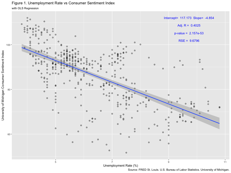
# define the plot's default parameters
fredseries <- "UNRATESENTIMENT"
chart.number <- "Figure 1"
chart.title <- paste(chart.number, ". Unemployment Rate vs Consumer Sentiment Index", sep = "", collapse = NULL)
chart.subtitle <- "with OLS Regression"
chart.caption <- "Source: FRED St. Louis. U.S. Bureau of Labor Statistics. University of Michigan."
chart.xlabel <- "Unemployment Rate (%)"
chart.ylabel <- "University of Michigan Consumer Sentiment Index"
chart.filename <- paste(chart.number," ",fredseries,".png", sep = "", collapse = NULL)
Step 7
Plot the scatter plot and OLS regression line using ggplot
# plot the xy scatter plot and OLS regression line
dfplt <- ggplot(dfall, aes(x = unrate, y = umcsent)) + geom_point(fill = NA, shape = 1) +
                labs( x = chart.xlabel,
                      y = chart.ylabel,
                      title = chart.title,
                      subtitle = chart.subtitle,
                      caption = chart.caption) +
                geom_smooth(method='lm')
Step 8
Define the x-y coordinates for text annotation to enhance readability
# define the x-y coordinates for text annotations
xpos1 <- max(dfall$unrate) * 0.90
xpos2 <- xpos1
xpos3 <- xpos1
xpos4 <- xpos1
ypos1 <- max(dfall$umcsent) * 0.94
ypos2 <- max(dfall$umcsent) * 0.97
ypos3 <- max(dfall$umcsent) * 1.00
ypos4 <- max(dfall$umcsent) * 0.91
Step 9
Annotate with OLS model specifications and plot the final complete chart
# add p-value to the chart
dfplt <- dfplt + annotate(geom="text", x=xpos1, y=ypos1,
                          label=paste("p-value = ",as.character(format(dffit.pVal, digits = 4))),
                          color="blue")

# add adjusted r square to the chart
dfplt <- dfplt + annotate(geom="text", x=xpos2, y=ypos2,
                          label=paste("Adj. R = ",as.character(format(dffit.AdjrSquared, digits = 4))),
                          color="blue")

# add OLS equation coefficients to the chart
dfplt <- dfplt + annotate(geom="text", x=xpos3, y=ypos3,
                          label=paste("Intercept= ",as.character(format(dffit.intercept, digits = 6))," Slope= ", as.character(format(dffit.slope, digits = 4))),
                          color="blue")

# add residual standard error to the chart
dfplt <- dfplt + annotate(geom="text", x=xpos4, y=ypos4,
                          label=paste("RSE = ",as.character(format(dffit.rse, digits = 5))),
                          color="blue")

# output the final completely composed chart to the console plot area
dfplt
The plot:
Step 10
Save the final plot as a PNG file with a size specified as 800×600
# save the plot into a graphics file with a size defined at 800 x 600
png(filename=chart.filename, width = 800, height = 600)
dfplt
dev.off()
That is it. This is a 10-step complete tutorial giving researchers new to the world of R programming an introduction to download data from FRED St. Louis economic databases and perform regression with detailed results plotted altogether.