Presenting data results in the most informative and compelling manner is part of the role of the data scientist. It's all well and good to master the arcana of some algorithm, to manipulate and master the numbers and bend them to your will to produce a “solution” that is both accurate and useful. But, those activities are typically in pursuit of informing some decision or at least providing information that serves a purpose. So taking those results and making them compelling and understandable by your audience is part of your job!
This article will focus on my efforts to develop an R function that is designed to automate the process of producing a Tufte style slopegraph using ggplot2 and dplyr. Tufte is often considered one of the pioneers of data visualization and you are likely to have been influenced techniques he championed such as the sparkline. I've been aware of slopegraphs for quite some time as an excellent visualization technique for some situations. So when I saw the article from Murtaza Haider titled “Edward Tufte’s Slopegraphs and political fortunes in Ontario” I just had to take a shot at writing a function.
To make it a little easier to get started with the function I have taken the liberty of providing a couple of small datasets for you to practice with, please see ?newcancer and ?newgdp.
Installation and setup
Long term I'll try and ensure the version on CRAN is well maintained but for now you're better served by grabbing the current version from GITHUB today since I tend to put all the latest features and fixes there in between pushing to CRAN. I've provided the instructions for installing both commented out below.
knitr::opts_chunk$set(
  collapse = TRUE,
  comment = "#>"
)
# Install from CRAN
# install.packages("CGPfunctions")

# Or the development version from GitHub
# install.packages("devtools")
# devtools::install_github("ibecav/CGPfunctions")
library(CGPfunctions)
Simple examples
If you're unfamiliar with slopegraphs or just want to see what the display is all about the dataset I've provided can get you started in one line
newggslopegraph(newcancer, Year, Survival, Type)
Gives this plot:
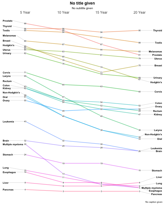
Slopegraphs are designed to provide maximum information with “minimum ink”. Some key features are:
- Scaling – this function plots to scale; a big gap indicates a big difference.
- Names of the items on both the left-hand and right-hand axes are aligned, to make vertical scanning of the items’ names easier. Rank ordering is easily understood as well as change in rank over time.
- Trends are easily understood over time via the slope. Many suggest using a thin, light gray line to connect the data. A too-heavy line is unnecessary and will make the chart harder to read. If the chart features many lines, judicious use of color can help.
- A table (with more statistical detail) might be a good complement to use alongside the slopegraph. As Tufte notes: “The data table and the slopegraph are colleagues in explanation not competitors. One display can serve some but not all functions.”
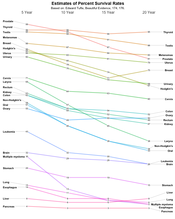
Optionally you can provide important label information through Title, Subtitle, and Caption arguments. You can suppress them all together by setting them = NULL but since I think they are very important the default behavior is to gently remind you, that you have not provided any information. Let's provide a title and sub-title but skip the caption.
newggslopegraph(dataframe = newcancer,
                Times = Year,
                Measurement = Survival,
                Grouping = Type,
                Title = "Estimates of Percent Survival Rates",
                SubTitle = "Based on: Edward Tufte, Beautiful Evidence, 174, 176.",
                Caption = NULL
                )
Gives this plot:
How it all works
It's all well and good to get the little demo to work, but it might be useful for you to understand how to extend it out to data you're interested in.
You'll need a dataframe with at least three columns. The function will do some basic error checking and complain if you don't hit the essentials.
-
Timesis the column in the dataframe that corresponds to the x axis of the plot and is normally a set of moments in time expressed as either characters, factors or ordered factors (in our casenewcancer$Year. If it is truly time series data (especially with a lot of dates you're much better off using an R function purpose built for time series). Innewcancerit's an ordered factor, mainly because if we fed the information in as character the sort order would beYear 10, Year 15, Year 20, Year 5which is very confusing. A command likenewcancer$Year <- factor(newcancer$Year,levels = c("Year.5", "Year.10", "Year.15", "Year.20"), labels = c("5 Year","10 Year","15 Year","20 Year"), ordered = TRUE)would be the way to force things they way you want them. -
Measurementis the column that has the actual numbers you want to display along the y axis. Frequently that's a percentage but it could just as easily be any number. Watch out for scaling issues here, you'll want to ensure that its not disparate. In our casenewcancer$Survivalis the percentage of patients surviving at that point in time, so the maximum scale is 0 to 100. -
Groupingis what controls how many individual lines are portrayed. Every attempt is made to color them and label them in ways that lead to clarity but eventually you can have too many. In our example case the column isnewcancer$Typefor the type of cancer or location.
As a sidenote, if you're interested in how the function was built and some of the underlying R programming please consider reading this other post about building the function step by step.
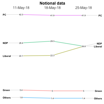
Another quick example
This is loosely based off a blog post from Murtaza Haider titled Edward Tufte’s Slopegraphs and political fortunes in Ontario. In this case we're going to plot the percent of the vote captured by some Canadian political parties. “The data is loosely based on real data but is not actually accurate”
moredata$Date is the hypothetical polling date as a factor (in this case character would work equally well). moredata$Party is the various political parties and moredata$Pct is the percentage of the vote they are estimated to have.
moredata <- structure(list(Date = structure(c(1L, 1L, 1L, 1L, 1L, 2L, 2L, 2L, 2L, 2L, 3L, 3L, 3L, 3L, 3L),
                                            .Label = c("11-May-18", "18-May-18", "25-May-18"),
                                            class = "factor"),
                           Party = structure(c(5L, 3L, 2L, 1L, 4L, 5L, 3L, 2L, 1L, 4L, 5L, 3L, 2L, 1L, 4L),
                                             .Label = c("Green", "Liberal", "NDP", "Others", "PC"),
                                             class = "factor"),
                           Pct = c(42.3, 28.4, 22.1, 5.4, 1.8, 41.9, 29.3, 22.3, 5, 1.4, 41.9, 26.8, 26.8, 5, 1.4)),
                      class = "data.frame",
                      row.names = c(NA, -15L))
newggslopegraph(moredata,
                Date,
                Pct,
                Party,
                Title = "Notional data",
                SubTitle = NULL,
                Caption = NULL)
#>
#> Converting 'Date' to an ordered factor
Gives this plot:
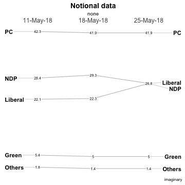
There are a plethora of formatting options. See ?newggslopegraph for all of them. Here's a few.
newggslopegraph(moredata, Date, Pct, Party,
                Title = "Notional data",
                SubTitle = "none",
                Caption = "imaginary",
                LineColor = "gray",
                LineThickness = .5,
                YTextSize = 4
                )
Converting 'Date' to an ordered factor
Gives this plot:
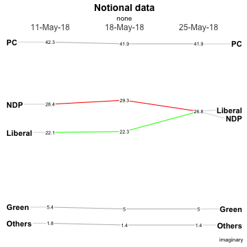
The most complex is LineColor where you can do the following if you want to highlight the difference between the Liberal and NDP parties while making the other three less prominent…
newggslopegraph(moredata, Date, Pct, Party,
                Title = "Notional data",
                SubTitle = "none",
                Caption = "imaginary",
                LineColor = c("Green" = "gray", "Liberal" = "green", "NDP" = "red", "Others" = "gray", "PC" = "gray"),
                LineThickness = .5,
                YTextSize = 4
                )
#>
#> Converting 'Date' to an ordered factor
Gives this plot:
One last set of data
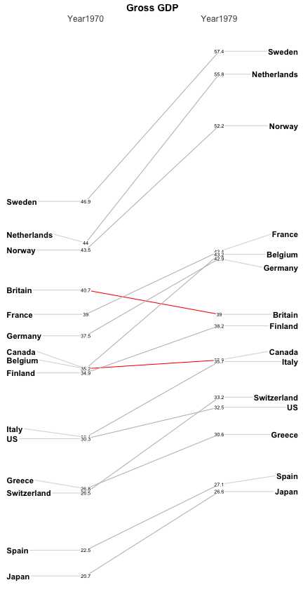
Also from Tufte, this is data about a select group of countries Gross Domestic Product (GDP). I'll use it to show you a tricky way to highlight certain countries without making a named vector with LineColor = c(rep("gray",3), "red", rep("gray",3), "red", rep("gray",10)) the excess vector entries are silently dropped… The bottom line is that LineColor is simply a character vector that you can fill any way you choose.
newggslopegraph(newgdp,
                Year,
                GDP,
                Country,
                Title = "Gross GDP",
                SubTitle = NULL,
                Caption = NULL,
                LineThickness = .5,
                YTextSize = 4,
                LineColor = c(rep("gray",3), "red", rep("gray",3), "red", rep("gray",10))
                )
Gives this plot:
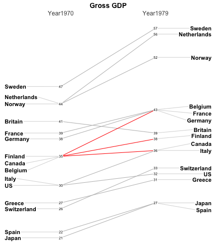
Finally, let me take a moment about crowding and labeling. I've made every effort to try and deconflict the labels on the left and right axis (in this example the Country) and that should work automatically as you resize your plot dimensions. ** pro tip – if you use RStudio you can press the zoom icon and then use the rescaling of the window to see best choices **.
But the numbers (GDP) are a different matter and there's no easy way to ensure separation in a case like this data. There's a decent total spread from 57.4 to 20.7 and some really close measurements like France, Belgium, and Germany on the right side. My suggestion is in a case like this one you create a new column in your dataframe with two significant places. So specifically it would be newgdp$rGDP <- signif(newgdp$GDP, 2). In my testing, at least, I've found this helps without creating inaccuracy and not causing you to try and “stretch” vertically to disambiguate the numbers. This time I'll also use LineColor to highlight how Canada, Finland and Belgium fare from 1970 to 1979.
newgdp$rGDP <- signif(newgdp$GDP, 2)
newggslopegraph(newgdp,
                Year,
                rGDP,
                Country,
                Title = "Gross GDP",
                SubTitle = NULL,
                Caption = NULL,
                LineThickness = .5,
                YTextSize = 4,
                LineColor = c(rep("gray",6), rep("red",2), "red", rep("gray",10))
                )
Gives this plot:
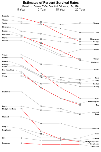
One last example and the latest feature
Returning to the cancer dataset we initially used I recently added a new feature that is only available from the github version of the library. It's called WideLabels and is a simple logical set to FALSE by default. If you change it to TRUE as I have in the next example it will expand the x axis and essentially give you more room for the side labels. This can be very useful in cases like the cancer data where you have a few long complex labels. Here's a made up example where I want to draw the reader's attention to certain cancers which appear to have a more precipitous decline in survival over time.
newggslopegraph(dataframe = newcancer,
                Times = Year,
                Measurement = Survival,
                Grouping = Type,
                Title = "Estimates of Percent Survival Rates",
                SubTitle = "Based on: Edward Tufte, Beautiful Evidence, 174, 176.",
                Caption = NULL,
                YTextSize = 2.5,
                LineThickness = .5,
                LineColor = c("red", rep("gray",4), "red", rep("gray",3)),
                WiderLabels = TRUE
                )
#>
#> You gave me 9 colors I'm recycling colors because you have 24 Types
Gives this plot:
If you like newggslopegraph, please consider filing a GitHub issue by leaving feedback at my GitHub, or by posting a comment here.