Bar charts are a pretty common way to represent data visually, but constructing them isn’t always the most intuitive thing in the world.
One way that we can construct these graphs is using R’s default packages.
Barplots using base R
Let’s start by viewing our dataframe: here we will be finding the mean miles per gallon by number of cylinders and number of gears.
View(mtcars)
We begin by aggregating our data by cylinders and gears and specify that we want to return the mean, standard deviation, and number of observations for each group:
myData <- aggregate(mtcars$mpg,
    by = list(cyl = mtcars$cyl, gears = mtcars$gear),
    FUN = function(x) c(mean = mean(x), sd = sd(x),
                        n = length(x)))
After this, we’ll need to do a little manipulation since the previous function returned matrices instead of vectors
myData <- do.call(data.frame, myData)
And now let's compute the standard error for each group. We can then rename the columns just for ease of use.
myData$se <- myData$x.sd / sqrt(myData$x.n)

colnames(myData) <- c("cyl", "gears", "mean", "sd", "n", "se")

myData$names <- c(paste(myData$cyl, "cyl /",
                        myData$gears, " gear"))
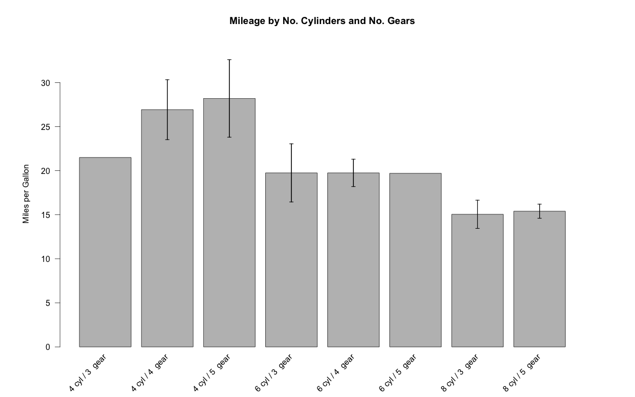
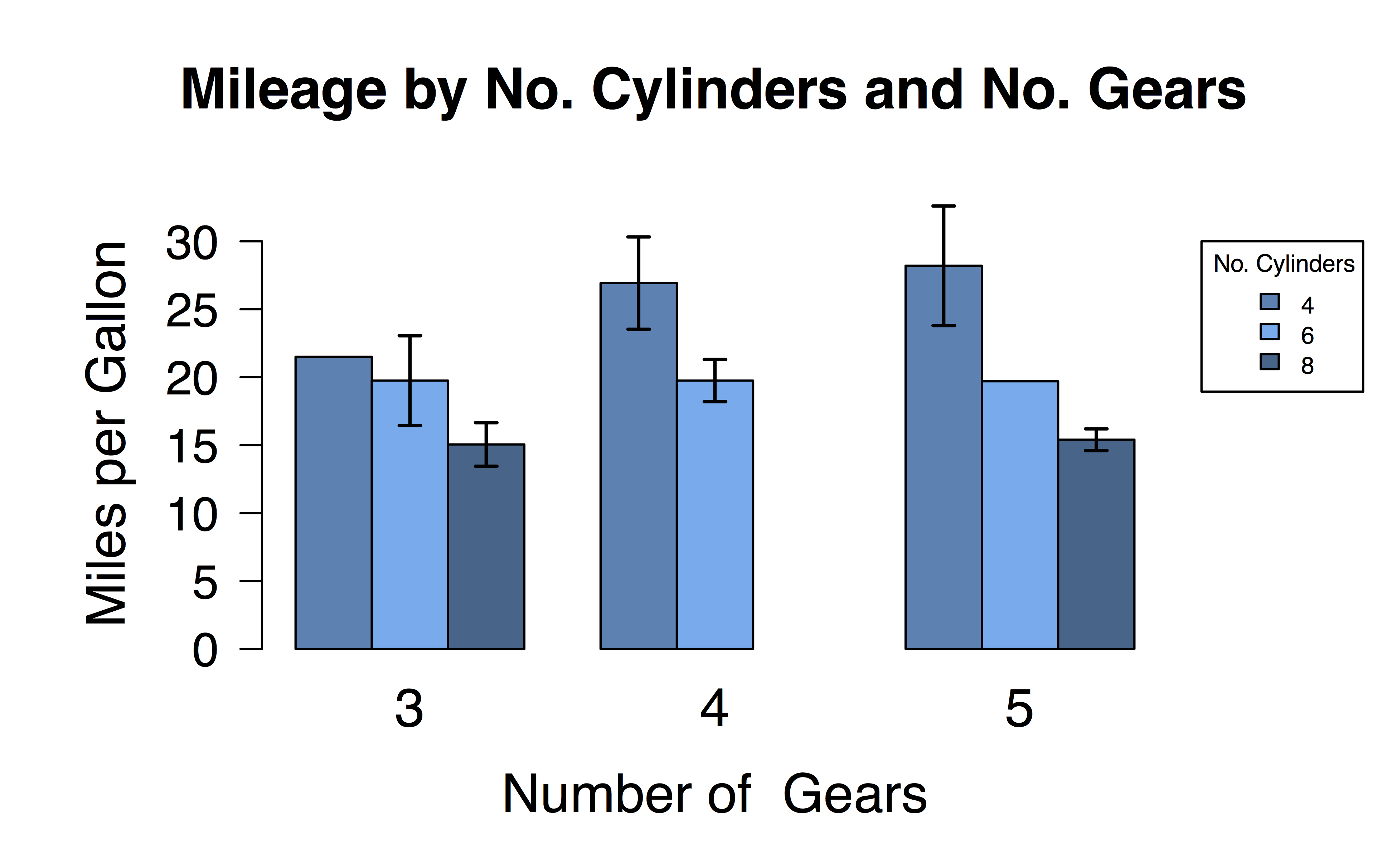
Now we’re in good shape to start constructing our plot! Here, we’ll start by widening the plot margins just a tad so that nothing runs off the edge of the figure (using the par() function). It’s also a good habit to specify the upper bounds of your plot since the error bars are going to extend past the height of your bars. Beyond this, it’s just any additional aesthetic styling that you want to tweak and you’re good to go! The error bars are added in at the end using the segments() and arrows() functions. In this case, we are extending the error bars to ±2 standard errors about the mean.
par(mar = c(5, 6, 4, 5) + 0.1)

plotTop <- max(myData$mean) +
           myData[myData$mean == max(myData$mean), 6] * 3

barCenters <- barplot(height = myData$mean,
                  names.arg = myData$names,
                  beside = true, las = 2,
                  ylim = c(0, plotTop),
                  cex.names = 0.75, xaxt = "n",
                  main = "Mileage by No. Cylinders and No. Gears",
                  ylab = "Miles per Gallon",
                  border = "black", axes = TRUE)

# Specify the groupings. We use srt = 45 for a
# 45 degree string rotation
text(x = barCenters, y = par("usr")[3] - 1, srt = 45,
     adj = 1, labels = myData$names, xpd = TRUE)

segments(barCenters, myData$mean - myData$se * 2, barCenters,
         myData$mean + myData$se * 2, lwd = 1.5)

arrows(barCenters, myData$mean - myData$se * 2, barCenters,
       myData$mean + myData$se * 2, lwd = 1.5, angle = 90,
       code = 3, length = 0.05)
This will give us a barplot that looks like this:
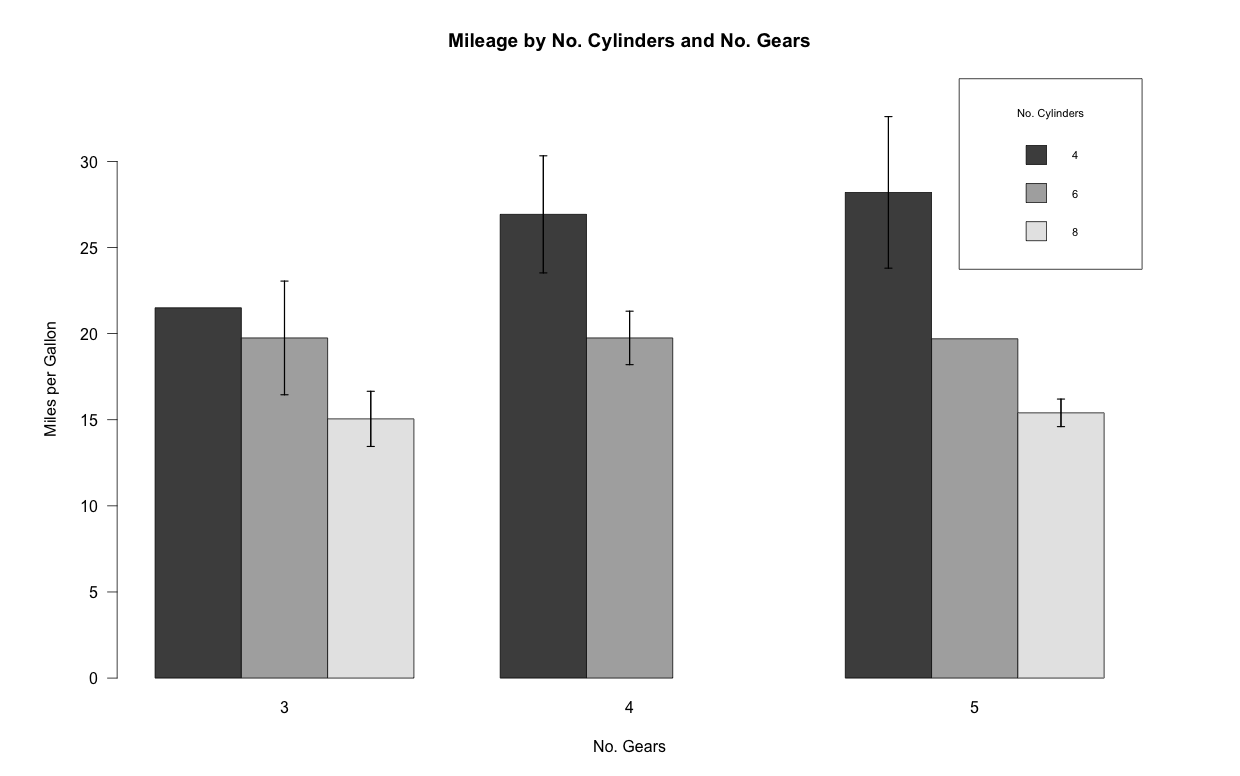
Grouped barplots
But… that’s kind of an ugly graph. Wouldn’t it be nicer if we could group the bars by number of cylinders or number of gears? Turns out, R makes this pretty easy with just a couple of tweaks to our code! Instead of columns of means, we just need to supply barplot() with a matrix of means. I.e., instead of this:
head(myData)

cyl gears   mean       sd n        se           names
  4     3 21.500       NA 1        NA 4 cyl / 3  gear
  4     4 26.925 4.807360 8 1.6996586 4 cyl / 4  gear
  4     5 28.200 3.111270 2 2.2000000 4 cyl / 5  gear
  6     3 19.750 2.333452 2 1.6500000 6 cyl / 3  gear
  6     4 19.750 1.552417 4 0.7762087 6 cyl / 4  gear
  6     5 19.700       NA 1        NA 6 cyl / 5  gear
we supply:
tapply(myData$mean, list(myData$cyl, myData$gears),
       function(x) c(x = x))

      3      4    5
4 21.50 26.925 28.2
6 19.75 19.750 19.7
8 15.05     NA 15.4
All that this requires is that we switch out a couple arguments in our previous code, resulting in:
tabbedMeans <- tapply(myData$mean, list(myData$cyl,
                                      myData$gears),
                         function(x) c(x = x))
tabbedSE <- tapply(myData$se, list(myData$cyl,
                                      myData$gears),
                         function(x) c(x = x))

barCenters <- barplot(height = tabbedMeans,
                      beside = TRUE, las = 1,
                      ylim = c(0, plotTop),
                      cex.names = 0.75,
                      main = "Mileage by No. Cylinders and No. Gears",
                      ylab = "Miles per Gallon",
                      xlab = "No. Gears",
                      border = "black", axes = TRUE,
                      legend.text = TRUE,
                      args.legend = list(title = "No. Cylinders",
                                         x = "topright",
                                         cex = .7))

segments(barCenters, tabbedMeans - tabbedSE * 2, barCenters,
         tabbedMeans + tabbedSE * 2, lwd = 1.5)

arrows(barCenters, tabbedMeans - tabbedSE * 2, barCenters,
       tabbedMeans + tabbedSE * 2, lwd = 1.5, angle = 90,
       code = 3, length = 0.05)
This, in turn, gives us a nicely grouped barplot:
Barplots using ggplot2
Unfortunately, that’s a really messy solution. It’s a lot of code written for a relatively small return. There’s got to be an easier way to do this, right?
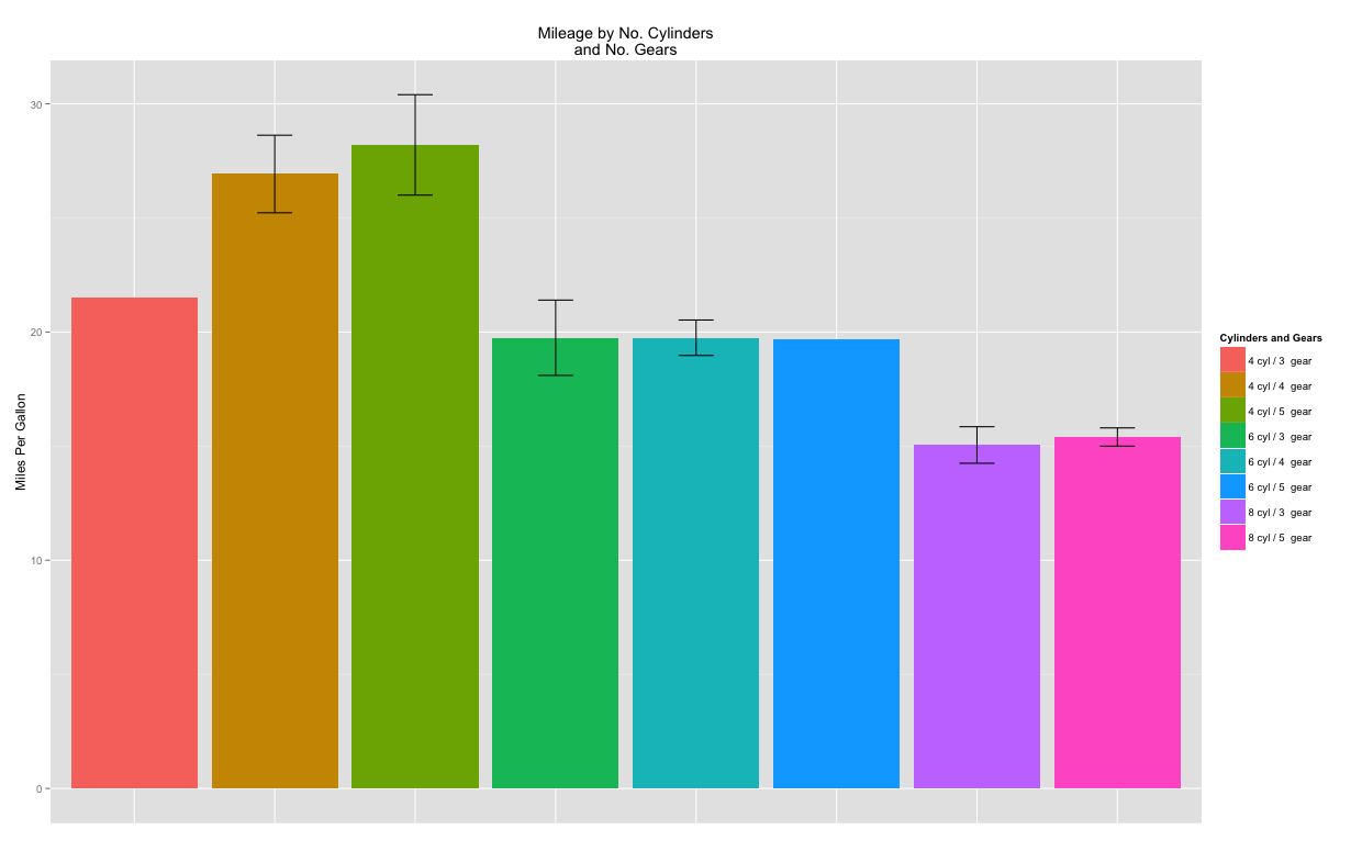
Thankfully, there is! Alternately, we can use Hadley Wickham’s ggplot2 package to streamline everything a little bit. We’ll use the myData data frame created at the start of the tutorial. After loading the library, everything follows similar steps to what we did above. Here we start by specifying the dodge (the spacing between bars) as well as the upper and lower limits of the x and y axes.
After this, we construct a ggplot object that contains information about the data frame we’re using as well as the x and y variables. From there it’s a simple matter of plotting our data as a barplot (geom_bar()) with error bars (geom_errorbar())!
library(ggplot2)

dodge <- position_dodge(width = 0.9)
limits <- aes(ymax = myData$mean + myData$se,
              ymin = myData$mean - myData$se)

p <- ggplot(data = myData, aes(x = names, y = mean, fill = names))

p + geom_bar(stat = "identity", position = dodge) +
  geom_errorbar(limits, position = dodge, width = 0.25) +
  theme(axis.text.x=element_blank(), axis.ticks.x=element_blank(),
        axis.title.x=element_blank())
This results in a similar barplot as before:
Grouped barplots
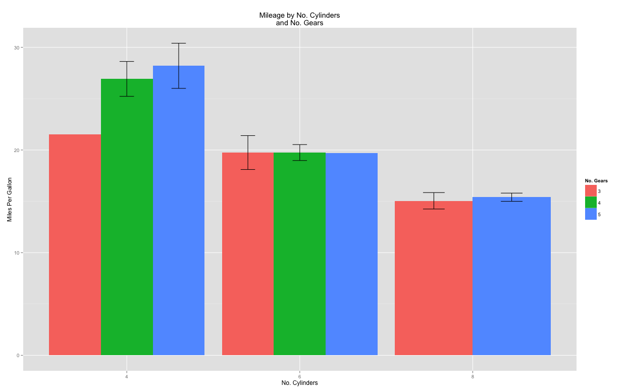
Just as before, we can also group our bars. Let’s try grouping by number of cylinders this time:
limits <- aes(ymax = myData$mean + myData$se,
              ymin = myData$mean - myData$se)

p <- ggplot(data = myData, aes(x = factor(cyl), y = mean,
               fill = factor(gears)))

p + geom_bar(stat = "identity",
             position = position_dodge(0.9)) +
  geom_errorbar(limits, position = position_dodge(0.9),
                width = 0.25) +
  labs(x = "No. Cylinders", y = "Miles Per Gallon") +
  ggtitle("Mileage by No. Cylinders\nand No. Gears") +
  scale_fill_discrete(name = "No. Gears")
In all cases, you can fine-tune the aesthetics (colors, spacing, etc.) to your liking. For example, by fiddling with some colors and font sizes:
Have questions? Post a comment below! Or download the full code used in this example.