Blue Bikes is a bicycle sharing system in the Boston, Massachusetts. The bikes sharing program started on 28 July 2011. This program aimed for individuals to use it for short-term basis for a price. The program allows individuals to borrow a bike from a dock station and retrun to another dock station after using it. According to 2017 report, there are more than 1600 bicycles in used.
The aims of the current project are to gain insight of the user who used this program such as gender. It also aimed to investigate the duration of the usage. The dataset used in this project can be found in this link. For the purpose of this project, two datasets are used the station dataset as recorded in 16th August 2017 and the trip data on 8th August 2018.
library(data.table) # for faster loading on large dataset
library(tidyverse) # load ggplot, dplyr
library(leaflet) # interactive mapping
library(leaflet.extras) #extra mapping for leaflet
library(geosphere) #used to calculate distance
library(lubridate) #formatting date and time
library(gridExtra) # multiple plot arrange
library(grid) #multiple plot arrange
library(psych) #to get describe function

#load the data set
data <- as.data.frame(fread("201807-bluebikes-tripdata.csv"))
#load station data
station <- read.csv("Hubway_Stations_as_of_July_2017.csv")
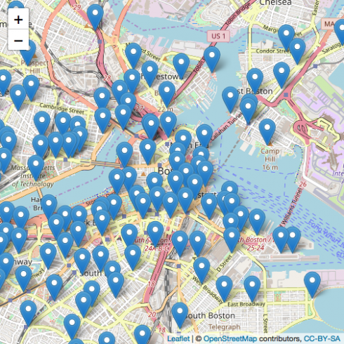
Before the analysis, let's visualize all the dock stations around Boston.
map1 <- station %>%
  leaflet() %>%
  setView(lng = -71.0589, lat = 42.3601, zoom = 13) %>%
  addTiles() %>%
  addMarkers(lng = station$Longitude, lat = station$Latitude, popup = station$Station)
map1
As you can see above, these are the distribution of dock station around Boston. You can run the code in RStudio and interact with the map.
Data Cleaning
glimpse(data)
## Observations: 242,891
## Variables: 15
## $ tripduration              <int> 220, 6578, 1311, 831, 1318, 609, 523...
## $ starttime                 <chr> "2018-07-01 00:01:06.5090", "2018-07...
## $ stoptime                  <chr> "2018-07-01 00:04:46.9020", "2018-07...
## $ `start station id`        <int> 11, 26, 20, 116, 194, 75, 149, 75, 7...
## $ `start station name`      <chr> "Longwood Ave at Binney St", "Washin...
## $ `start station latitude`  <dbl> 42.33863, 42.34152, 42.35991, 42.370...
## $ `start station longitude` <dbl> -71.10650, -71.06892, -71.05143, -71...
## $ `end station id`          <int> 45, 26, 61, 117, 100, 179, 104, 179,...
## $ `end station name`        <chr> "Jersey St. at Boylston St.", "Washi...
## $ `end station latitude`    <dbl> 42.34468, 42.34152, 42.34876, 42.366...
## $ `end station longitude`   <dbl> -71.09785, -71.06892, -71.08238, -71...
## $ bikeid                    <int> 1188, 2020, 2875, 2334, 2813, 2152, ...
## $ usertype                  <chr> "Subscriber", "Subscriber", "Subscri...
## $ `birth year`              <int> 1969, 1969, 1961, 1990, 1990, 1993, ...
## $ gender                    <int> 0, 0, 1, 1, 1, 1, 1, 2, 1, 1, 1, 1, ...
A quick overview of the dataset shows that there is 242,891 observation of the dat and 15 variables. The date range from 1st July 2018 to 31st July 2018. In addition, the data is not as clean as it looks. First, the trip duration is caluculated in second which we need to convert into minutes. Next, only birth year gave which we need to perform a simple calculation to calculate users' age. Besides that, gender variable is dummy coded and the data dictionary does not explain what does each value mean. Therefore, I'm going to code them based on assumption (0 = Female, 1 = Male, 2 = Prefered not to say). Although the data dictionary explained that there are different user types such as Casual = 24-Hour or 72-Hour Pass user; Member = Annual or Monthly Member. But, all have been coded into one type which is a subscriber. This does not provide any use for the analysis. Lastly, I'm going to calculate the trip distances based on the start and end point of longitude and latitude using haversine formula. The formula is given below:
\(a = \sin^2(\frac{\bigtriangleup \varphi}{2} + \cos \varphi_l * \cos \varphi_2 * \sin^2(\frac{\bigtriangleup \lambda}{2}))\)
\(c = 2 * a \tan2 (\sqrt{a}, \sqrt{(1 – a)}\)
\(d = R * c\)
where \(\varphi\) is latitude, \(\lambda\) is longitude, R is earth's radius which is 6371. This formula calculates the distance into the kilometer. To convert it into miles changes the earth's radius to 3958.756. The details of the formula can be seen here.. The distance calculated here might not be accurate because haversine formula is calculated based on shortest distance without considering the slope, hill and other factors.
#convert second to minutes and round it non decimal points
data$minutes <- round(data$tripduration/60, 0)

#calculate the age from birth year
data$age <- 2018 - data$`birth year`

#recoding gender variables
data$gender <- as.factor(recode(data$gender, "0" = "Female", "1" = "Male", "2" = "Prefer not to say"))

#convert the time and date variable to correct format
data$starttime <- ymd_hms(data$starttime)
data$stoptime <- ymd_hms(data$stoptime)

#separate date and time
data <- data %>%
  mutate_at(vars(starttime), ymd_hms) %>%
  mutate_at(vars(starttime), funs("start_date" = date(.)))

data <- data %>%
  mutate_at(vars(stoptime), ymd_hms) %>%
  mutate_at(vars(stoptime), funs("stop_date" = date(.)))

#extracting day, weekday and hour
data$day <- day(data$starttime)
data$weekday <- wday(data$starttime, label = TRUE)
data$hour <- hour(data$starttime)

# writing function for the distance formula
dist <- function(long1, lat1, long2, lat2) {
  R <- 6371
  radian <-  pi / 180
  a1 <- lat1 * radian
  a2 <- long1 * radian
  b1 <- lat2 * radian
  b2 <- long2 * radian
  diff_long <- b2 - a2
  diff_lat <- b1 - a1
  a <- (sin(diff_lat/2))^2 + cos(a1) * cos(b1) * (sin(diff_long/2))^2
  c <- 2 * atan2(sqrt(a), sqrt(1 - a))
  d <- R * c
  return(d)
}

# return the calculation into 2 decimals and data frame
a <- as.data.frame(round(dist(data$`start station longitude`, data$`start station latitude`, data$`end station longitude`, data$`end station latitude`),2))

#binding two data frame
new_data <- cbind(data, a)

#select relevant variable
bike_data <- select(new_data, "tripduration", "start_date", "stop_date", "start station latitude", "start station longitude", "end station latitude", "end station longitude", "gender", "minutes", "age", "round(dist(data$`start station longitude`, data$`start station latitude`, data$`end station longitude`, data$`end station latitude`), 2)", "day", "weekday", "hour")

#rename variabe
colnames(bike_data) <- c("tripduration", "start_date", "stop_date", "start_lat", "start_long", "end_lat", "end_long", "gender", "minutes", "age", "distances", "day", "weekday", "hour")

# convert into factor
bike_data$weekday <- as.factor(bike_data$weekday)

glimpse(bike_data)
## Observations: 242,891
## Variables: 14
## $ tripduration <int> 220, 6578, 1311, 831, 1318, 609, 523, 564, 1499, ...
## $ start_date   <date> 2018-07-01, 2018-07-01, 2018-07-01, 2018-07-01, ...
## $ stop_date    <date> 2018-07-01, 2018-07-01, 2018-07-01, 2018-07-01, ...
## $ start_lat    <dbl> 42.33863, 42.34152, 42.35991, 42.37080, 42.38614,...
## $ start_long   <dbl> -71.10650, -71.06892, -71.05143, -71.10441, -71.0...
## $ end_lat      <dbl> 42.34468, 42.34152, 42.34876, 42.36610, 42.39697,...
## $ end_long     <dbl> -71.09785, -71.06892, -71.08238, -71.08639, -71.1...
## $ gender       <fct> Female, Female, Male, Male, Male, Male, Male, Pre...
## $ minutes      <dbl> 4, 110, 22, 14, 22, 10, 9, 9, 25, 22, 5, 23, 3, 1...
## $ age          <dbl> 49, 49, 57, 28, 28, 25, 45, 26, 24, 26, 31, 28, 2...
## $ distances    <dbl> 0.98, 0.00, 2.83, 1.57, 3.87, 0.92, 1.86, 0.92, 3...
## $ day          <int> 1, 1, 1, 1, 1, 1, 1, 1, 1, 1, 1, 1, 1, 1, 1, 1, 1...
## $ weekday      <ord> Sun, Sun, Sun, Sun, Sun, Sun, Sun, Sun, Sun, Sun,...
## $ hour         <int> 0, 0, 0, 0, 0, 0, 0, 0, 0, 0, 0, 0, 0, 0, 0, 0, 0...
describe(bike_data$age)
##    vars      n  mean    sd median trimmed   mad min max range skew
## X1    1 242891 35.65 11.81     32   34.91 11.86  16 132   116 0.64
##    kurtosis   se
## X1    -0.07 0.02
A quick examination shows that there are many impossible values from the age where the maximum age is 132. By guessing, it maybe because some of the users prefered not to identify their age and choose the default setting from the Blue Bikes system. Therefore, any age above 99 will be removed.
bike_data <- bike_data[bike_data$age < 99,]
Exploratory Data Analysis
First we are going to examine the Blue Bikes usage in July, 2018.
group <- bike_data %>%
  group_by(start_date) %>%
  summarise(total = n())

group %>% ggplot(aes(x = start_date, y = total)) +
  geom_line(lty = 1) +
  geom_point() +
  labs(title = "Total of Blue Bikes Usage in July, 2018",
       x = "Date",  y = "Total of Blue Bikes Used") +
  theme_bw() +
  annotate(geom="text", x = as.Date("2018-07-03"), y = 5000, label = "
           mean = 7833.87\n
           sd = 1508.95\n
           min = 3466\n
           max = 9860",
           color = "red",
           size = 3.5)
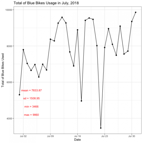
The plot above shows that total usage of the Blue Bikes on July 2018. It shows that there are two lowest usage of Blue Bikes during 17th and 22nd of July. Is there a reason why this is happening maybe due to weather, weekend or holiday?
Next, I'm going to examine which day have the most usage of the Blue Bikes.
days <- bike_data %>%
  group_by(weekday, start_date) %>%
  summarise(total = n()) %>%
  filter(start_date < as_date("2018-07-08"))

day2 <- bike_data %>%
  group_by(weekday, start_date) %>%
  summarise(n = n()) %>%
  filter(start_date < as_date("2018-07-15") & start_date > as_date("2018-07-07"))

day3 <- bike_data %>%
  group_by(weekday, start_date) %>%
  summarise(n1 = n()) %>%
  filter(start_date < as_date("2018-07-22") & start_date > as_date("2018-07-14"))

day4 <- bike_data %>%
  group_by(weekday, start_date) %>%
  summarise(n2 = n()) %>%
  filter(start_date < as_date("2018-07-29") & start_date > as_date("2018-07-21"))


p1 <- ggplot(days, aes(x = weekday, y = total)) +
  geom_col(fill = "red") +
  geom_label(aes(label = total), color = "black", hjust = 1) +
  coord_flip() +
  labs(title = "From 1st July to 7th July",
       x = "Weekday",
       y = "Total") +
  theme_bw()

p2 <- ggplot(day2, aes(x = weekday, y = n)) +
  geom_col(fill = "red") +
  geom_label(aes(label = n), color = "black", hjust = 1) +
  coord_flip() +
  labs(title = "From 8th July to 14th July",
       x = "Weekday",
       y = "Total") +
  theme_bw()

p3 <- ggplot(day3, aes(x = weekday, y = n1)) +
  geom_col(fill = "red") +
  geom_label(aes(label = n1), color = "black", hjust = 1) +
  coord_flip() +
  labs(title = "From 15th July to 21st July",
       x = "Weekday",
       y = "Total") +
  theme_bw()

p4 <- ggplot(day4, aes(x = weekday, y = n2)) +
  geom_col(fill = "red") +
  geom_label(aes(label = n2), color = "black", hjust = 1) +
  coord_flip() +
  labs(title = "From 22nd July to 28th July",
       x = "Weekday",
       y = "Total") +
  theme_bw()


grid.arrange(p1,p2,p3,p4, top = textGrob("Total of Blue Bikes Usage in Four Different Weeks",gp = gpar(fontsize = 15, font = 3)))
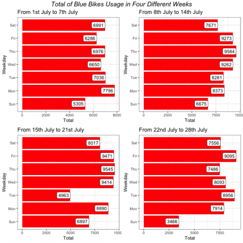
As presented above, it shows that weekdays have the highest Blue Bikes usage while weekends have the lowest.
Next, I'm going to visulize hour that have most Blue Bikes usage.
Sun <- bike_data %>%
  group_by(hour, start_date) %>%
  summarise(total = n()) %>%
  filter(start_date < as_date("2018-07-02"))

Mon <- bike_data %>%
  group_by(hour, start_date) %>%
  summarise(total = n()) %>%
  filter(start_date < as_date("2018-07-03") & start_date > as_date("2018-07-01"))

Tue <- bike_data %>%
  group_by(hour, start_date) %>%
  summarise(total = n()) %>%
  filter(start_date < as_date("2018-07-04") & start_date > as_date("2018-07-02"))

Wed <- bike_data %>%
  group_by(hour, start_date) %>%
  summarise(total = n()) %>%
  filter(start_date < as_date("2018-07-05") & start_date > as_date("2018-07-03"))

Thu <- bike_data %>%
  group_by(hour, start_date) %>%
  summarise(total = n()) %>%
  filter(start_date < as_date("2018-07-06") & start_date > as_date("2018-07-04"))

Fri <- bike_data %>%
  group_by(hour, start_date) %>%
  summarise(total = n()) %>%
  filter(start_date < as_date("2018-07-07") & start_date > as_date("2018-07-05"))

Sat <- bike_data %>%
  group_by(hour, start_date) %>%
  summarise(total = n()) %>%
  filter(start_date < as_date("2018-07-08") & start_date > as_date("2018-07-06"))

m1 <- Sun %>% ggplot(aes(x = hour, y = total)) +
  geom_line(lty = 2) +
  geom_point() +
  labs(title = "Sunday", x = "Hour",  y = "Total") +
  theme_bw()

m2 <- Mon %>% ggplot(aes(x = hour, y = total)) +
  geom_line(lty = 2) +
  geom_point() +
  labs(title = "Monday", x = "Hour",  y = "Total") +
  theme_bw()

m3 <- Tue %>% ggplot(aes(x = hour, y = total)) +
  geom_line(lty = 2) +
  geom_point() +
  labs(title = "Tuesday", x = "Hour",  y = "Total") +
  theme_bw()

m4 <- Wed %>% ggplot(aes(x = hour, y = total)) +
  geom_line(lty = 2) +
  geom_point() +
  labs(title = "Wednesday", x = "Hour",  y = "Total") +
  theme_bw()

m5 <- Thu %>% ggplot(aes(x = hour, y = total)) +
  geom_line(lty = 2) +
  geom_point() +
  labs(title = "Thursday", x = "Hour",  y = "Total") +
  theme_bw()

m6 <- Fri %>% ggplot(aes(x = hour, y = total)) +
  geom_line(lty = 2) +
  geom_point() +
  labs(title = "Friday", x = "Hour",  y = "Total") +
  theme_bw()

m7 <- Sat %>% ggplot(aes(x = hour, y = total)) +
  geom_line(lty = 2) +
  geom_point() +
  labs(title = "Saturday", x = "Hour",  y = "Total") +
  theme_bw()

grid.arrange(m1,m2,m3,m4,m5,m6,m7, top = textGrob("Total of Blue Bikes Usage in Hour for One Week",gp = gpar(fontsize = 15,font = 3)))
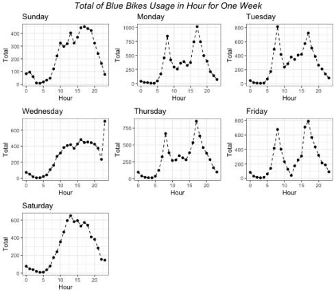
As you can see in the plot, it shows that there is a pattern across different hour during weekdays and weekends. On weekends, Blue Bikes mostly likely to be used during the afternoon. However, during weekday Blue Bikes are most likely to be used on before and after working hour.
Next, I'm going to visualize the gender and age group most likely to use Blue Bikes.
gender <- bike_data %>%
  group_by(gender) %>%
  summarise(total = n()) %>%
  filter(gender != "Prefer not to say")

gender %>% ggplot(aes(x = gender, y = total, fill = gender)) +
  geom_col() +
  geom_text(aes(label = total), vjust = -0.1) +
  labs(main = "Gender on Blue Bikes Usage",
       x = "Gender",
       y = "Total") +
  guides(fill = FALSE) +
  theme_bw()
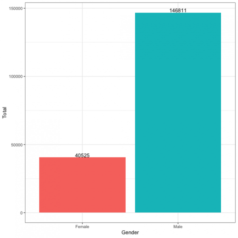
Based on the observation, Male are more likely to used Blue Bikes compared to female in July 2018. However, this plot might not be true because we code the gender based on our assumption.
Let's test is there is a significant difference between gender and distance travel using Blue Bikes.
Before that, let's examine the distance.
ggplot(data = bike_data, aes(x = distances)) +
  geom_density(alpha = 0.3, fill = "black") +
  guides(fill = FALSE) +
  labs(title = "Desntiy Plot of Distance",
       x = "Distance",
       y = "Density") +
  annotate(geom ="text", x = 6, y = 0.3, label = "
           mean = 1.97\n
           sd = 1.37\n
           min = 0\n
           max = 11.24",
           color = "red",
           size = 4) +
  theme_bw()
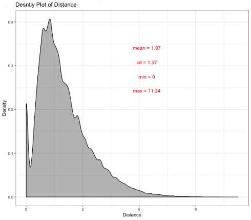
Based on the description analysis, it shows that the distance is not normally distributed and it is positively skewed. It was suggested that on average the travel distances of Blue Bikes are 1.97 kilometer and the maximum travel distance is 11.24 kilometer.
Let's examine the difference between male and female.
gender_distance <- bike_data %>%
  group_by(gender, distances) %>%
  summarise(total = n())  %>%
  filter(gender != "Prefer not to say")

gender_distance %>% ggplot(aes(x = distances)) +
  geom_density(alpha = 0.3, fill = "black") +
  guides(fill = FALSE) +
  labs(title = "Density Plot of Distance Based on Gender" ,
       x = "Distance",
       y = "Density") +
  facet_wrap(~ gender)
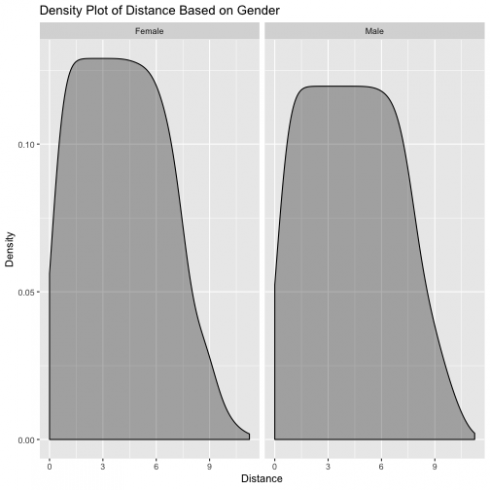
The plot shows that both male and female have a similar distribution, but this does not give much information about the differeces between gender on distance travel using Blue Bikes. I'm going to conduct a T-Test to test the hypothesis.
t.test(gender_distance$distances ~ gender_distance$gender)
##
##  Welch Two Sample t-test
##
## data:  gender_distance$distances by gender_distance$gender
## t = -2.2447, df = 1610.1, p-value = 0.02492
## alternative hypothesis: true difference in means is not equal to 0
## 95 percent confidence interval:
##  -0.52101431 -0.03509147
## sample estimates:
## mean in group Female   mean in group Male
##             4.078028             4.356081
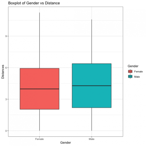
The T-test shows that \(t_{1610.1} = -2.2447\) with p = 0.025 which is lower than 0.05 suggested that there is a significant difference between male and female when using Blue Bikes. It was suggested that male are more likely to travel further 0.28 kilometer compared to female.
gender_distance %>%
  ggplot(aes(x = gender, y = distances, fill = gender)) +
  geom_boxplot() +
  labs(title = "Boxplot of Gender vs Distance",
       x = "Gender",
       y = "Distances") +
  guides(fill=guide_legend(title = "Gender")) +
  theme_bw()
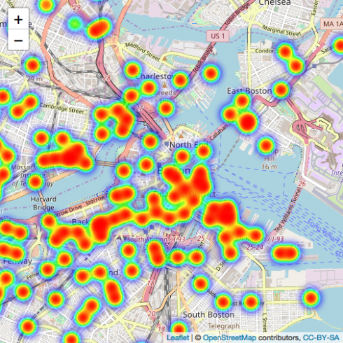
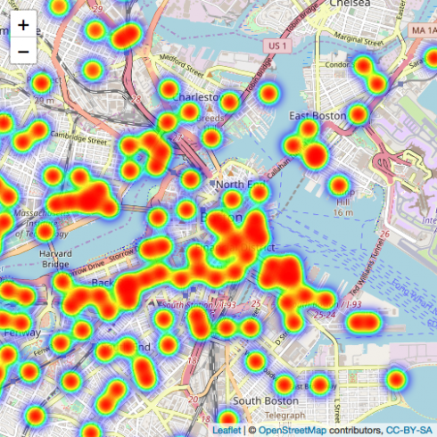
Next, I'm going to visualize the heatmap of starting location and ending location of using Blue Bikes.
#starting location
#mapping
bike_data %>%
  leaflet() %>%
  setView(lng = -71.0589, lat = 42.3601, zoom = 13) %>%
  addTiles() %>%
  addHeatmap(lng = bike_data$start_long, lat = bike_data$start_lat, max = 2, radius = 15)
#ending location
#mapping
bike_data %>%
  leaflet() %>%
  setView(lng = -71.0589, lat = 42.3601, zoom = 13) %>%
  addTiles() %>%
  addHeatmap(lng = bike_data$end_long, lat = bike_data$end_lat, max = 2, radius = 15)
Conclusion
This analysis is just my personal interest and trying to mapping using leaflet.
