Today we’ll see what happens when you have not one, but two variables in your model. We will also continue to use some old and new dplyr calls, as well as another parameter for our ggplot2 figure. I’ll be taking for granted some of the set-up steps from Lesson 1, so if you haven’t done that yet be sure to go back and do it. The other lessons can be found in there: Lesson 0; Lesson 2; Lesson 3; Lesson 5; Lesson 6, Part 1; Lesson 6, Part 2.
By the end of this lesson you will:
- Have learned the math of multiple regression.
- Be able to make a figure to present data for a multiple regression.
- Be able to run a multiple regression and interpret the results.
- Have an R Markdown document to summarise the lesson.
There is a video in end of this post which provides the background on the math of multiple regression and introduces the data set we’ll be using today. There is also some extra explanation of some of the new code we’ll be writing. For all of the coding please see the text below. A PDF of the slides can be downloaded here. Before beginning please download these text files, it is the data we will use for the lesson. We’ll be using data from the “Star Trek” universe (both “Star Trek: The Original Series” and “Star Trek: The Next Generation” collected from The Star Trek Project. All of the data and completed code for the lesson can be found here.
Lab Problem
As mentioned, the lab portion of the lesson uses data from the television franchise “Star Trek”. Specifically, we’ll be looking at data about the alien species on the show, and whether they are expected to become extinct or not. We’ll be testing three questions using logistic regression, looking at both the main effects of these variables and seeing if there is an interaction between the variables.
- Series: Is a given species more or less likely to become extinct in “Star Trek: The Original Series” or “Star Trek: The Next Generation?
- Alignment: Is a given species more or less likely to become extinct if it is a friend or foe of the Enterprise (the main starship on “Star Trek”)?
- Series x Alignment: Is there an interaction between these variables?
Setting up Your Work Space
As we did for Lesson 1 complete the following steps to create your work space. If you want more details on how to do this refer back to Lesson 1:
- Make your directory (e.g. “rcourse_lesson4”) with folders inside (e.g. “data”, “figures”, “scripts”, “write_up”).
- Put the data files for this lesson in your “data” folder.
- Make an R Project based in your main directory folder (e.g. “rcourse_lesson4”).
- Commit to Git.
- Create the repository on Bitbucket and push your initial commit to Bitbucket.
Okay you’re all ready to get started!
Cleaning Script
Make a new script from the menu. We start the same way we usually do, by having a header line talking about loading any necessary packages and then listing the packages we’ll be using. Today in addition to loading dplyr we’ll also be using the package purrr. If you haven’t used the package purrr before be sure to install it first using the code below. Note, this is a one time call, so you can type the code directly into the console instead of saving it in the script.
install.packages("purrr")Once you have the package installed, copy the code below to your script and and run it.
## LOAD PACKAGES ####
library(dplyr)
library(purrr)
Reading in our data is little more complicated than it has been in the past. Here we have three data sets one for each series (“The Original Series”, “The Animated Series”, and “The Next Generation”)*. We want to read in each file at the same time and then combine them into a single data frame. This is where purrr comes in. purrr allows us to read in multiple files with the “list.files()” call, then perform the same action on each file with the map() call, in this case reading in the file, and then finally we use the reduce() call to combine them all into a single data frame. Our read.table() call is also a little different than usual. I’ve added na.strings = c("", NA) to make sure that any empty cells are coded as “NA”, this will come in handy later. For a more detailed explanation of what the code is doing watch the video. Note, this call is assuming that all files have the same number of columns and same names of columns. Copy and run the code below to read in the three files.
## READ IN DATA ####
data = list.files(path = "data", full.names = T) %>%
       map(read.table, header = T, sep = "\t", na.strings = c("", NA)) %>%
       reduce(rbind)
As always we now need to clean our data. We’ll start with a couple filter() calls to get rid of unwanted data based on our variables of interest. First, we only want to look at data from “The Original Series” and “The Next Generation”, so we’re going to drop any data from “The Animated Series”, coded as “tas”. Next the “alignment” column has several values, but we only want to include species that are labeled as a “friend” or a “foe”. We’ll also include a couple mutate() and factor() calls so that R drops the now filtered out levels for each of our independent variables.
## CLEAN DATA ####
data_clean = data %>%
             filter(series != "tas") %>%
             mutate(series = factor(series)) %>%
             filter(alignment == "foe" | alignment == "friend") %>%
             mutate(alignment = factor(alignment))
Our column for our dependent variable is a little more complicated. Currently there is a column called “conservation”, which is coded for the likelihood of a species becoming extinct. The codings are: 1) LC – least concern, 2) NT – near threatened, 3) VU – vulnerable, 4) EN – endangered, 5) CR – critically endangered, 6) EW – extinct in the wild, and 7) EX – extinct. If you look at the data you’ll see that most species have the classification of “LC”, so for our analysis we’re going to look at “LC” species versus all other species as our dependent variable. First we’re going to filter out any data where “conservation” is an “NA”, as we can’t know if it should be labeled as “LC” or something else. We can do this with the handy !is.na() call. Recall that an ! means “is not” so what we’re saying is “if it’s not an “NA” keep it”, this was why we wanted to make sure empty cells were read in as “NA”s earlier. Next we’ll make a new column called “extinct” for our logistic regression using the mutate() call, where an “LC” species gets a “0”, not likely to become extinct, and all other species a “1”, for possible to become extinct. Copy and run the updated code below.
data_clean = data %>%
             filter(series != "tas") %>%
             mutate(series = factor(series)) %>%
             filter(alignment == "foe" | alignment == "friend") %>%
             mutate(alignment = factor(alignment)) %>%
             filter(!is.na(conservation)) %>%
             mutate(extinct = ifelse(conservation == "LC", 0, 1))
There’s still one more thing we need to do in our cleaning script. The data reports all species that appear or are discussed in a given episode. As a result, some species occur more than others if they are in several episodes. We don’t want to bias our data towards species that appear on the show a lot, so we’re only going to include each species once per series. To do this we’ll do a group_by() call including “series”, “alignment”, and “alien”, we then do an arrange() call to order the data by episode number, and finally we use a filter() call with row_number() to pull out only the first row, or the first occurrence of a given species within our other variables. For a more detailed explanation of the code watch the video. The last line ungroups our data. Copy and run the updated code below.
data_clean = data %>%
             filter(series != "tas") %>%
             mutate(series = factor(series)) %>%
             filter(alignment == "foe" | alignment == "friend") %>%
             mutate(alignment = factor(alignment)) %>%
             filter(!is.na(conservation)) %>%
             mutate(extinct = ifelse(conservation == "LC", 0, 1)) %>%
             group_by(series, alignment, alien) %>%
             arrange(episode) %>%
             filter(row_number() == 1) %>%
             ungroup()
The data is clean and ready to go to make a figure! Before we move to our figures script be sure to save your script in the “scripts” folder and use a name ending in “_cleaning”, for example mine is called “rcourse_lesson4_cleaning”. Once the file is saved commit the change to Git. My commit message will be “Made cleaning script.”. Finally, push the commit up to Bitbucket.
Figures Script
Open a new script in RStudio. You can close the cleaning script or leave it open, we’re done with it for this lesson. This new script is going to be our script for making all of our figures. We’ll start with using our source() call to read in our cleaning script, and then we’ll load our packages, in this case ggplot2. For a reminder of what source() does go back to Lesson 2. Assuming you ran all of the code in the cleaning script there’s no need to run the source() line of code, but do load ggplot2. Copy the code below and run as necessary.
## READ IN DATA ####
source("scripts/rcourse_lesson4_cleaning.R")

## LOAD PACKAGES ####
library(ggplot2)
Now we’ll clean our data specifically for our figures. There’s only one change I’m going to make for “data_figs” from “data_clean”. Since R codes variables alphabetically, currently “tng”, for “The Next Generation”, will be plotted before “tos”, for “The Original Series”, which is not desirable since chronologically it is the reverse. So, using the mutate() and factor() calls I’m going to change the order of the levels so that it’s “tos” and then “tng”. I’m also going to update the actual text with the “labels” setting so that the labels are more informative and complete. Copy and run the code below.
## ORGANIZE DATA ####
data_figs = data_clean %>%
            mutate(series = factor(series, levels=c("tos", "tng"),
                            labels = c("The Original Series", "The Next Generation")))
Just as in Lesson 3 when we summarised our “0”s and “1”s for our logistic regression into a percentage, we’ll do the same thing here. In this example we group by our two independent variables, “series” and “alignment”, and then get the mean of our dependent variable, “extinct”. Finally, we end our call with ungroup(). Copy and run the code below.
# Summarise data by series and alignment
data_figs_sum = data_figs %>%
                group_by(series, alignment) %>%
                summarise(perc_extinct = mean(extinct) * 100) %>%
                ungroup()
Now that our data frame for the figure is ready we can make our barplot. Remember, because we only have four values in “data_figs_sum”, 1) “tos” and “foe”, 2) “tos” and “friend”, 3) “tng” and “foe”, and 4) “tng” and “friend”, we can’t make a boxplot of the data because there is no spread. The first few and last few lines of the code below should be familiar to you. We have our header comment and then we write the code for “extinct.plot” with the attributes for the x- and y-axes. Something new is the fill attribute. This is how we get grouped barplots. So, first there will be separate bars for each series, and then two bars within “series”, one for each “alignment” level. The fill attribute says to use the fill color of the bars to show which is which level. The geom_bar() call we’ve used before, but the addition of the position = "dodge" tells R to put the bars side by side instead of on top of each other in the grouped portion of the plot. The next line we used last time to set the range of the y-axis, but the final two lines of the plot are new. The call geom_hline() is used to draw a vertical line on the plot. I’ve chosen to draw a line where y is 50 to show chance, thus yintercept = 50. The final line of code manually sets the colors. I’ve decided to go with “red” and “yellow” as they are the most common “Star Trek” uniform colors. The end of the code block prints the figure, and, if you uncomment the pdf() and dev.off() lines, will save it to a PDF. To learn more about the new lines of code watch the video. Copy and run the code to make the figure.
## MAKE FIGURES ####
extinct.plot = ggplot(data_figs_sum, aes(x = series, y = perc_extinct, fill = alignment)) +
geom_bar(stat = "identity", position = "dodge") +
ylim(0, 100) +
geom_hline(yintercept = 50) +
scale_fill_manual(values = c("red", "yellow"))
# pdf("figures/extinct.pdf")
extinct.plot
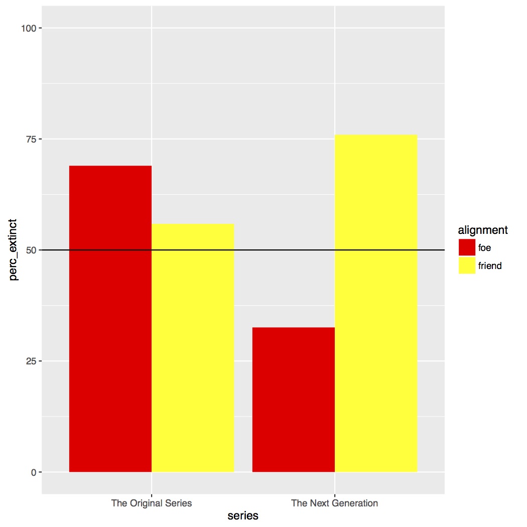
# dev.off()As you can see in the figure below, it looks like there is an interaction between “series” and “alignment”. In “The Original Series” a “foe” was more likely to go extinct than a “friend”, whereas in “The Next Generation” the effect is the reverse and also much larger of a difference.
In the script on Github you’ll see I’ve added several other parameters to my figures, such as adding a title, customizing how my axes are labeled, and changing where the legend is placed. Play around with those to get a better idea of how to use them in your own figures.
Save your script in the “scripts” folder and use a name ending in “_figures”, for example mine is called “rcourse_lesson4_figures”. Once the file is saved commit the change to Git. My commit message will be “Made figures script.”. Finally, push the commit up to Bitbucket.
Statistics Script
Open a new script and on the first few lines write the following, same as for our figures script. Note, just as in previous lessons we’ll add a header for packages, but we won’t be loading any for this script.
## READ IN DATA ####
source("scripts/rcourse_lesson4_cleaning.R")

## LOAD PACKAGES ####
# [none currently needed]
We’ll also make a header for organizing our data. Just as I changed the order of “series” for the figure, I’m going to do the same thing in my data frame for the statistics so the model coefficients are easier to interpret. There’s no need for me to change the names of the levels though since they are clear enough as is for the analysis. Copy and run the code below.
## ORGANIZE DATA ####
data_stats = data_clean %>%
             mutate(series = factor(series, levels = c("tos", "tng")))
We’re going to build several logistic regressions, working up to our full model with the interaction. We’ll add a header for our code and then a comment describing our first model. The first model will use just our one variable “series”. This code should be familiar from Lesson 3. Copy and run the code below.
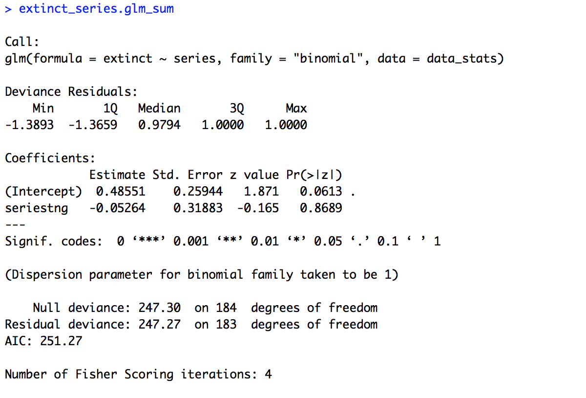
## BUILD MODELS ####
# One variable (series)
extinct_series.glm = glm(extinct ~ series, family = "binomial", data = data_stats)

extinct_series.glm_sum = summary(extinct_series.glm)
extinct_series.glm_sum
The summary of the model is provided below. Looking first at the estimate for the intercept we see that it is positive (0.48551). This means that in “The Original Series” a given species was likely to be headed towards extinction (since 0 is chance, positive number above chance, negative numbers below chance). Looking at the p-value for the intercept (0.0613) we can see there was trending effect of the intercept. So we can’t say that in “The Original Series” species were significantly likely to become extinct. More importantly though let’s look at the estimate for our variable of interest, “series”. Our estimate is negative (-0.05264), which suggests species were less likely to become extinct in “The Next Generation” than “The Original Series”. But is this difference significant? Our p-value (0.8689) would suggest no.
Next let’s look at our other single variable, “alignment”. The code is provided below. It is the same as the code above only using a different variable. Copy and run the code below.
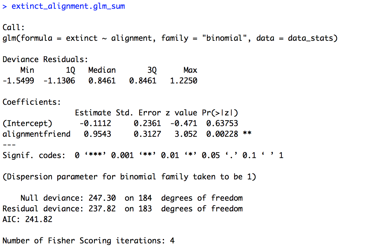
# One variable (alignment)
extinct_alignment.glm = glm(extinct ~ alignment, family = "binomial", data = data_stats)

extinct_alignment.glm_sum = summary(extinct_alignment.glm)
extinct_alignment.glm_sum
The summary of the model is provided below. Our baseline here is “foe” and the intercept is negative (-0.1112) suggesting that foes are likely to not become extinct, but the intercept is not significant (p = 0.63753). However, we do get a significant effect of “alignment” (p = 0.00228). Our estimate is positive (0.9543), which means friends are more likely to become extinct that foes.
Now we can put all of this together in a single model, but first without an interaction. To do this we build our same model but using the + symbol to string together our variables. Copy and run the code below
# Two variables additive
extinct_seriesalignment.glm = glm(extinct ~ series + alignment, family = "binomial", data = data_stats)

extinct_seriesalignment.glm_sum = summary(extinct_seriesalignment.glm)
extinct_seriesalignment.glm_sum
The summary of the model is provided below. We’re not going to try and interpret the intercept because it’s not totally transparent what it means, but the estimates and significance tests for our variables match our single variable models: there is no effect of “series” but there is an effect of “alignment”. Note, the estimates aren’t exactly the same as in our single variable models. This is because our data set is unbalanced, and our additive model takes this into account when computing the estimates for both variables at the same time. If our data set were fully balanced we would have the same estimates across the single variable models and the additive model.

Our final model takes our additive model but adds an interaction. To do this we just change the + symbol connecting our two variables to a * symbol. When saving the model I added a x between the variables in the name. Copy and run the code below.
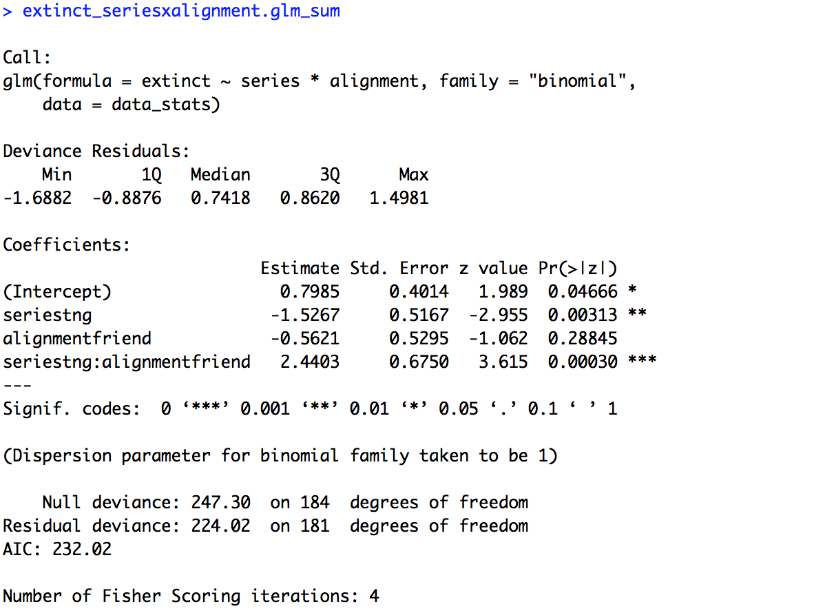
# Two variables interaction (pre-determined baselines)
extinct_seriesxalignment.glm = glm(extinct ~ series * alignment, family = "binomial", data = data_stats)

extinct_seriesxalignment.glm_sum = summary(extinct_seriesxalignment.glm)
extinct_seriesxalignment.glm_sum
The summary of the model is provided below. Now our intercept is meaningful, it is the mean for our two baselines, foes in “The Original Series”. We see that it has a positive estimate (0.7985) and is significant (p = 0.04666), suggesting that foes in “The Original Series” are likely headed towards extinction. Now, for the first time we also have a significant effect of “series” (p = 0.00313). Remember though, this is specifically for the data on foes, the baseline of “alignment”. So, foes in “The Next Generation” were significantly less likely to become extinct (estimate = -1.5267) than in “The Original Series”. We still have no effect of alignment, but again this is only in reference to the data from “The Original Series”, our baseline for “series”. Finally, we have a significant interaction of “series” and “alignment” (p = 0.00030) as expected based on our figure. The estimate is a little hard to interpret on its own, an easier way to understand would be to look at other baseline comparisons in the data and see where results differ. For example, there is no effect of “alignment” for “The Original Series”, but we don’t know if this holds for “The Next Generation”.
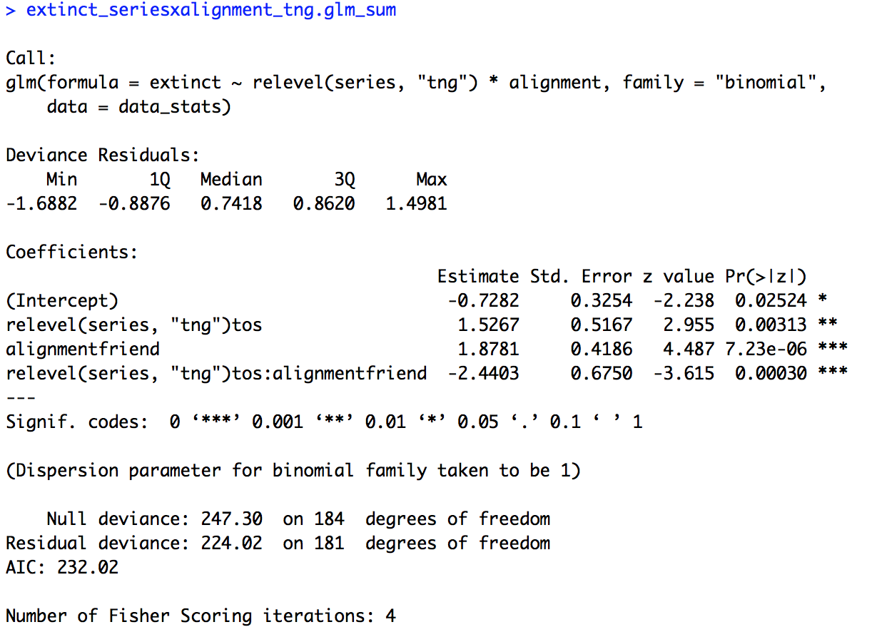
In order to look at other baseline comparisons we’re going to change the baseline of our model within the code for the model itself. We change the baseline for “series” earlier when we made “data_figs”, but changing it within the model gives us a little more flexibility to not have to make an entirely new data frame. In the code below I’ve changed the baseline of “series” to “tng”. Copy and run the code below.
# Two variables interaction (change baseline for series)
extinct_seriesxalignment_tng.glm = glm(extinct ~ relevel(series, "tng") * alignment, family = "binomial", data = data_stats)

extinct_seriesxalignment_tng.glm_sum = summary(extinct_seriesxalignment_tng.glm)
extinct_seriesxalignment_tng.glm_sum
The summary of the model is provided below. Now the intercept is in reference to data for foes from “The Next Generation”. The intercept is still significant (p = 0.02524) but now the estimate is negative (-0.7282) suggesting that unlike in “The Original Series”, in “The Next Generation” foes are likely to not be headed towards extinction. Also interesting to note, the effect of “alignment” is now significant (p = 7.23e-06) with a positive estimate (1.8781) suggesting that in “The Next Generation” friends are significantly more likely to be headed towards extinction than foes. Looking at our other two effects, “series” and the interaction of “series” and “alignment”, they have exactly the same coefficients and significance values as our previous model. The only difference is the sign of the coefficient, positive or negative, is switched, since we switched the baseline value for “series”.
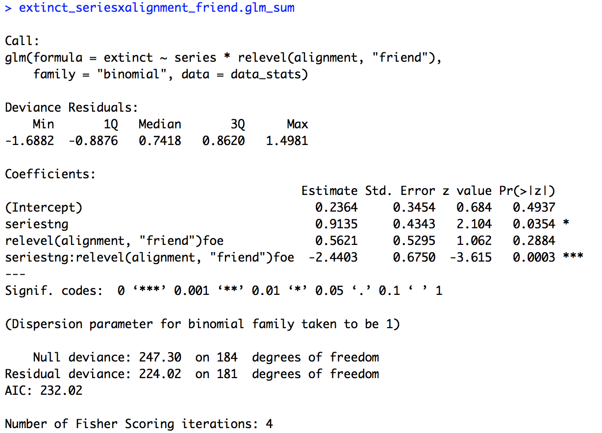
We could also relevel the variable “alignment” but keep “series” set to the original level, “tos”. Copy and run the code below.
# Two variables interaction (change baseline for alignment)
extinct_seriesxalignment_friend.glm = glm(extinct ~ series * relevel(alignment, "friend"), family = "binomial", data = data_stats)

extinct_seriesxalignment_friend.glm_sum = summary(extinct_seriesxalignment_friend.glm)
extinct_seriesxalignment_friend.glm_sum
The summary of the model is provided below. Now our intercept isn’t significant (p = 0.4937), so friends in “The Original Series” are not significantly more or less likely to become extinct (don’t forget, the baseline for “series” is back to “tos”!). Our effect for “series” continues to be significant (p = 0.0354), but now in the reverse direction as before (0.9135). Friends are significantly more likely to become extinct in “The Next Generation” than in “The Original Series”. As before, our values for our remaining variables, “alignment” and the interaction of “series” and “alignment”, are the same as the original model with the interaction, just with reversed signs.
In the end our expectations based on the figure are confirmed statistically, there was an interaction of “series” and “alignment”. Breaking it down a bit more, we found that foes were significantly less likely to become extinct in “The Next Generation” than in “The Original Series”, but friends were significantly more likely to become extinct in “The Next Generation” than in “The Original Series”. Within “series”, there was no difference between foes and friends in “The Original Series”, but there was in “The Next Generation”, with friends being more likely to become extinct.
You’ve now run a logistic regression with two variables and an interaction in R! Save your script in the “scripts” folder and use a name ending in “_statistics”, for example mine is called “rcourse_lesson4_statistics”. Once the file is saved commit the change to Git. My commit message will be “Made statistics script.”. Finally, push the commit up to Bitbucket.
Write-up
Let’s make our write-up to summarise what we did today. First save your current working environment to a file such as “rcourse_lesson4_environment” to your “write_up” folder. If you forgot how to do this go back to Lesson 1. Open a new R Markdown document and follow the steps to get a new script. As before delete everything below the chuck of script enclosed in the two sets of ---. Then on the first line use the following code to load our environment.
```{r, echo=FALSE}
load("rcourse_lesson4_environment.RData")
```
Let’s make our sections for the write-up. I’m going to have three: 1) Introduction, 2) Results, and 3) Conclusion. See below for structure.
# Introduction


# Results


# Conclusion
In each of my sections I can write a little bit for any future readers. For example below is my Introduction.
# Introduction

I analyzed alien species data from two "Star Trek" series, "Star Trek: The Original Series" and "Star Trek: The Next Generation". Specifically, I looked at whether series ("The Original Series", "The Next Generation") and species alignment to the Enterprise (foe, friend) could predict whether the species was classified as likely to become extinct in the near future or not. Note, in the classification for this analysis only species with a classification of "least concerned" in a more nuanced classification system, were labeled as "not likely", the rest were labeled as "likely".
Turning to the Results section, I can include both my figure and my model results. For example, below is the code to include my figure and my full model with the interaction.
# Results

I tested for if an alien species' likelihood of becoming extinct could be predicted by the series in which the species appeared and whether the species was a friend or a foe. Initial visual examination of the data suggests that there is an interaction, where likelihood of becoming extinct for friends or foes is flipped for each series.

```{r, echo=FALSE, fig.align='center'}
extinct.plot
```

To test this effect I ran a logistic regression with "not likely to become extinct" (0) or "likely to become extinct" (1) as the dependent variable and series and alignment as independent variables. There was a significant effect of series and a significant interaction of series and alignment.

```{r}
extinct_seriesxalignment.glm_sum
```
Go ahead and fill out the rest of the document to include the releveled models to fully explain the interaction and write a short conclusion, you can also look at the full version of my write-up with the link provided at the top of the lesson. When you are ready, save the script to your “write_up” folder (for example, my file is called “rcourse_lesson4_writeup”) and compile the HTML or PDF file. Once your write-up is made, commit the changes to Git. My commit message will be “Made write-up.”. Finally, push the commit up to Bitbucket. If you are done with the lesson you can go to your Projects menu and click “Close Project”.
Congrats! You can now do multiple regression in R!
Conclusion and Next Steps
Today you learned how to take an old statistics test (logistic regression) but expand it to when you have two variables (multiple regression). You were also introduced to the package purrr to read in multiple files at once, and expanded your knowledge of dplyr and ggplot2 calls. One issue you may have is that with baselines we lose our ability to see general main effects across the data. For example, in our model with the interaction we didn’t get to know if there was an effect of “series” regardless of “alignment”, only within one “alignment” level or the other. Next time we’ll be able to get around this issue with an analysis of variance (ANOVA).
* Data for the rest of the series is not currently available in full on The Star Trek Project.